Data Mining — course script
About this page
This is the full course script (skrypt) in HTML — the written companion to the slide decks: the same argument in full sentences, plus the details, caveats and worked numbers that do not fit on a slide. Also available as a PDF, alongside the slides and lab notebooks in the repository.
How to use this script
This script is the written companion to the lecture slides: the same argument, in full sentences, plus the details, caveats and worked numbers that do not fit on a slide. Each block of the course has one chapter here, one slide deck, and one lab notebook; the three are built from the same dataset and tell one continuous story. Read the chapter after (or instead of) the lecture; run the notebook alongside it.
| # | Date | Topic | Lab notebook |
|---|---|---|---|
| 1 | 06.10 | Data mining & CRISP-DM; EDA; missingness; features; project brief | 01 |
| 2 | 13.10 | Linear & logistic regression; regularisation; intro to evaluation | 02 |
| 3 | 20.10 | Trees; SVM; ensembles (RF, GBDT); honest evaluation; leakage | 03 |
| 4 | 27.10 | Clustering (k-means, hierarchical, DBSCAN); PCA | 04 |
| 5 | 03.11 | Pattern discovery / Market Basket; text-mining basics | 05 |
| 6 | 10.11 | Foundations of neural networks; responsible ML | 06 |
| 7 | 17.11 | Project defences (part I) + Exam, term 0 (part II) | - |
Course organisation - learning outcomes, project rules and rubric, exam format, datasets and tooling - is collected in the course organisation appendix.
1 Block 1 - Data mining, EDA & the anatomy of missing data
1.1 What data mining is - and is not
Data mining is the craft of finding useful structure in data in order to support a decision, with methods that are honest about uncertainty. Every part of that sentence carries weight. “Useful” rules out structure that is statistically real but operationally irrelevant. “Decision” anchors the whole exercise: someone will approve a loan, contact a customer, or set a price differently because of what we find. And “honest about uncertainty” separates data mining from wishful thinking dressed in charts.
It is just as important to say what data mining is not. It is not running every algorithm in a library and keeping the one with the highest accuracy - we will see in Block 3 how easily that procedure fools its author. It is not “the model said so”: a model output is an input to human judgement, not a substitute for it. And it is not a replacement for understanding the business problem; no amount of gradient boosting fixes a mis-posed question. Throughout the course the direction is always the same: we start from the decision and choose the method - never the reverse.
Where does the discipline sit on the map? Artificial intelligence is the broadest ring: systems that behave “intelligently” by whatever mechanism. Machine learning is the subset that learns from data rather than from hand-written rules. Data mining is the part of machine learning (plus a good deal of statistics and databases) aimed at extracting useful patterns from business data. Statistics underpins all three rings - inference, uncertainty quantification, experimental design. The borders are soft, and industry job titles (“data scientist”) usually mean the union rather than any single ring. Nothing in this course depends on the taxonomy; it exists so that you can place what you learn here next to what you learn elsewhere.
1.1.1 The promise - and where it fails in organisations
Why do banks, telecoms and retailers fund this discipline at all? Because a small relative improvement applied to a large flow of decisions compounds into serious money. A toy calculation makes the logic concrete (the numbers are invented, the structure is not). Suppose a lender approves 100,000 loans a year at an average of 20,000 PLN, and credit losses run at 3% of the amount lent - 60 million PLN a year. A scoring model that cuts those losses by 10% relative, at the same approval rate, is worth 6 million PLN a year, every year, for the cost of a small team and some computers. That is the promise: not one brilliant prediction, but a slightly better decision repeated a hundred thousand times. The same arithmetic explains why data mining lives most comfortably in businesses with high decision volumes - lending, insurance pricing, marketing, fraud - and least comfortably where decisions are few and each one is idiosyncratic.
The same logic exposes where projects fail, and it is rarely in the mathematics. The value of a data-mining project is a chain: data model decision rule execution - and the weakest link caps the whole chain. In practice the chain breaks in recognisable places. A model is built but nobody owns the decision it was supposed to change, so it is admired and shelved. The predictions are accurate but the business process cannot act on them - the collections team has no capacity for the extra calls the model recommends. The model is deployed but the input data pipeline differs subtly from the training pipeline, so production scores drift away from notebook scores. Or - the most common failure of all - the question was never a decision in the first place: “find something interesting in this data” produces findings that are interesting and change nothing. Industry surveys have reported for years that a large majority of models never reach production; the reasons above, not algorithmic weakness, dominate the post-mortems.
The lesson for this course is a habit of mind: before touching data, write one sentence of the form “because of this analysis, person X will do Y differently”. If you cannot fill in the blanks, you do not yet have a data-mining problem - you have data and curiosity, which is a fine starting point but not a deliverable. Your course project is graded on exactly this discipline: the framing marks are earned by the sentence above, not by the model that follows it.
1.2 A map of learning problems
Before any method, a vocabulary. Machine-learning problems fall into three broad paradigms:
The data come with labels - for each historical case we know the outcome - and the goal is to predict the label for new cases. Will this applicant default?
No labels; the goal is to find structure in the data: groups of similar cases, co-occurrence patterns, compressed representations. Which customers are similar to each other?
An agent takes actions, receives rewards, and adapts its strategy. Which collections action should we try next? We only mention this paradigm in the course, so that you can place it on the map.
Supervised learning itself comes in flavours, distinguished by the type of target:
| Task | Target | Credit example |
|---|---|---|
| Binary classification | one of two classes | default |
| Multiclass classification | one of several classes | complaint category; rating grade |
| Regression | a continuous number | loss amount; recovery rate |
| Others (mentioned only) | ordinal, ranking, survival time | months until default |
The course concentrates on binary classification (the probability-of-default thread of Blocks 2, 3 and 6) and regression (Blocks 2–3); multiclass classification and the remaining task types appear in passing where a method naturally generalises. The unsupervised paradigm gets its own two blocks: clustering and dimensionality reduction (Block 4), pattern discovery and text mining (Block 5).
Translating a business question into one of these tasks is the analyst’s job, and no algorithm does it for you. “Will this applicant default?” is binary classification; “how large will the loss be if they do?” is regression; “which complaint team should read this email?” is multiclass; “do our customers form natural segments?” is clustering; “which products are bought together?” is association-rule mining. Getting this translation wrong invalidates everything downstream, which is why it belongs to the business understanding phase, not to modelling.
Two subtleties hide inside the translation, and both will reappear later in the course. First, the target itself is a design decision, not a fact of nature. “Default” sounds objective, but someone had to decide how many days past due count as default, over what observation window, and measured from which moment - and two teams with different definitions will build models that cannot be compared. Whenever you receive a labelled dataset, ask who defined the label, how, and whether that definition matches the decision you are supporting. Second, the same business problem can often be posed as more than one task: “how risky is this applicant?” can be binary classification (default / no default), regression (expected loss), or survival analysis (time until default). The cheapest formulation that supports the decision wins; do not reach for the exotic one because it sounds sophisticated. Retail credit overwhelmingly chooses binary classification with a fixed outcome window precisely because the resulting probability plugs directly into an approve/decline rule, a price, and a capital calculation - the decision shapes the task.
1.3 CRISP-DM: the spine of the course
CRISP-DM (Cross-Industry Standard Process for Data Mining) structures every project in this course: (1) business understanding, (2) data understanding, (3) data preparation, (4) modelling, (5) evaluation, (6) deployment - drawn as a loop, because deployment feeds back into business understanding. The most important arrow in the diagram is the dashed one, from evaluation back to data understanding: a disappointing evaluation is rarely fixed by a fancier model; it is fixed by going back and understanding the data better. Block 1 lives entirely in phases 1 and 2.
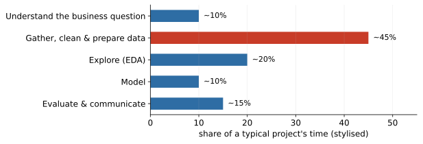
Figure 1 explains why this course starts with data understanding rather than algorithms: gathering, cleaning and exploring data is where most of a project’s calendar time - and most of its failure modes - actually live.
1.3.1 The six phases, seen from the trenches
CRISP-DM reads like bureaucracy until you have watched a project die in each phase. Here is what the boxes mean in practice, with the failure mode each one exists to prevent.
Turn a vague wish into a decision, a target, a unit of analysis, and success criteria in business terms. The classic failure: a team spends months on “predicting churn” before anyone asks what the retention department would do with a churn score - and it turns out they have budget to contact two hundred customers a month, which changes the whole problem from “predict churn” to “rank the two hundred most saveable customers”. One meeting in phase 1 would have replaced three months of phase 4.
Collect the data, describe it, explore it, and audit its quality - the whole of this chapter. The failure it prevents is building on sand: documentation that lies (a field labelled “monthly income” that a legacy system has stored as annual income since a migration nobody remembers), keys that do not hold, missingness nobody counted. The cheapest place to discover a data problem is here; the most expensive is after deployment.
Clean, join, transform, engineer features, and construct the modelling table. This is the phase that eats the calendar (Figure 1) and the phase where leakage traps are laid: joins that quietly use future information, transforms fitted on all rows, duplicates manufactured by a many-to-many merge. Every preparation step is a modelling decision wearing overalls.
Choose model families, fit, tune. Genuinely the easiest phase - a few library calls - which is exactly why beginners overweight it. The discipline: start with the simplest baseline that could work, so that every added complexity can be judged against it (Block 2 makes this concrete).
Not “compute the accuracy” but: does the model, evaluated honestly, support the decision from phase 1 well enough to act on? This is where you discover that the brilliant score was leakage, that the model fails on exactly the segment the business cares about, or that the data does not contain the signal you hoped for. Hence the dashed arrow: evaluation routinely sends you back to phase 2, and a project plan with no room for that loop is a fiction.
The model leaves the notebook: scoring pipelines, monitoring, documentation, handover. Failure mode one: the feature code is re-implemented for production and computes something subtly different, so the deployed model is not the validated one. Failure mode two: nobody monitors, the world drifts, and the model degrades silently for a year. Deployment is where data mining stops being a study and starts being a liability - which is why regulated industries audit it.
Two remarks on using the framework well. First, the phases are a checklist of questions, not a waterfall of gates: real projects run several loops, each deeper than the last, and a first pass through all six phases in a week (a “walking skeleton” of the project) beats six weeks spent perfecting phase 3. Second, the phase boundaries are where misunderstandings hide, because responsibility changes hands - the business owner frames, the analyst prepares and models, engineering deploys. Write down what was agreed at each boundary; the written form is the cheap insurance. Your course project is a miniature of exactly this cycle, and its rubric mirrors the phases - framing, preparation, modelling, evaluation, interpretation - so the process is not just background theory; it is the marking scheme.
1.4 The business problem for the whole term
We are a retail lender. At application time we observe a customer’s characteristics; we must decide whether to grant credit. The modelling question: given what we know at application time, how likely is the customer to default - and what should we do about it?
One row of our table is one customer with one loan application. This choice of the unit of analysis deserves a moment, because it is the first decision nobody teaches. The unit fixes what a prediction means and when it can be used. A customer with three loans could be three rows or one; your metrics change either way. Mixing units - some rows customers, some applications - silently double-counts people. Whenever you meet a new table, ask what a row is before you ask anything else.
1.4.1 The unit of analysis: a second worked example
The application-level table is not the only way to slice a lending portfolio, and seeing a second slicing makes the concept stick. Consider a customer-month panel: one row per customer per calendar month on the books, with behavioural fields (balance, payments made, days past due) and a target such as “defaults within the next 12 months”. Banks use exactly this shape for behavioural scoring of existing customers, next to the application scoring we build in this course.
A toy portfolio shows how much the unit changes the numbers. Ten customers are observed for twelve months each - 120 customer-month rows - and two of the customers default once during the year. At the customer level the default rate is . At the customer-month level it is . Same portfolio, same events, a twelvefold difference in the headline rate - and neither number is wrong; they answer different questions (“will this customer ever default this year?” versus “will this customer default in a given month?”). Every downstream choice moves with the unit: the features (application data versus recent behaviour), the moment the prediction is usable (once, at application, versus every month), and the class balance the model faces.
The panel shape also plants a landmine we will defuse properly in Block 3: the twelve rows of one customer are not twelve independent observations. They share the same person, the same habits, the same eventual outcome. A random row-level train/test split puts months 1–6 of a customer in training and months 7–12 in test - the model has effectively seen the test customers already, and every score is inflated. The split must be by customer (or by time), not by row. The general rule: whatever your unit of analysis, ask what the true independent unit is, and split on that. For our application-level table the two coincide, which is one reason it is the right training ground.
The Block 1 portfolio has 4,000 customers and 18 columns; the primer and Block 1 lab load it via finance_data.load_credit(), which fetches the classic German Credit data from OpenML or generates a synthetic Polish portfolio with the same interface (the labs pin the synthetic source for reproducibility; from Block 2 onward the modelling labs switch to the real Taiwan portfolio via load_taiwan()). Alongside ordinary application fields - age, income, housing, loan purpose, existing loans, savings - it contains three columns placed there deliberately: months_since_last_delinquency, which is structurally missing for customers who were never delinquent; monthly_income_pln with income-dependent missingness; and collections_contact, a leakage trap we defuse in Section 1.8 and detonate, on purpose, in Block 3.
1.4.2 The data you will never see: selection bias
One question should precede even the first histogram: how did rows get into this table? A lender’s portfolio contains only approved loans. Rejected applicants have no default outcome - they are simply absent - so any model trained here learns the behaviour of the survivors of yesterday’s approval policy. For applicants unlike anyone previously approved, the model extrapolates, and its confidence in that region is borrowed, not earned. Credit scoring is unusual in having a name and a toolbox for the problem (reject inference: inferring what the rejected would have done); most other domains quietly ignore the same pattern - churn models see only customers who were acquired, hiring models see only people who were hired. Two things matter on day one: selection bias cannot be fixed by collecting more data from the same source, and every dataset deserves the how-did-rows-get-here question before any conclusion leaves the room.
Why the approved-only sample distorts what a model learns.
It is worth seeing the mechanics, because “the sample is biased” sounds abstract until you watch it bend a relationship. Toy numbers, chosen for arithmetic rather than realism. In the full applicant population there are two groups: low-utilisation applicants who default at 10%, and high-utilisation applicants who default at 50% - a strong, honest risk signal. Yesterday’s policy approved essentially all of the low group but only a carefully chosen tenth of the high group: the ones with high incomes and long employment, who default at 20% rather than 50%. Now look at the training table this policy left behind. Within it, moving from low to high utilisation raises the observed default rate from 10% to 20% - the model learns a modest slope, when the true population slope runs from 10% to 50%. The signal is attenuated, because the policy systematically removed the worst cases from exactly the region where the feature mattered most. Worse, the model has never seen an ordinary high-utilisation applicant at all, so when tomorrow’s policy asks it to score one, it confidently applies the 20% pattern learned from an elite subgroup. The general phenomenon: past selection on (or correlated with) your features flattens, bends, or even reverses the relationships a model estimates, and it does so invisibly - the training data contains no trace of the people who were filtered out.
What reject inference tries to do.
Since the problem cannot be ignored in credit scoring - the score will be applied to the full applicant population, not the approved one - the industry has developed partial remedies, worth knowing by name even though their details are beyond this course. The cleanest is outcome data from elsewhere: credit-bureau records sometimes show how a rejected applicant performed on a loan granted by a competitor, turning some rejects into labelled rows. The statistical family includes reweighting (make the approved sample resemble the applicant population on observables) and extrapolation or parcelling (score the rejects with an interim model and assign them inferred outcomes, in proportion to their estimated risk). The honest caveat applies to all of them: they infer the rejects’ outcomes from a model trained on the approved - the very extrapolation we distrust - so they encode assumptions rather than replace missing facts. The gold standard is experimental: approve a small random slice of applicants who would normally be rejected, and observe what actually happens. It is the only approach that produces real labels from the unseen region, and it costs real money in defaults - a controlled price paid for knowledge, which risk departments weigh explicitly. If one idea survives from this subsection, let it be this: the absence of data is itself data about the process that produced your table, and no amount of modelling sophistication can conjure the missing region back.
1.5 Exploratory data analysis
EDA is not a ritual to perform before the “real work”. It is real work: most projects fail quietly here, not loudly in modelling. The checklist: shape and types; target balance; univariate distributions; bivariate relationships with the target; data quality (duplicates, outliers, missingness).
1.5.1 First contact
Four commands before anything else: df.shape (how much data?), df.dtypes (what does pandas think each column is?), df.head(10) (do the values look like the documentation promised?), and df.describe(include="all") (ranges, counts, uniques). You are looking for numbers stored as strings ("12 000", "N/A"), categorical levels that differ only by case or spelling, minima and maxima that make no physical sense, and describe() counts smaller than len(df) - the first sign of missingness.
Reading describe() like a practitioner.
The output of describe() is a dense little report, and experienced analysts read it in a fixed order, each row answering a specific question. count against len(df): any shortfall is missingness - note the column and the size of the gap before doing anything else. mean against the 50% row (the median): a mean well above the median announces right skew (income, balances, anything monetary); well below, left skew. std against the mean: a standard deviation of the same order as the mean, on a positive variable, is another skew fingerprint - a symmetric variable that “wanted” to go negative but cannot. min: should this variable ever be zero or negative? A negative income or a zero age is a data-entry question, and a large pile of exact zeros may be a hidden category (“no savings account”) rather than a measured amount. max: is it physically plausible, and is it suspiciously round? A maximum of exactly 999,999 is a sentinel wearing a number’s clothing. For categorical columns, unique, top and freq carry the same kind of signal: unique close to len(df) means the column is an identifier in disguise (and identifiers are never features); freq close to len(df) means the column is nearly frozen and likely carries no information; a unique count higher than the documentation promises means phantom levels - typos, case variants, or trailing spaces. Ten seconds per column, and you have a working map of where the problems live. The point is not the tool - any summary table works - but the habit of interrogating each number instead of scrolling past it.
Then verify the key: does customer_id really identify rows uniquely? Duplicated rows are double-counted evidence, and a duplicate that lands in both training and test data inflates every score you will ever compute on it - a cousin of the leakage problem of Block 3. In our portfolio the key holds and there are no full-row duplicates; in the wild, repeated exports glued together and joins that multiplied rows are everyday occurrences.
Know your variable types, because the type decides the plot, the summary statistic, and (later) the encoding: numeric continuous (income, DTI), numeric discrete (number of existing loans - often better treated as categories), categorical nominal (purpose, region), categorical ordinal (checking status: none low medium high - the order matters, keep it), dates and times (time zones bite, and date columns enable leakage), free text (its own pipeline, Block 5), and identifiers - never features.
Behind this practical typology sits the classical theory of measurement scales (Stevens, 1946), worth knowing because it says which operations are meaningful at all:
| Scale | Defining property | Meaningful operations | Example |
|---|---|---|---|
| Nominal | categories, no order | , | purpose, region |
| Ordinal | ordered, unknown gaps | , | checking status, ratings |
| Interval | equal gaps, no true zero | , | temperature in °C; calendar dates |
| Ratio | true zero exists | , | income, loan amount, age |
The scale limits the statistics: a mean of nominal codes is nonsense, a median needs at least an ordinal scale, and “twice as much” requires a true zero - 40°C is not twice as warm as 20°C, but a 40,000 PLN loan is exactly twice a 20,000 one. The scale also constrains encodings, which matters from Block 2 onward: coding a nominal variable as integers invents an order that is not there, while one-hot-encoding an ordinal variable throws a real order away.
Stevens’ scales, seen through transformations.
There is an elegant way to remember what each scale licenses: ask which relabellings of the data would leave its meaning intact. A nominal variable survives any one-to-one renaming - call the purposes A, B, C or 1, 7, 42, nothing changes - so only statements invariant to renaming (equality, counts, the mode) are meaningful. An ordinal variable survives any order-preserving transformation - recode none/low/medium/high as 0/1/2/3 or as 0/10/11/99 and the order still holds - so medians and quantiles are safe (they depend only on order), but means are not: the two recodings above give different means for the same data. An interval variable survives shifts and rescalings (): Celsius and Fahrenheit disagree about every number yet agree about every difference of temperatures, which is why differences are meaningful and ratios are not. A ratio variable survives only rescaling (): PLN and EUR disagree about the numbers but agree that one loan is twice another. A statistic is meaningful on a scale exactly when it is invariant under that scale’s permissible transformations - a one-line rule that settles most “can I average this?” arguments. One practical footnote: applied work bends these rules constantly (survey research averages ordinal rating scales as a matter of routine), and the bending is often harmless. The theory is not a police force; it is a warning system that tells you when a summary depends on an arbitrary coding choice - and therefore when a critic can legitimately attack your number.
1.5.2 The target comes first
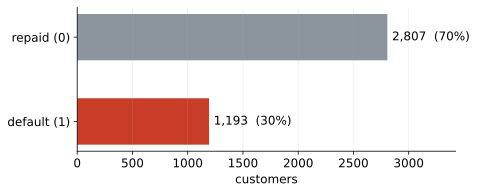
About 30% of the portfolio defaults (Figure 2). A model that always predicts “repaid” is therefore right seven times out of ten - and completely useless, because it approves everyone. This is the accuracy trap: on imbalanced problems, accuracy rewards ignoring the minority class. Real PD portfolios are far more extreme (1–5% default rates), which makes the trap deeper. The honest metrics for imbalanced classification are the subject of Block 3; for now, note the imbalance and distrust accuracy.
Why check the target first, before any feature? Three reasons. The base rate is your baseline: every model you ever build must beat the trivial strategy of predicting the majority class, and you cannot know what that strategy scores until you know the balance. The base rate also calibrates your reading of every bivariate plot to come - a segment defaulting at 39% is alarming against a 30% portfolio and unremarkable against a 38% one. And the imbalance previews an economic asymmetry that will drive Block 3: the two errors do not cost the same. Approving a future defaulter loses (part of) the principal; declining a good customer loses only the margin. When one error is many times dearer than the other, a metric that weights them equally - accuracy - is answering a question nobody asked. The target distribution is one number, and it silently parameterises the entire project.
1.5.3 Univariate structure
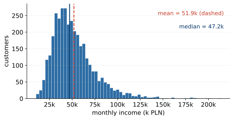
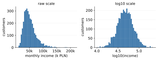
Income (Figure 3) is right-skewed: a minority of high earners pulls the mean above the median. Skew is information. It tells you which summary to report (the median, for skewed variables), and it hints that a transform may help. Figure 4 shows the same variable through a log lens: nearly symmetric. Monetary amounts - income, savings, losses - almost always deserve a log look, because money behaves multiplicatively: the difference between 3 and 6 thousand PLN is a doubling, like the difference between 30 and 60 thousand, not like the difference between 30 and 33.
Why the log lens works.
The pattern is too reliable to be a coincidence, and it is not one. Quantities that grow by proportional steps - salaries raised by percentages, wealth compounding at rates, firms growing relative to their size - are products of many multiplicative factors: after periods, . Take logarithms and the product becomes a sum, , and sums of many small independent contributions are exactly what the central limit theorem domesticates: approximately normal. So a multiplicatively generated variable is approximately lognormal - symmetric on the log scale, right-skewed with a long tail in raw units. This is why the log transform is not a cosmetic trick that happens to prettify histograms: it is the change of coordinates in which the process that generated the data is additive, and in which “equal distances” mean “equal ratios” - the comparison that actually matters for money. Three practical footnotes. Use (np.log1p) when the variable contains legitimate zeros - a zero savings balance is information, not an error, and plain would discard the row. Never log a variable with genuine negative values (profits, balance changes); other transforms exist for those. And remember the lens metaphor cuts both ways: after modelling on the log scale, effects are multiplicative in the original units - “+0.1 in log income” means “about 10% more income”, a reading you must translate back for any human audience.
Alongside the shapes, run sanity checks for implausible values: ages outside ; negative incomes; sentinel codes (a suspicious spike at 999,999 usually means “missing” coded as a number); unit mixes (monthly versus annual salary, PLN versus EUR); too-round values (everyone earning exactly 5,000 suggests a form default); and frozen columns with one value everywhere (a broken export). Each red flag is a question for the data owner, not a value to silently “fix”. The checks cost three lines of pandas and have saved careers.
Sanity checks are hypotheses, not chores.
There is a mindset shift hidden in the list above. A weak analyst runs generic checks and scrolls the output; a strong one writes down, before looking, what the data must satisfy if it is what it claims to be - and then tests each statement like a hypothesis. “Every age lies in , because the bank does not lend to minors.” “No application date precedes the product’s launch.” “Instalment never exceeds the loan amount.” “debt_to_income equals total debt divided by income, to rounding error” - derived columns can be recomputed and compared, and a mismatch means either the documentation or the pipeline is wrong. Each check has only two outcomes, and both are valuable: it passes, and one corner of the data is certified; or it fails, and you have found - for the cost of one line of code - either a data defect or a hole in your own understanding of the business. The second discovery is the more valuable one. Checks that pass also earn their keep later: rerun on every data refresh, they become a tripwire that catches upstream changes before the model does.
For categorical variables, inspect the levels. Typos and case variants create phantom categories. Rare levels (below 1–2% of rows) often get grouped into other before modelling - but only after checking that they are not special: a tiny segment can carry a very high default rate, and grouping it away destroys exactly the signal a lender cares about.
1.5.4 Bivariate structure: what moves with the target
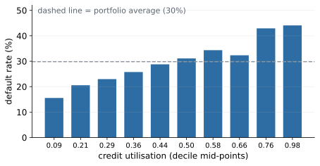
The quickest model-free signal check is the binned default-rate plot: cut a numeric feature into quantile bins and plot the default rate per bin. Figure 5 shows the result for credit utilisation - monotone and steep, the signature of a strong candidate feature, and exactly what credit-risk domain knowledge predicts.
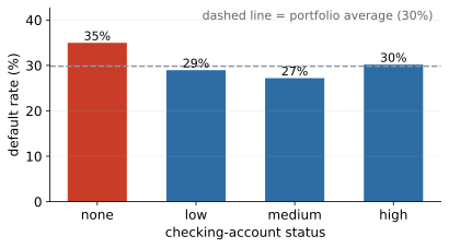
For categorical features, compare each level’s default rate with the portfolio average (Figure 6). “No checking account” is the riskiest level - the bank cannot see those customers’ cash flows, an effect so robust that it survives from the 1990s German Credit data to today’s portfolios. Two cautions. First, mind the group sizes: a default rate computed on thirty customers is noise, and eyeballing differences of a few percentage points between small groups is how false “insights” are born. Second, these are raw associations, not effects: the “none” group differs from the “high” group in many other ways at once.
How noisy is a rate on customers?
The first caution deserves numbers, because “small groups are noisy” becomes usable only when you can say how noisy. A default rate estimated on customers with true rate has standard error . Plug in toy values near our portfolio’s balance: with and , the standard error is - more than eight percentage points. Two thirty-customer groups drawn from the same population will routinely show rates like 27% versus 37%, a gap that looks like an insight and is pure sampling noise. Grow the group to and the standard error falls to about 2.6 points; at , to under one point. A serviceable habit: annotate every grouped-rate plot with the group sizes (or error bars), and refuse to interpret any difference smaller than a couple of standard errors. This is also why the interaction segment of Section 1.7 quotes its alongside its rate - a rate without its denominator is an anecdote wearing a percentage sign.
1.5.5 Correlations - a first map, handled with care
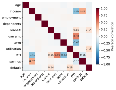
The correlation matrix (Figure 7) gives one picture of which features move together and which move with the target. In our portfolio, credit utilisation () and the number of existing loans () stand out for default - current debt load beats income - and income correlates visibly with savings, as the domain would predict. Strongly correlated feature pairs () are candidates for dropping one member; nearly-duplicate features add instability without adding information.
Four caveats keep the tool honest. Correlation is not causation - ice cream sales correlate with drownings because summer causes both. Pearson’s sees only straight lines - a perfect U-shaped relationship can score . A single extreme point can manufacture correlation where none exists. And when variables are heavily skewed, Spearman’s rank correlation - which only asks “do they move in the same direction?” - is the more robust lens. A correlation matrix generates hypotheses, never conclusions.
Correlation, formally.
Pearson’s product-moment correlation between variables and over observations is a number in measuring the strength of the linear relationship; it is invariant to shifting and (positive) rescaling of either variable, which is why units do not matter. Spearman’s is simply Pearson’s computed on the ranks of the data; with no ties it reduces to and measures monotone association: it is immune to any monotone transform (log included) and far more robust to outliers. Kendall’s counts concordant versus discordant pairs, ; it has a clean probabilistic reading (“how much more likely are two random customers to be ordered the same way on both variables?”) and is preferred for small samples with many ties, at cost against once ranks are sorted.
Two practical remarks complete the picture. First, a Pearson correlation against a binary target (our default) is the point-biserial correlation. Its magnitude is mechanically bounded well below 1 when the classes are imbalanced, so small-looking numbers can accompany strong signals: utilisation’s modest coexists with the steep decile gradient of Figure 5 - from 15% to 44% default. Judge features against a 0/1 target by grouped rates and (later) by model-based measures, not by alone. Second, Pearson and Spearman apply to numeric (at least ordinal, for Spearman) variables; for a pair of nominal variables the analogous tool is Cramér’s , built from the statistic of the contingency table, for a table, ranging from 0 (independence) to 1.
The ecological fallacy.
One more caveat belongs on the list, because aggregated data invites it constantly: a correlation computed across groups says nothing reliable about individuals within them. Suppose you correlate, across the regions of a country, average income with regional default rate, and find that richer regions default less. It does not follow that richer individuals default less - the individual-level relationship could be weaker, absent, or even reversed, because regions differ in a hundred other ways (industry mix, product mix, the lender’s regional policies) that are averaged into the group figures. The classic demonstrations in the statistics literature show group-level and individual-level correlations differing not just in size but in sign. The trap matters in practice because aggregated data is so often the only data available - published statistics, market research, competitor benchmarks all come pre-averaged. The discipline: state explicitly at which level a correlation was computed, and refuse to let a group-level number masquerade as a statement about persons. It is the mirror image of Simpson’s paradox below - both are failures of moving between levels of aggregation without paying the toll.
Simpson’s paradox.
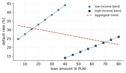
One more way a bivariate summary can lie: the aggregate trend can point the opposite way from the trend inside every subgroup. Figure 8 shows a constructed credit example - in aggregate, bigger loans look safer, because high-income customers take the big loans; within each income band, bigger loans are riskier. Both statements are true; only the within-band one is useful for a lending decision. Before concluding from any bivariate plot, ask: compared within what? Segment first, conclude second.
The paradox stops feeling like magic once you do the arithmetic yourself, so here is a toy portfolio (invented numbers, engineered to be transparent) with two income bands and two loan sizes:
| Income band | Loan size | Loans | Defaults | Default rate |
|---|---|---|---|---|
| Low income | small | 200 | 40 | 20% |
| Low income | big | 50 | 15 | 30% |
| High income | small | 50 | 4 | 8% |
| High income | big | 200 | 24 | 12% |
Within the low-income band, big loans are riskier (30% versus 20%); within the high-income band, big loans are riskier again (12% versus 8%). Now pool the bands. Small loans: loans with defaults - a rate of . Big loans: loans with defaults - a rate of . In aggregate, big loans look safer, even though they are riskier inside every single band. The engine of the reversal is the lopsided mix: 80% of big loans sit in the low-risk high-income band, while 80% of small loans sit in the high-risk low-income band, so the pooled comparison is mostly comparing income bands, not loan sizes. Income here is a confounder - a variable associated with both the feature and the outcome - and pooling lets it impersonate the feature. The practical defences: segment by the suspected confounder before concluding (as the within-band rows do); and be suspicious whenever a pooled comparison contradicts domain sense, because an unbalanced mix is usually hiding underneath. Note finally what the paradox does not say: neither level of aggregation is automatically the truth. Which comparison is right depends on the causal question being asked - for “should loan size worry me for a given applicant?”, the within-band answer is the relevant one, because the applicant’s income is known at decision time.
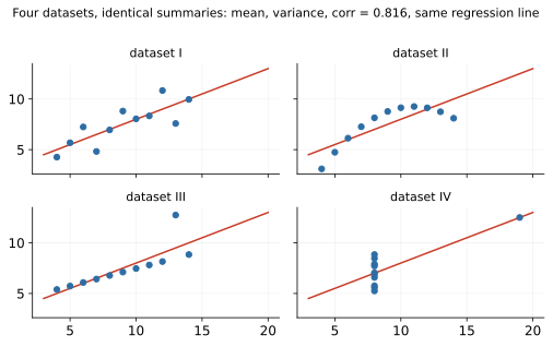
The definitive argument for plotting rather than trusting summaries is Anscombe’s quartet (Figure 9): four datasets with the same means, variances, correlation () and regression line - and four completely different stories, including one where the “relationship” is a single outlier. Summary statistics hide; plots reveal.
Anscombe built the quartet by hand in 1973 to attack a then-common attitude he quoted as “numerical calculations are exact, but graphs are rough” - and his deeper point survives every improvement in tooling since. A summary statistic is a lossy compression of the data, chosen in advance; it can only answer the question it was designed for, and it is silent about everything else. The four panels are precisely the failure modes an analyst meets in the wild: a genuinely linear relationship (the one case where the summaries tell the truth); a smooth curve, for which a correlation is the wrong question; a clean line plus one outlier that drags the fitted slope; and a pathological case where a single extreme point manufactures the entire “relationship” - remove one row and collapses. The moral is not “distrust statistics” but “statistics answer prepared questions; plots let the data volunteer what you did not think to ask”. In a modern workflow the quartet translates into one cheap habit: for any relationship you are about to report - to a colleague, a committee, a model - spend the ten seconds to look at its scatter plot first. The habit costs nothing and has, more than once, saved an analyst from presenting panel four as a finding.
1.5.6 Outliers: spot, then decide
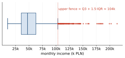
The boxplot’s IQR rule flags points beyond (Figure 10). It is a convention, not a law: for skewed variables it flags many perfectly genuine values - log-transform first and look again. What to do about an outlier is a four-step decision, in order: investigate (error or real?); if an error, fix it at the source or set it to missing - do not invent a replacement value; if genuine, keep it, possibly capped (winsorised) or log-transformed so it stops dominating; and document the rule, because “we capped income at the 99th percentile” must be applied identically to every future dataset the model scores.
Where the IQR rule comes from - and when it misleads.
The magic constant is not magic. For a normal distribution the quartiles sit at , so the interquartile range is , and the upper fence lands at Under normality about of values fall beyond each fence - roughly flagged in total, a pleasantly small “worth a second look” pile. Tukey, who proposed the rule, reportedly chose because flagged too much and too little; it is a calibrated convention for approximately symmetric data, nothing deeper. Knowing the derivation tells you exactly when the rule breaks. On skewed data the normal calibration is void: a right-skewed income variable will have a crowd of genuine values beyond the upper fence (as in Figure 10) while the lower fence sits below zero, flagging nothing - the rule turns into a skew detector, not an outlier detector, which is why the advice is to log-transform first and look again. On heavily discrete data the rule can degenerate: if more than half the customers have, say, the same number of existing loans, the IQR can be tiny or zero and the fences collapse onto the median, flagging every other value in the column. On small samples the quartiles themselves are noisy, so the fences wobble. And on mixtures - two populations glued into one column, such as retail and private-banking customers in one income field - the rule flags the smaller population wholesale, which is a finding about segmentation, not about data errors. The practitioner’s summary: the IQR rule is a cheap tripwire that draws your attention; the four-step decision above - investigate, fix or keep, transform, document - is the actual outlier policy.
In practice
Whether an outlier is a problem depends entirely on the business question. In fraud detection the outliers often are the signal - the analyst who routinely deletes them is deleting the fraud. The same customer that distorts an income histogram may be the case your model exists to catch.
EDA, finally, is a loop, not a phase: ask a question, make the one plot that answers it, let the answer raise two new questions, and repeat until the surprises stop. Keep an evidence log - one sentence plus one plot per finding. “Income is MNAR-missing for high earners” is worth more than forty unlabelled histograms, and your future self will re-read it.
1.6 Missing data: the anatomy
Missing data is where Block 1 earns its keep, because missingness is not one thing. The mechanism behind the gaps decides what treatments are safe:
| Type | Meaning | Example in our portfolio |
|---|---|---|
| MCAR | missing completely at random - unrelated to anything | a form field lost to a system glitch |
| MAR | depends on observed data | employment length missing far more often for renters |
| MNAR | depends on the unobserved value itself | high earners decline to state income |
| Structural | the value cannot exist | months since last delinquency, when there was none |
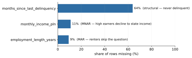
Our portfolio exhibits three of the four (Figure 11), and the lab notebook finds evidence for each. The MAR case is directly checkable: group the missingness indicator of employment length by housing status, and renters show a 16% missing rate against 4% for owners - the missingness depends on an observed column. The MNAR case is subtler, and this is the uncomfortable truth about MNAR in general: it is invisible in principle, because the missingness depends on the value we never see. It can, however, leave fingerprints on correlated, observed variables. Savings correlate with income; in our data, customers with missing income show a median savings balance of about 3,000 PLN against about 2,400 for the rest - indirect evidence that the unstated incomes were high. No statistical test proves MNAR from observed data alone; the diagnosis comes from proxies like this plus domain knowledge (wealthy applicants often decline to state income).
1.6.1 Rubin’s formalism, in plain mathematics
The MCAR/MAR/MNAR taxonomy comes from Rubin (1976), and its formal version is worth thirty seconds because it makes precise what the table above says loosely - and because it explains, rather than merely asserts, why the mechanism dictates the treatment. Write for the complete data we wish we had (all features and the target, for every customer), split it into the part we actually observe, , and the part that is missing, , and let be the missingness indicator - a matrix of the same shape as the data with where value of row is missing. The mechanism is the conditional distribution : how does the pattern of gaps depend on the data? The three cases are three assumptions about this distribution: the gaps depend on nothing - a coin flip decides who answers; the gaps may depend on what we did observe (renters skip the employment field more often - and housing status is on file), but given the observed data, they carry no further information about the missing values themselves; the gap depends on the value hiding inside it - high earners decline to state income because it is high. Structural missingness sits outside the trio: there does not exist even in principle, so the question “what would the value have been?” has no answer to estimate.
Two consequences follow directly from the definitions. First, MAR is the weakest assumption under which the missing values can be handled by looking only at observed data: under MAR, everything the gaps could tell us about the missing values is already carried by the observed columns, so methods that condition on those columns (group-wise or model-based imputation, likelihood methods) are on solid ground. Under MNAR the gaps carry information that no observed column can recover, and any method pretending otherwise is quietly assuming MAR. Second - and this is the uncomfortable part - the distinction between MAR and MNAR is untestable from the observed data alone: both mechanisms can produce identical observed datasets. You can test MCAR against MAR (our 16%-versus-4% grouping does exactly that, and rejects MCAR), but the MAR-versus-MNAR verdict always rests partly on domain knowledge, which is why the income diagnosis above leaned on the savings proxy plus an argument about applicant behaviour.
Why the mechanism dictates the estimator: a worked miniature.
Abstract definitions become believable when you watch a simple estimator fail. Toy numbers, arranged around our MAR example. Suppose a portfolio is 60% homeowners and 40% renters, owners earn 7,000 PLN a month on average and renters 4,000, so the true average income is . Now let the employment-style MAR mechanism act on income instead: owners fail to state income 4% of the time, renters 16% of the time (the chapter’s observed missingness rates, borrowed for the toy). Compute the naive complete-case average - the mean over rows where income is present. The owners contribute of the original population, the renters ; among complete cases the owner share has risen to . The complete-case mean is therefore about - biased upward, because deletion silently reweighted the sample toward the better-earning group. The bias is small here because the missingness rates are moderate; make the mechanism stronger and it grows without bound. Notice also what repairs it: within each housing group the data is (by assumption) missing at random, so the group means are unbiased, and recombining them with the true group weights ( and , which we know, because housing is observed) recovers 5,800 exactly. That is the MAR recipe in miniature - condition on the observed variables that drive the missingness, and the damage is undone; ignore them, and every “simple” summary inherits a tilt. Under MNAR no observed variable carries the needed information, and no reweighting or imputation built from observed data can fully repair the bias - which is precisely why the taxonomy matters before any treatment is chosen.
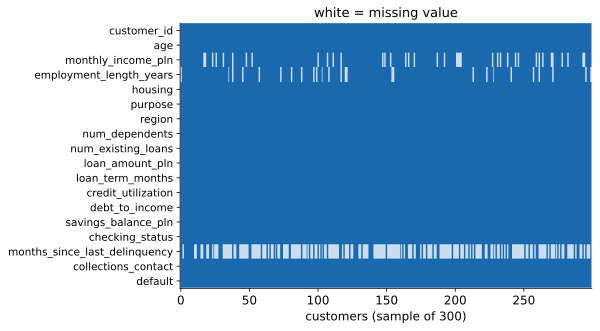
A missingness matrix - rows as customers, columns as variables, gaps in white - shows the structure at a glance: which columns, how often, and whether gaps co-occur in the same rows (Figure 12). No dedicated library is needed; df.isna() is the whole trick.
1.6.2 Deletion, and when it is (not) safe
The simplest treatment is to drop rows with gaps (listwise deletion). Under MCAR this is safe-ish: you lose statistical power but introduce no bias. Under MAR or MNAR it biases the sample toward whoever answers the question. In our portfolio, dropping the income-missing rows would remove disproportionately wealthy customers - the median savings of the removed group is visibly higher - so the surviving “complete” dataset systematically under-represents high earners. Dropping a mostly-empty column is defensible only when it also carries no signal, and both conditions must be checked: our delinquency column is 64% missing and still among the most informative variables in the data. Deletion is a modelling decision, not housekeeping; justify it like one.
There is also a compounding cost that the per-column view hides: listwise deletion drops a row if any of its columns is missing, so modest per-column gaps multiply into a large row-level loss. As a toy illustration, ten columns that are each independently missing for 5% of customers leave only of rows fully complete - you would discard four rows in ten to avoid handling gaps that individually looked negligible. Real missingness is usually correlated across columns (the same customers skip several fields), which softens the arithmetic, but the direction of the lesson stands: deletion is priced per row, not per gap, and the price grows with the width of the table.
1.6.3 The imputation menu
| Method | Good | Risky |
|---|---|---|
| Mean / median | simple, fast; median survives skew | shrinks variance; distorts under MAR/MNAR |
| Mode (categorical) | simple | inflates the majority level |
| Group-wise median | respects segments (e.g. per region) | groups must be big enough |
| Model-based / KNN | uses relationships between features | complexity; leakage risk if fitted on all data |
| Constant + indicator | keeps “was missing” as signal | adds columns |
One golden rule spans every row of the menu: any imputation with fitted parameters (a mean, a median, a model) must be fitted on the training data only and then applied to the test data - otherwise information leaks across the split. This is a preview of Block 3’s leakage discussion.
Why the indicator works.
The “constant + indicator” row deserves a mechanical explanation, because it looks like a hack and is in fact the honest option. Adding a 0/1 column was_missing lets any downstream model treat the missing group as its own segment: a linear model gains a separate intercept shift for rows with the gap, a tree can split on the indicator directly. In effect the model estimates “the default rate given that this field is absent” as a quantity in its own right - which is exactly the right target, because at scoring time future applicants will arrive with the same kinds of gaps, and the model must say something sensible about them. This is also where prediction parts company with classical inference. For estimating a population parameter, MNAR missingness is a wound that observed data cannot fully heal. For prediction, the question is milder: we only need , and “this field is missing” is itself an observable fact. The indicator turns the gap into data, and the model conditions on it like on any other feature - valid under any mechanism, MNAR included, with one condition attached: the missingness process must be stable between training and deployment. If the application form changes and a field that used to be optional becomes mandatory, the indicator’s meaning evaporates overnight - one more reason data provenance belongs in your documentation.
Multiple imputation - an honourable mention.
The statistics literature’s gold-standard answer to missing data is multiple imputation: instead of filling each gap with one number, draw several plausible values from a model of the missing data given the observed data, produce completed datasets, run the analysis on each, and pool the results (with rules, due again to Rubin, that combine within-imputation and between-imputation variability). Its virtue is honesty about uncertainty: a single-value imputation pretends the gap is known, and every downstream standard error is too small; multiple imputation propagates “we are not sure what this value was” into the final answer. It is standard practice in medical and social-science inference. In production credit scoring it is rare - a deployed scorecard needs one deterministic score per applicant, not a distribution of scores - so industry practice leans on the indicator-plus-impute pattern instead. Know that multiple imputation exists, know what problem it solves (uncertainty, not prediction), and reach for it when your goal is an estimate with an honest confidence interval rather than a scoring pipeline.
1.6.4 The punchline: a missing value can be a signal
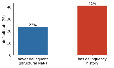
The structural gap in months_since_last_delinquency is the centrepiece of the block. Customers with the NaN - who were never delinquent - default at about 23%; customers with a real value default at about 41% (Figure 13). The fact of missingness is itself one of the strongest predictors in the dataset.
Now watch what naive mean imputation does. The observed values average about 31 months, so imputation assigns every never-delinquent customer a synthetic delinquency roughly 31 months ago. Two very different groups now carry the same feature value: the genuinely delinquent customers with values near the mean default at about 40%, the imputed never-delinquents at about 23% - and the model can no longer tell them apart. In the lab, the model-free quantification is stark: the mean-imputed column’s correlation with default is ; the missing-indicator’s is . Nearly all the signal lives in the gap, and imputation erased it. The honest first move is therefore: add a missing-indicator column, then impute the number.
The economics of missingness-as-signal.
Why should the absence of a number predict anything? Because in business data, gaps are rarely accidents of measurement - they are the traces of decisions, and decisions are made by people with information. The delinquency NaN encodes a clean credit history: here the absence of a record is the record, and it is the single most valuable fact a lender can know about repayment behaviour. The income gap has a different economics - self-reported fields are subject to a mild form of adverse selection, where what a customer chooses not to disclose correlates with what the disclosure would reveal; the same logic makes “no checking account” (Figure 6) informative, since it deprives the bank of exactly the cash-flow visibility that reassures it. Once you see gaps as traces of processes, you also see the caveats. Some missingness patterns encode the pipeline rather than the customer - applications arriving through a broker channel may lack fields the branch form collects, so the indicator quietly becomes a channel flag, predictive today and gone after the next IT release. And an indicator can proxy for things a lender must not use: if declining to state a field correlates with a protected characteristic, the “signal” walks the model into fairness territory that Block 6 treats seriously. The craft position: harvest missingness as signal deliberately - indicator first, impute second - but document what each indicator most likely means, and treat an indicator whose meaning you cannot explain as a risk, not a free lunch.
In practice
In regulated lending this is not merely a modelling nicety. Adverse-action reasons given to a declined customer must be truthful. “You were declined because of a delinquency 28 months ago” would be a false statement about a customer who was never delinquent - an invented history, manufactured by an imputation default. Imputation choices are not cosmetic; they change the story the institution tells about a person.
1.7 Feature engineering: a first look
Feature engineering is the craft of building new columns that expose structure a model would struggle to find alone - the step of CRISP-DM’s data preparation phase where domain knowledge becomes signal. The missing-indicator of the previous section is feature engineering; the wider toolbox consists of five recurring moves:
| Move | Recipe | Portfolio example |
|---|---|---|
| Ratio | divide two raw columns | instalment / income |
| Flag | boolean condition | has_delinquency_history |
| Binning | continuous bands | utilisation: low / mid / maxed-out |
| Interaction | combine two features | renter and no checking account |
| Date arithmetic | differences, tenures | months since last delinquency |
Look at the portfolio’s data dictionary again with this table in mind: debt_to_income is a ratio - someone engineered it before us.
1.7.1 Why ratios beat raw pairs - especially for linear models
The ratio row of the table is the workhorse of credit features (debt-to-income, utilisation, instalment-to-income, loan-to-value), and there is a precise reason it earns its keep. Affordability is inherently relative: a 1,500 PLN monthly instalment is a heavy burden on a 3,000 PLN income (half of it) and a light one on a 15,000 PLN income (a tenth). The risk-relevant quantity is the quotient, not either raw number. Now consider what a linear model - the family we meet in Block 2 - can express with the raw pair: a score of the form . Whatever weights you choose, the instalment’s contribution to the score is the same for both customers above; the income term shifts their scores apart, but it cannot make the effect of the instalment depend on the income - that would require a product or quotient of the two inputs, which is exactly the nonlinearity a linear form excludes. Handing the model the ratio as a column supplies that nonlinearity ready-made, in one interpretable number, and turns an unlearnable relationship into a single well-behaved slope. This is the general shape of good feature engineering: you spend domain knowledge to buy the model a coordinate system in which the true relationship becomes simple. Flexible models blunt but do not remove the argument - a deep tree ensemble can approximate a ratio threshold with a staircase of axis-aligned splits, at the price of many splits and shakier extrapolation - and in regulated lending the interpretable ratio wins on explainability grounds anyway. Two cautions for the craft: guard the denominator (a zero or near-zero income makes the ratio explode - decide the convention and document it), and keep the raw columns in view during EDA even if the model only sees the ratio, because errors are easier to spot in raw units.
Interactions, by the same logic.
The interaction move is the categorical sibling of the ratio. An additive model forced to score “renter” and “no checking account” separately must give the combination the sum of the two individual effects - it has no way to express “the combination is worse than the sum of its parts”. An explicit interaction column (the boolean AND of the two flags) grants exactly that freedom, one column at a time, guided by domain sense about which combinations plausibly matter. The worked example below shows the payoff on our portfolio.
A worked example.
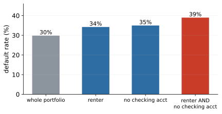
Renting alone is mildly risky (34% default against the 30% portfolio average), and having no checking account alone is similar (35%). The interaction flag - renter and no checking account - isolates a segment defaulting at 39%, on customers, comfortably enough to trust (Figure 14). Two weak signals, combined by domain sense, concentrate into a strong one. And the strongest engineered feature of the whole block is one we built in Section 1.6 without calling it that: the delinq_missing indicator, whose correlation with default () exceeds that of any raw numeric column in the data.
Encodings: making categories digestible.
Most models eat numbers, not labels, so categorical features must be encoded - and the scale of measurement picks the encoding. One-hot encoding (one 0/1 column per level) is the safe default for nominal variables like purpose or region; its cost is column explosion when a variable has many levels. Ordinal codes (none , low , …) are right exactly when the order is real, as for checking status - and wrong otherwise, because they invent distances. Target encoding (replacing a level by the average target within it) handles high-cardinality nominals elegantly and is a leakage machine when fitted on all data - it must be fitted on the training split only, one more instance of Block 3’s golden rule. Credit scoring’s own tradition is Weight of Evidence (WoE): bin a feature, then encode each bin by ; it pairs naturally with scorecards and returns in Block 2. Encoding choices look mechanical but change what a model can learn - scale first, encoding second.
Why target encoding is dangerous: a five-row disaster.
The target-encoding warning deserves its own toy example, because the failure is subtle enough to survive code review. Suppose the loan-purpose column contains a rare level - say, “boat” - with just two customers in the data, and both happened to default. Naive target encoding replaces “boat” with the level’s observed default rate: . The model now receives a feature announcing that boat purchasers default with certainty - a “fact” manufactured from two data points, i.e. from noise. Worse, if the encoding was computed on all rows before the train/test split, the test-set boat customer’s own outcome is baked into the feature value used to predict that same outcome - the model is shown the answer in disguise, and cross-validation will cheerfully report a score the model can never achieve on genuinely new data. Two standard repairs, both worth knowing by name. Smoothing shrinks each level’s rate toward the global prior in proportion to how little data the level has: with the formula and a prior strength of , the boat level’s encoding becomes - pulled firmly back toward the portfolio’s 30% base rate, as two observations deserve. Out-of-fold fitting computes each row’s encoding from data that excludes that row’s fold, so no row’s own target ever touches its own feature. Used with both repairs and fitted on the training split only, target encoding is a respectable tool for fifty-level categoricals; used naively, it is the single most common source of the too-good-to-be-true scores that Block 3 teaches you to distrust.
Two rules discipline the craft. First, every engineered feature must pass the time-travel test (Section 1.8): it may use application-time information only. Second, any transform with fitted parameters - bin edges, scaling means, encodings - must be fitted on the training data only; this is the leakage-safe pipeline of Block 3. In regulated lending a third constraint joins them: features must remain explainable, because any of them may end up in an adverse-action reason. Expect diminishing returns - five features built from domain sense routinely beat five hundred generated blindly - and document every recipe, because production must compute the feature identically or the model silently degrades.
Feature engineering runs through the whole course rather than owning one block: missing-value indicators here, encodings for regression in Block 2, leakage-safe pipelines in Block 3, and turning raw text into a feature matrix in Block 5.
1.8 A first warning about leakage
Leakage is using information at training time that will not exist at prediction time. Our dataset carries a deliberate example: collections_contact records whether the collections department contacted the customer - which happens mostly after default. A model given this column looks brilliant in the notebook and is worthless in production, because at application time the collections call has not happened yet.
The universal antidote is the time-travel test, asked of every feature, raw or engineered: would I have known this value at the moment of the decision? If the answer is no, the feature is a time traveller; drop it. Block 3 stages a live demonstration - training with and without the leaky column - and generalises the test to subtler forms of leakage (duplicates across the train/test split, transforms fitted on all data, target information smuggled through encodings).
Making the test a discipline, not a vibe.
Asked casually, the time-travel test catches only the obvious offenders; the subtle ones require it to be asked per column, in writing. The working form is a feature inventory: one row per candidate feature, recording what the value means, which system it comes from, and - the load-bearing entry - at what moment the value becomes known and frozen. Filling in that last column is where the quiet time travellers surface. A “current balance” field extracted from an operational system is current as of the extraction date, not the application date - for a two-year-old application it embeds two years of the future. A customer table that is updated in place (address, employment, income corrected over time) shows you today’s version of yesterday’s applicant. An aggregate like “average utilisation over the last 12 months”, computed once over the whole dataset, spans the outcome window for early applications. None of these columns is labelled “leak”; each is discovered only by asking, pedantically, when its value was written. Hence the discipline: no feature enters the modelling table without a stated as-of time, and any feature whose as-of time cannot be established is treated as leaky until proven otherwise - the burden of proof sits with the feature, not with the doubter. The inventory feels bureaucratic on a 18-column teaching portfolio; on a production system with hundreds of candidate columns from a dozen source systems, it is the difference between an audit and an incident.
1.9 The craft: habits that save beginner data scientists
Beyond methods, Block 1 closes with the working habits that distinguish reliable analysts. Each of these exists because of a common, expensive failure mode.
Reproducibility from day one.
Fix random seeds everywhere a coin is flipped (splits, models, samples). Pin the environment - the course repository ships a uv lockfile; “works on my machine” is not a result. Follow the one-command rule: a colleague should reproduce your numbers by running one thing top to bottom. Record data provenance - where the data came from and when, because datasets change under your feet. If it cannot be reproduced, it is an anecdote, not an analysis - and the project rubric scores it.
Why so much ceremony for a student project? Because every element answers a failure you will otherwise meet personally. Unseeded randomness means your headline number changes each run, and you cannot tell an improvement from a reroll - the seed converts “the score moved” into “my change moved the score”, which is the only comparison worth making. Unpinned environments mean a teammate installs a newer library version and gets different results from identical code; the lockfile makes the environment part of the analysis, versioned like the code. Unrecorded provenance means that when the source data is refreshed - and business data is refreshed constantly - nobody can say whether today’s disagreement with last month’s numbers is a bug or a data change. And the one-command rule is ultimately a social contract: it is the difference between “trust me” and “check me”, and in any serious setting - a regulator, a model validator, a co-author, your own team six months later - only the second is acceptable. Reproducibility is cheap when built in from the first commit and painfully expensive to retrofit; day one is the discount window.
Notebooks: superpower and trap.
Notebooks put code, plots and narrative in one place, which makes them perfect for EDA and for the course project. Their trap is hidden state: cells run out of order produce results that cannot be recreated, and deleted cells leave live variables behind. The habit that saves you: before trusting any result, Restart kernel & run all. If it breaks, it was already broken - you just did not know.
Version control - yes, for analysts too.
Commit small and often, with messages that say why. Code, notebooks, configs and figure scripts go in; raw data (use loaders), credentials and hundred-megabyte artefacts stay out. In a student project the payoff is concrete: at 23:50 before the deadline you will want yesterday’s working version back.
Reading errors and asking good questions.
Read tracebacks bottom-up - the last line is the error, the lines above are where it happened. Reproduce the bug in the smallest possible example; half the time it evaporates as you shrink it. When asking for help (a colleague, a forum, an AI assistant), state what you expected, what happened instead, and what you tried, with the minimal example attached. The discipline of writing the question well often answers it.
Communicating to humans.
Lead with the decision, not the method: “we can cut losses 12% at the same approval rate” beats “our AUC is 0.79”. State uncertainty honestly - ranges and caveats build trust, false precision destroys it. One chart, one message. And know your audience: the risk committee, the regulator and a fellow data scientist need three different stories. A model’s impact is capped by its author’s ability to explain it.
Beginner traps.
Six mistakes account for most early-career disasters, and the course meets each one deliberately: evaluating on training data (Block 2); optimising accuracy on a 97/3 problem (Block 3); reaching for complex models before a baseline, so the extra complexity can never be judged (Blocks 2 and 6); not looking at the data - Block 1’s whole point; torturing the data until it confesses (testing a hundred hypotheses and reporting the five that “worked”); and silently deleting inconvenient rows, when outliers and missing values carry signal. The course subtitle is a promise: how not to fool yourself.
1.10 Lab and hand-in
The lab notebook 01_eda_missingness walks the full arc of this chapter on the live portfolio: first contact and keys; target balance; univariate shapes, the log lens and sanity checks; bivariate default-rate plots; correlations and outliers; the missingness taxonomy with evidence for each mechanism; and the imputation experiment that reproduces the numbers of Section 1.6. Five exercises extend it, including engineering one feature from loan amount, term and income - and defending it.
“Done” for Block 1 means: you can defend, in one paragraph, how you would treat each missing column and why. The project-team hand-in is a one-paragraph data understanding note: the target, the class balance, and the top three data-quality risks you found. A useful self-check before submitting: for every claim in your paragraph, you should be able to point at the one plot or one number that backs it - the evidence-log habit of Section 1.5, applied to your own work.
2 Block 2 - Regression, re-framed: from inference to prediction
Block 1 ended with a feature matrix and a promise: this week the features meet their first models. The models themselves - linear and logistic regression - you have seen before, in econometrics, and that is precisely why this chapter exists. The mathematics will be familiar; the question asked of it will not. Econometrics fits a regression to learn about the world; this course fits the same regression to score the next applicant. Almost every habit you carry from the first tradition - staring at p-values, celebrating , trusting in-sample fit - must be re-examined under the second, and some must be unlearned. By the end of the block you will have a defensible probability-of-default baseline on a real portfolio, and, more importantly, the discipline that makes the word “defensible” mean something: held-out evaluation, honest metrics, and a threshold chosen by economics rather than habit.
2.1 Why these models, in the age of LLMs
A fair question opens the block: large language models exist - why learn logistic regression? Five reasons, each sufficient on its own. First, structured data is not language: on tabular problems like a credit portfolio, small dedicated models still match or beat LLMs, at a millionth of the cost per decision. Second, explainability is a legal requirement - a declined customer is entitled to reasons, and “the LLM said so” is not one, while coefficients and odds ratios are. Third, regulation: credit models live inside model-risk frameworks - validated, monitored, audited, reproducible - and a deterministic model with fixed coefficients can be audited in a way a prompt cannot. Fourth, insight: the point is often the drivers rather than the prediction, and a coefficient answers where a chat completion gestures. Fifth, engineering economics: millions of scoring calls a day, identical output for identical input, fractions of a cent each.
It is worth pausing on what “auditable” means concretely, because the word carries the weight of the argument. A validator receiving a logistic scorecard gets a finite list of inputs, a fixed vector of coefficients, and a deterministic formula; she can recompute any decision the bank ever made, test the model on her own held-out sample, check monotonicity (does risk really rise with delays?), and sign her name to the result. A validator receiving a prompt and an API key gets none of that: the weights are not hers to inspect, the vendor may update the model under her feet, and the same input can, depending on settings, produce different outputs on different days. Model-risk frameworks were written by people who had watched opaque models fail expensively; the frameworks do not forbid complexity, but they price it, and the price of an unauditable decision engine in retail credit is currently: not approvable.
None of this makes LLMs irrelevant here. They are excellent assistants - writing pandas code, explaining tracebacks, drafting documentation (verify what they produce; Block 1’s advice on reading errors applies doubly). They are promising feature factories, turning complaint texts into categories or embeddings that feed a classical model - Block 5’s pipeline, modern edition. What they are not, for regulated, high-volume, structured decisions, is the decision engine. The division of labour: LLMs help you build the model; the model makes the decision; you remain responsible for both.
2.2 Tools: scikit-learn and the three samples
scikit-learn is the standard Python library for classical machine learning and the workhorse of this course. Its one design idea worth the fame: every model is an estimator with the same interface. fit(X, y) learns parameters from training data; predict(X) outputs numbers or classes; classifiers add predict_proba(X) for class probabilities; preprocessing objects (scalers, encoders) are transformers with transform(X). The consequence is strategic: swapping logistic regression for a random forest is a one-line change, which is exactly why baselines cost nothing to keep. One warning attaches to predict: for classifiers it silently applies a 0.5 threshold. In credit we almost always want predict_proba and our own threshold (Section 2.9 explains why).
The uniform interface deserves one more sentence of appreciation, because it encodes a methodological stance, not just a convenience. By forcing every model behind the same three verbs, sklearn makes the model a swappable component and the protocol - split, fit, judge - the part you actually author. That inversion is the right mental model for the whole course: Blocks 2 through 6 change what sits behind fit, while the evaluation discipline around it stays fixed. A student who internalises the protocol can adopt any future model family in an afternoon; a student who memorises one model’s API has learned one model.
Data, meanwhile, plays three roles, and mixing them is how optimism sneaks into results. The training sample fits the parameters (the coefficients). The validation sample compares models and tunes hyperparameters. The test sample delivers the final judgement - and is touched once. Three questions, three datasets: what are the coefficients? which model or setting? how good is the winner, really? When data is scarce, cross-validation (Block 3) makes the validation role cheap by rotating it; today’s lab tunes nothing, so a simple train/test split suffices.
Why three samples and not two? Because any dataset that influences a choice gets optimistically biased as a judge of that choice. The training data chose the coefficients, so training error flatters the coefficients. If the same held-out data then chooses the hyperparameters - you sweep twenty settings and keep the best score - that best score flatters the winning setting, for the same reason: among twenty noisy numbers, the maximum is biased upward. Hence the third sample, reserved for the one question no earlier sample can answer honestly: how good is the final, frozen model? Each sample is spent the moment it influences a decision; budgeting them is part of the craft.
2.3 The real portfolio
From this chapter on, the modelling work runs on real data: the UCI Default of Credit Card Clients study - 30,000 credit-card clients of a Taiwanese bank, observed in 2005 (Yeh & Lien), with the target “default next month” at a base rate of 22.1%. Each client carries a credit limit, four demographic fields (sex, age, education, marriage) and six months of behaviour: monthly repayment status, bill amounts and payment amounts. The course loader (finance_data.load_taiwan()) downloads the file once and caches it in the repository, so students work offline; the shared feature matrix (taiwan_features()) mixes raw application-time columns with the engineered features of Blocks 1-2 - utilisation (bill over limit), payment ratio, delay counters. One column is planted and documented: collections_contact is injected from the outcome exactly as in the synthetic portfolio, and Block 3 detonates it on schedule. Block 1’s synthetic portfolio retires to the missingness lab, where it belongs: real data never labels its missingness mechanisms, and ours did, by design. Two side notes for completeness: the classic 1,000-row German Credit (Statlog) set remains available through load_credit(source="openml") as the historical reference, and the Kaggle Give Me Some Credit competition set - with genuinely missing income and a real months-since-delinquency column - is recommended as an optional Block 1 exercise and a project-pool dataset for teams with Kaggle accounts.
Two properties make this dataset pedagogically ideal. The 22.1% base rate is friendly imbalance: rare enough that the accuracy trap of Section 2.9 bites visibly, common enough that models still see thousands of positive examples - real loan books at 1–5% default rates are harsher, and we will discuss how. And the six months of repayment behaviour make it a behavioural scoring problem, not an application-scoring one: the strongest predictors are things the customer did (paid late, revolved a balance), not things the customer is (age, marital status). That ordering - behaviour beats demographics - is one of the most robust empirical regularities in retail credit, and you will watch it emerge from the coefficients within the hour.
2.4 From inference to prediction
Students meet regression twice in their education, with different loyalties. Econometrics asks whether is significant and what its causal story is; prediction asks how accurate is on customers never seen before. Same fitted coefficients, different success criteria. This course sits on the prediction side, while borrowing econometrics’ discipline about interpretation - and both traditions share the question “can I defend this model to a regulator?”
2.4.1 Shmueli’s argument: to explain or to predict
The cleanest statement of the divide is Shmueli’s paper To Explain or to Predict? (Statistical Science, 2010), on the block’s reading list and worth your evening. Its central, initially uncomfortable claim: the best explanatory model and the best predictive model are, in general, different models - not because one camp is sloppy, but because the two goals decompose error differently. For a new observation, the expected squared prediction error splits into three parts: Explanation cares almost exclusively about the bias term: a mis-specified model gives wrong structural conclusions, full stop. Prediction cares about the sum of the last two terms - and they trade off. Adding the theoretically correct but weakly identified variable removes a sliver of bias while adding a slab of estimation variance; dropping it biases the model and improves its predictions. A deliberately mis-specified model can therefore out-predict the true one, and with noisy features and modest samples it routinely does. This is not a paradox; it is the bias-variance trade-off wearing its formal clothes, and it licenses everything this chapter later does on purpose - shrinking coefficients toward zero (regularisation) is nothing but deliberately buying bias to sell variance.
The same argument dethrones the standard error. A standard error quantifies uncertainty about a coefficient - useful when the coefficient is the product. When the prediction is the product, the relevant uncertainty is the error of on new data, and the two are not interchangeable. With our 30,000 rows, utterly negligible effects clear the 5% significance bar easily - significance is a statement about sample size as much as about the world - while a significant coefficient can add exactly nothing to out-of-sample accuracy if its information is already carried by other features. Conversely, prediction has no objection to a coefficient whose sign makes no causal sense, so long as it helps on held-out data (we will meet exactly such a coefficient in the logistic baseline). The practical rule: p-values answer “is this effect distinguishable from zero in this sample?”; they do not answer “will this model score tomorrow’s applicants well?”. This block builds the machinery that does.
2.4.2 The golden rule and the split protocol
Prediction’s first principle is the golden rule: never judge a model on the data it was fitted on. A model that reproduces its training data has proven only that it can memorise; the product we sell is generalisation. The minimum honest protocol is the train/test split: split once (say 70/30), fit the model and every transform on the training part only, judge on the test part, and touch the test set as rarely as possible. Details that bite in practice: stratify classification splits so the default rate matches in both halves; fix the random seed for reproducibility; remember that a duplicate landing on both sides of the split is leakage (Block 1’s keys check just became modelling advice); and with time-stamped data, split by time, not at random (Block 3).
2.4.3 What the test score actually estimates
It pays to be precise about what the test number is, because the precision changes how you read it. The quantity we care about is the generalisation error: the expected loss of our frozen model on a fresh customer drawn from the same population. That is a population quantity we can never observe. The test score is its estimator: an average of losses over the particular customers who happened to land in the test set. Like every estimator, it has sampling variance - re-deal the split and the number moves. How much? For accuracy the arithmetic is back-of-envelope binomial: a score of about on test rows has standard error , so the honest reading of “80.6%” is “80.6%, give or take roughly percentage points; a 95% interval is about points”. Three consequences follow. First, differences in the third decimal place between two models on a test set this size are noise, not ranking - resist the leaderboard instinct. Second, small test sets give noisy verdicts: a 300-row test set has a standard error near points, wide enough to reverse most model comparisons; this is one reason Block 3’s cross-validation, which averages several held-out estimates, is worth its cost. Third, the estimator is unbiased only if the test set never influenced any choice - which is exactly why the peeking rule below exists, and why “we picked the model that did best on test” is a confession, not a methodology.
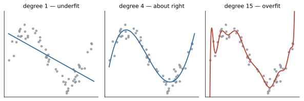
Figure 15 shows why the rule exists. The degree-15 polynomial hugs the training points more closely than the sensible degree-4 fit - and predicts worse everywhere between them. Sweep the complexity dial and the pattern generalises into Figure 16: training error falls monotonically with complexity, while test error traces a U - underfitting on the left, overfitting on the right. Model selection means finding the bottom of that U without peeking at the test set; regularisation (Section 2.7) is one steering wheel for it.
2.4.4 The U-curve worked in numbers
The U-curve deserves one pass in explicit numbers, because the picture alone lets you nod along without feeling the mechanism. Set up a toy problem: ten observations generated from a gently curved truth - say a quadratic in - plus noise with variance 1. Now fit polynomials of increasing degree and count parameters. A degree-1 fit spends 2 parameters; it cannot bend, so its training error contains both the noise and a bias term from the missed curvature. A degree-2 fit spends 3 parameters, matches the truth’s shape, and its training error settles near the noise floor of 1 - it cannot honestly go lower, because the remaining scatter is genuinely random. A degree-9 fit spends 10 parameters on 10 points, and here a small algebraic fact does the teaching: a polynomial of degree through points can interpolate them exactly. Training error: precisely zero. Zero! And precisely uninformative - the fit has spent its entire budget memorising the noise, and between the training points it swings through wild excursions to honour each memorised wiggle. On fresh data from the same truth, a representative run of this experiment reads roughly: degree 1, training error , test error (biased both sides); degree 2, training , test (near the irreducible floor); degree 9, training , test in the hundreds. The numbers vary run to run; the shape never does. Two morals to carry out of the toy. Training error is a biased estimator of generalisation error, and the bias grows with model flexibility - at the interpolation extreme the training score contains no information at all. And the bottom of the test-error U sits where the model is just flexible enough for the structure and no more; every parameter past that point is purchased with test error.
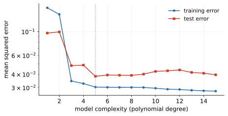
Two more self-deceptions complete the set. Extrapolation: a model is trustworthy inside the range of its training data; our portfolio’s incomes top out around 1M NT$, so for a 5M NT$ applicant the model will output a number confidently and baselessly - and Block 1’s selection bias makes this worse, since the training data contains approved customers only. Test-set peeking: check the test score, tweak, check again - after a dozen rounds you have manually fitted the test set and its verdict is contaminated. The test set answers one question, once, at the end. Peeking is worth spelling out mechanically, because nobody plans to do it. You fit model A, check the test score, feel dissatisfied, add a feature, check again, remove an outlier, check again. Each check was innocent; the sequence was not. You have run an informal search whose objective function was the test score, and the winning configuration won partly because it fit that particular test sample’s quirks - the same optimism-of-the-maximum that made a third sample necessary in the first place, reproduced by hand. The defence is procedural, not moral: decide the full recipe on train and validation data, then run the test evaluation once, and let the number be what it is.
2.5 Linear regression as a prediction machine
The model is the familiar - linear in the coefficients, not in the world: the can be logs, flags, interactions or squares, so feature engineering supplies the nonlinearity. Ordinary least squares picks the coefficients minimising ; squares make big misses hurt disproportionately, keep the objective smooth, and admit a closed-form solution - at the price of sensitivity to outliers, which turns Block 1’s boxplots into modelling advice. The classical assumptions (linearity, independent errors, equal error variance) we treat as things to check with plots, not articles of faith.
2.5.1 Least squares as projection
One geometric picture, in words, organises everything else you know about OLS. Think of the target as a single vector in an -dimensional space - one axis per customer. The feature columns (plus the intercept’s column of ones) span a small flat subspace inside it, at most dimensions: the set of all predictions any coefficient vector could produce. Least squares does one thing: it finds the point of that subspace closest to . The fitted values are the orthogonal projection of onto the feature subspace, and the residual vector is the perpendicular dropped from to the plane. Every classical OLS fact is a corollary of this picture. Residuals are exactly uncorrelated with every feature and with - perpendicularity, nothing deeper. Adding a feature enlarges the subspace, and a larger subspace can only be closer to - hence in-sample fit never worsens when you add a column, which is ’s original sin (next subsection). And multicollinearity acquires a picture too: two nearly-parallel feature columns span the subspace between them ambiguously - the projection is perfectly stable, but its decomposition into “how much along column one, how much along column two” teeters, because nearly-parallel directions offer infinitely many near-equivalent decompositions. Prediction lives on the projection; interpretation lives on the decomposition. Hold that asymmetry - it returns twice below.
2.5.2 Which assumptions still matter for prediction
The classical assumption list was written for inference, and re-reading it with prediction’s eyes is clarifying, because most of it relaxes. Normality of errors: never needed for the fit at all, only for exact small-sample inference - for prediction, irrelevant. Homoscedasticity: its violation invalidates the textbook standard errors and makes OLS inefficient, but the fitted line remains a sensible least-squares approximation; for prediction, heteroscedasticity mainly warns that your error size varies by segment - a practical fact worth knowing (your big-ticket predictions miss by more), not a disqualification. Exogeneity - no correlation between features and the error - is the load-bearing wall of causal interpretation, and prediction walks past it whistling: a feature correlated with the error term for deep endogeneity reasons still predicts. What prediction cannot relax is less advertised: the new data must come from the same population as the training data (tomorrow’s applicants must resemble yesterday’s - Block 3 calls violations “drift”), and observations should not leak information across the split. In short: prediction trades the exogeneity religion for a stability religion. Neither is optional in its own church.
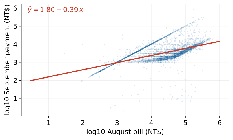
Our warm-up (Figure 17) regresses log September payment on log August bill among the 24,605 paying clients - Block 1’s lens, put to work. In a log-log specification the slope is an elasticity, and ours reads 0.39: a 1% larger bill draws only about 0.39% more payment - the revolvers absorb the rest, financing rather than repaying bill growth. Quantifying the cloud’s width introduces the three standard metrics: (share of variance explained, unitless), RMSE and MAE (in the units of the target - the language for business, with RMSE punishing large misses and MAE robust to them). Our fit reaches , and a number like that is typical of behavioural targets: real relationships, plenty of noise. The reverse deserves the alarm: on behavioural data, a suspiciously high means leakage or a target twin - investigate before celebrating.
2.5.3 Log-log and elasticities: the algebra
Why does a log-log slope read as “percent per percent”? The algebra is three lines and worth owning rather than trusting. Write the fitted relationship as . Exponentiating, with - the model is a power law in the original units. Now perturb by a small fraction: differentiate to get i.e. the relative change in is times the relative change in - percent in, percent out, at any point on the curve. That constancy is the whole appeal: in raw units the payment response to a 1,000-unit bill increase depends on where you start, while in logs a single number, the elasticity, summarises the response everywhere. For our : a bill 1% larger predicts a payment larger by the factor , i.e. about % - for small changes the derivative version and the exact version agree to the decimals shown. For large changes they do not: a bill doubling predicts payments scaling by , not by - compound the elasticity, do not add it. And note what means economically before you ever check significance: payments grow less than proportionally with bills, so utilisation drifts up as bills grow - the revolving mechanism, visible in one exponent.
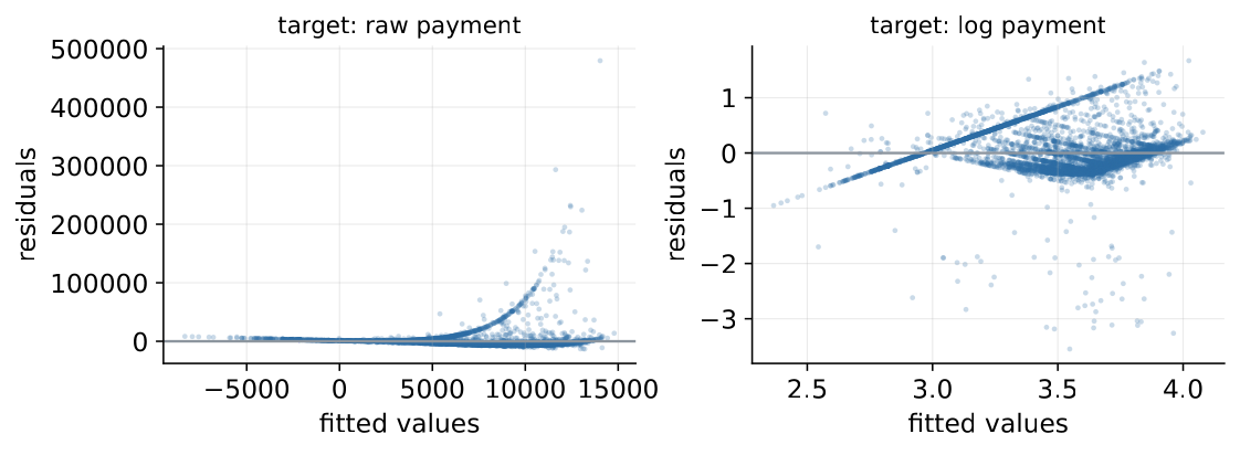
The diagnostic that tells the truth about any regression is the residual plot (Figure 18): residuals against fitted values, wanted structureless around zero. A funnel means error variance grows with the prediction (heteroscedasticity) - the raw-payment fit has exactly that, and the log target cures it. Curvature means missing nonlinearity: engineer a feature.
2.5.4 Reading residual plots like a professional
Treat the residual plot as a small vocabulary and read it every time. A structureless horizontal band: the model has extracted what it can; remaining scatter is (as far as this plot can see) honest noise. A funnel opening rightward: errors grow with the prediction - multiplicative noise, the signature of monetary variables, and the canonical cure is a log transform of the target, which turns “errors proportional to size” into “errors constant in logs”. Note what the cure means for prediction: if you model and exponentiate to report , your predictions are (roughly) medians, not means, in the original units - fine for ranking, worth a footnote when someone sums them into a portfolio total. A bow or curve: the conditional mean is not linear in your features - the model systematically overpredicts in one range and underpredicts in another; add a squared term, a log, or an interaction, guided by where the bow sits. Isolated extreme points: outliers, and under squared loss each one pulls with leverage proportional to its miss - revisit Block 1’s boxplots and decide, case by case, whether the point is an error to fix or a customer to respect. What the residual plot cannot show also matters: it is an in-sample diagnostic, so it certifies specification, not generalisation - a leaky feature produces gorgeous residuals and a useless model. The plot and the test score audit different failures; you need both.
2.5.5 and its failure modes
is the most quoted and most misread number in regression, so we give its pathologies their own paragraph. Failure mode one: in-sample monotonicity. By the projection argument, adding any column - a noise column, an astrology column - never lowers in-sample . A model with enough junk features can push in-sample wherever you like; the adjusted patches this with a parameter penalty, but the honest fix is the one this chapter keeps prescribing: compute out of sample, on the test set, where junk features hurt rather than help. Failure mode two: the sign. Out-of-sample compares your model’s squared error against predicting a constant mean - and your model can lose. Out-of-sample below zero is not a bug in the library; it is the report that your model generalises worse than a horizontal line, which overfit models regularly do. Failure mode three: no intercept. The usual variance decomposition behind requires the residuals to sum to zero, which the intercept guarantees; fit through the origin and software packages fall back on different formulas, producing values that are not comparable to anything - if you must drop the intercept, stop quoting . Failure mode four: across transforms. An on and an on measure explained variance of different targets; our 0.33 on log payments cannot be compared with a raw-payment fit’s number, and neither is “the” of the problem. Failure mode five: the silent range restriction. is relative to the target variance in the sample at hand; score the same model on a narrower subpopulation and drops with no change in the model’s error - which is also why quoted on extrapolated predictions, outside the training range, is fiction twice over. None of this makes useless; it makes it a single, context-bound summary - quote it out of sample, alongside RMSE in business units, and never alone.
Reading coefficients without embarrassment takes three habits. First, units: is the change in per one unit of - per NT$, per thousand, per SD? Standardising features (mean 0, SD 1) makes coefficients comparable as effects-per-SD. Second, remember coefficients are teammates, not soloists: adding or removing a correlated feature reshuffles the others, and Block 1’s correlation map says which ones. Third, “holding others fixed” is a statistical statement, not a causal one - the Simpson’s-paradox caution applies to coefficients too.
Categorical features enter via one-hot encoding with one level dropped as the reference: keeping all levels alongside an intercept creates perfect collinearity (the dummy variable trap). Each dummy coefficient then reads “versus the reference”, so choose the reference deliberately - it changes the story, not the fit. More generally, when two features carry near-identical information, least squares cannot decide how to split the credit between them: coefficients take absurd signs and sizes and swing between samples while predictions stay fine - prediction survives, interpretation dies. Remedies: drop one twin, combine them (a ratio), or regularise. The diagnostic keyword is the variance inflation factor (VIF).
2.5.6 Multicollinearity and the VIF, quantified
The VIF deserves the two minutes it takes to demystify. For feature , regress on all the other features and record the of that auxiliary regression - how predictable this feature is from its colleagues. Then and the sampling variance of is inflated by exactly this factor relative to the uncorrelated-features ideal. The arithmetic makes the folklore thresholds concrete: gives VIF - mild; gives VIF - the classic alarm level, at which the standard error of is times larger than it would otherwise be; , the near-duplicate case, gives VIF and coefficients that are pure noise. Notice what the formula does not contain: the target. Multicollinearity is a property of the feature matrix alone, which is why it damages the decomposition (coefficients) and not the projection (predictions) - the geometric asymmetry from the projection picture, now with a number attached. Practical protocol for credit work: compute VIFs on the final feature set; for any feature above 10, decide openly - drop a twin, build the ratio (utilisation is such a repair: bill and limit, individually collinear with everything, combined into one interpretable feature), or accept the inflated coefficient and refrain from interpreting it. What is not acceptable is interpreting a VIF-10 coefficient’s sign in front of a risk committee as if it were stable.
A last piece of linear-model vocabulary: interactions. In the plain additive model, utilisation contributes the same slope for every customer. If in reality utilisation bites harder after payment delays, the model needs a product column: after which the utilisation slope becomes - one feature moderates another (Figure 19). Without the interaction term the two groups get parallel lines (shifted intercepts, one slope); with it, the slopes may differ. Two lessons attach. First, a linear model cannot discover an interaction on its own: the product column is feature engineering - Block 1’s interaction move, graduated into a term, and one more place where domain knowledge enters the model by hand. Second, this is a genuine limitation of linear models that tree-based models do not share: trees carve the feature space region by region and pick up interactions automatically, which is one of the reasons they win on tabular data (Block 3). In logistic regression the same construction works on the log-odds scale, and the interaction coefficient exponentiates into a ratio of odds ratios - interpretable, but read it slowly.
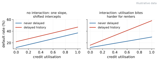
2.6 Logistic regression: the credit-scoring workhorse
Fit a straight line to a 0/1 target and it breaks visibly (Figure 20): predictions escape , producing “%” and “130%” probabilities. The repair keeps the linear machinery and squashes it through the sigmoid , which maps any score to a probability.
2.6.1 The linear probability model: broken, but not worthless
Before discarding the straight line, give it its due, because your econometrics courses did not teach it to you by accident. Fitting OLS to a 0/1 target is called the linear probability model (LPM), and its defects are structural, not cosmetic. The escaping predictions you saw are one; a second is baked into the target itself: a 0/1 outcome with success probability has conditional variance , which changes with - the LPM is heteroscedastic by construction, no residual plot needed to suspect it. A third is the constant-slope assumption: the LPM insists that one more month of delay adds the same probability increment to a pristine customer as to one already at the cliff edge, which contradicts everything the sigmoid’s shape (and common sense) says about saturation near 0 and 1. Yet the LPM survives in econometric practice for a defensible reason: its coefficients are marginal effects on the probability scale, directly, with no transformation - a convenience causal researchers prize, and with everyone’s probabilities sitting in a moderate middle range the linear and logistic fits barely differ. The division of labour, then: for estimating an average treatment effect, the LPM is a legitimate tool; for producing per-customer PDs that must live in , feed a pricing engine, and extrapolate sanely into the tails - our job - it is the wrong tool, and the sigmoid is the repair.
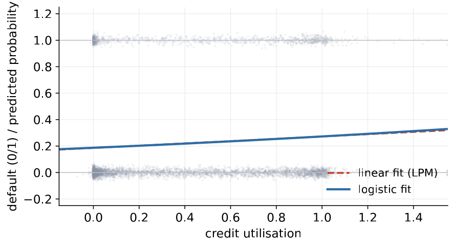
The natural scale of the model is odds. With , the model says i.e. logistic regression is linear in log-odds - that is the sense in which it is a linear model. ( is odds and log-odds ; is odds and log-odds .) Fitting replaces least squares with maximum likelihood: minimise the log-loss which punishes confident wrongness brutally ( for a customer who repays costs ; a humble costs ). There is no closed form; sklearn iterates silently, and the same loss reappears inside neural networks in Block 6.
2.6.2 Logistic regression as a GLM, and one line of calculus
For the statistically minded, the tidy frame is the generalised linear model: keep a linear predictor , choose a distribution for the target (here Bernoulli), and connect the two with a link function - here the logit, , whose inverse is the sigmoid. Linear regression is the same skeleton with a Gaussian target and the identity link; Poisson regression for counts is a third sibling. Seeing the family matters beyond taxonomy: it says the modelling choice is really two choices - what noise the target carries, and on what scale effects are additive - and logistic regression answers “Bernoulli” and “the log-odds scale”. The fitting story also collapses to one satisfying line of calculus. The sigmoid differentiates into itself: . Chain that through the log-loss of one observation and everything cancels except the prediction error times the feature - the exact same shape as the OLS gradient, with in place of . The consequences are worth collecting. At the optimum the errors are orthogonal to every feature, the projection intuition reborn on the log-odds scale; with an intercept in the model the average predicted probability exactly equals the observed default rate, a free calibration-in-the-large check; and because the log-loss is convex in , the iterative fit finds the optimum, not an optimum - part of why logistic regression is so reproducibly stable. Block 6’s neural networks will use this identical gradient, stacked deeper; the derivative you just read is the last layer of every classification network you will ever train.
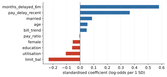
months_delayed_6m.Fitted to the real portfolio (standardised features, leakage-safe pipeline), the baseline’s coefficients read like a page of credit wisdom (Figure 21). Payment history is king: the engineered delay counter months_delayed_6m () and the most recent repayment status () tower over everything - Block 1’s feature-engineering craft vindicated on real data. And one haunting: limit_bal enters at - higher limits, lower risk - because the bank’s historical screening granted large limits to safe clients. That is Block 1’s selection bias, visible inside a coefficient. Exponentiating turns coefficients into odds multipliers: scales the odds per of . One SD more months-delayed multiplies the odds of default by ; one SD more limit multiplies them by . Effects compound multiplicatively: two moves make , not “something”.
Pause on the limit_bal coefficient once more, because it is this chapter’s cleanest specimen of the inference-prediction divide made flesh. Causally, the sign is backwards: handing a risky customer a larger limit does not make them safer - the arrow runs the other way, from the bank’s past risk assessment to the limit. An econometrician must treat this coefficient as an endogeneity problem to be instrumented away. A predictor may keep it: at scoring time the granted limit genuinely carries information about the customer (it summarises a previous underwriter’s file review), and the model is right to use it - as long as nobody reads it as advice to raise limits, and as long as everyone notices the dependency it creates: if the bank’s granting policy changes, this coefficient’s usefulness quietly expires. One coefficient, three lessons: prediction can use what causation cannot bless, every predictive model borrows against the stability of the process that generated its data, and the sign of a coefficient is a question, never an answer.
Interpretation becomes concrete at the level of a single customer. Because the model is linear in log-odds, every prediction decomposes exactly: each feature contributes (standardised units), the contributions plus the intercept sum to , and is the PD. Figure 22 shows the receipt for one test customer: recent delays push the log-odds up, a high limit pulls them down, and the pieces total , i.e. a PD of 65%. Two things follow. Practically, adverse-action reasons fall straight out of the largest positive bars - the explanation is the model. Methodologically, this exact, free decomposition is the object that SHAP (Block 3) approximates for models that are not this polite; students who understand this figure already understand what a SHAP plot is trying to be.
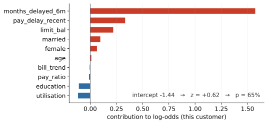
One subtlety separates competent readings from embarrassing ones: odds ratios are constant, probability effects are not. The same odds multiplier moves a 10% PD to 14.6% ( pp), a 50% PD to 60.6% ( pp), and a 90% PD to 93.3% ( pp) - the sigmoid is steep in the middle and flat in the tails, with marginal effect , maximal at . When communicating, always say which scale you are on, and report probability changes in percentage points: “risk rose 10 percent” and “risk rose 10 percentage points” are claims an order of magnitude apart, and mixing them up in a risk committee is not soon forgotten.
2.6.3 Odds ratios versus marginal effects, with the arithmetic
Let us make the two dialects fully concrete, because committee conversations switch between them mid-sentence and you must not get lost. Take the odds multiplier ( per SD of utilisation) and trace the 10% customer by hand. Odds before: . Odds after: . Probability after: - the 14.6% in the table, no magic, three lines of arithmetic you can reproduce on a napkin. The derivative shortcut answers the same question locally: at a PD near our portfolio’s 22% base rate, the marginal effect is - roughly percentage points of PD per SD of utilisation, for customers near the base rate. The same , applied at , yields - just points, because the sigmoid is flat down there. Hence the reporting rules of the trade. The odds ratio is the model’s native constant - one number, true everywhere, but in a currency (odds) most audiences only think they understand. The marginal effect is the audience’s currency - percentage points - but it is local: it depends on the customer’s starting PD, so you must state where it was evaluated (“at the base rate” being the usual convention, averaged-over-sample effects the more careful one). Reporting a single probability effect as if it applied to everyone is the most common quantitative error in model documentation; you are now inoculated.
2.6.4 The scorecard tradition: WoE, points, and why banks still care
The scorecard is not nostalgia; it is a parallel formulation of exactly the model you just fitted, engineered for governance, and its logic rewards a closer look. The classical stack has three moves. First, bin each feature into a handful of intervals (utilisation into, say, five bands) - deliberately coarse, which throws away wiggle-room and thereby regularises (the leash principle of Section 2.7, avant la lettre). Second, replace each bin with its weight of evidence: the log of the ratio between the share of good customers and the share of bad customers landing in the bin. WoE is a log-odds-shaped encoding, so a logistic regression on WoE features is linear on the same scale twice over - the construction makes the model additive in bins, each bin carrying an evidential weight with a sign anyone can audit (negative WoE bin: this range of values is bad news). Third, rescale log-odds into points: choose a base score and a points-to-double-the-odds constant (20 is customary), and the score is an affine function of the same - with points per doubling, each point multiplies the odds by . The result is a table a branch officer can apply with a pencil and a validator can check line by line: this bin, these points, summed, compared to a cut-off. Every property regulators like - monotone bins, visible contributions, no customer scored outside the table’s range - was bought by discarding flexibility a GBDT would have kept, which is the whole trade stated honestly: scorecards sit deliberately left of the U-curve’s bottom, paying a little accuracy for a lot of accountability.
In practice
A credit score is a rescaled log-odds: choose a base score and a “points to double the odds” constant, and the scorecard is linear in the same the model computes. The classical stack - logistic regression on WoE-encoded bins, formatted as a scorecard - has run production lending for decades because each feature’s contribution is a number an auditor can read line by line. Modern practice often runs GBDT for power and a scorecard for explainability, side by side.
Prediction needs one more step: a decision. The predicted-probability distributions of the two classes overlap (Figure 23) - no threshold separates them cleanly, and 0.5 is not a law of nature but a library default. Which threshold to use is a cost question, taken up in Section 2.9. Three honest notes on imbalance complete the picture: real PD portfolios (1–5% default rates) push predicted probabilities so low that a 0.5-threshold model may never predict “default” - a threshold problem, not a model problem; class_weight="balanced" re-weights the loss but distorts predicted probabilities, so recalibrate if probabilities matter (in pricing, they do); and resampling schemes are popular and overrated - try thresholds and weights first.
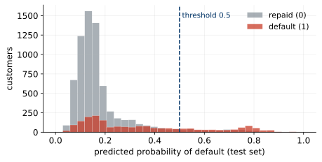
Why crown logistic regression the baseline? It is fast (milliseconds, millions of rows), stable (decent with zero tuning), explainable (coefficients odds ratios adverse-action reasons), and an honest yardstick. The baseline discipline of this course: no GBDT, no neural network, no ensemble gets built - in class or in projects - before a logistic baseline exists for it to beat. The discipline has a quiet second payoff: the baseline is a measuring instrument for your features. Because logistic regression can only use what you hand it - no automatic interactions, no carved regions - its performance is a direct read on feature quality, and the gap between it and a later GBDT is a direct read on how much nonlinearity and interaction structure your problem actually contains. A small gap says the signal was linear all along and the complex model is decoration; a large gap says go hunting for the interactions the trees found and consider engineering them into the scorecard. Either way you learn something no single model run could tell you - which is the deeper reason baselines are non-negotiable.
2.7 Regularisation
Many features, correlated features and finite data conspire to tailor coefficients to this sample’s noise - the U-curve wearing a suit. The cure is to charge for coefficient size: add a penalty to the loss, so the model must buy each unit of coefficient with genuine predictive payoff. A little bias in, a lot of variance out - usually a bargain on test error.
2.7.1 The mechanics, in one small example
To see shrinkage operate rather than just hear it described, take the smallest possible case: one standardised feature, so OLS gives some slope . Ridge with penalty replaces it with where is the feature’s (scaled) sum of squares - a pure shrinkage factor between 0 and 1. With and , every unit of OLS slope survives at 80%; crank to 400 and only 20% survives; at you have OLS back, and as the coefficient - and the model’s variance with it - goes to zero, leaving the intercept: maximal bias, zero variance. The dial between those endpoints is the U-curve’s steering wheel, now with a formula on it. The multi-feature version keeps the moral and adds a subtlety: ridge shrinks hardest in the directions where the data is thinnest - exactly the ambiguous, nearly-parallel directions that multicollinearity leaves ill-determined - and barely touches directions the data pins down well. That is why ridge is the multicollinearity remedy: it does not pick a winner between twin features, it splits the coefficient between them and stabilises both. Lasso’s absolute-value penalty changes the character of the solution rather than just its size, as the paths and the geometry below show.
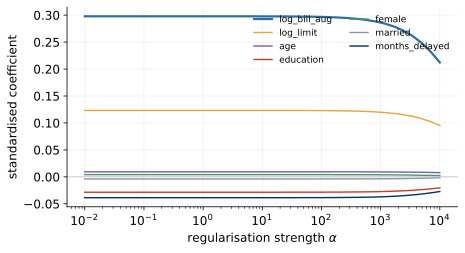
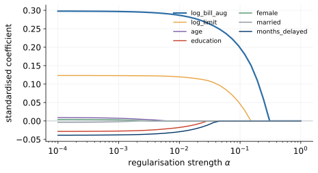
Two classic penalties, two personalities. Ridge (L2) adds : as grows every coefficient shrinks smoothly toward zero without reaching it (Figure 24), and correlated twins share the credit - the multicollinearity remedy. Lasso (L1) adds : coefficients hit exactly zero one by one (Figure 25), giving built-in feature selection - though with twins it keeps one and drops the other, a choice not to be read causally. The geometry explains the guillotine (Figure 26): the penalised solution is the first touch between the equal-loss ellipses around the OLS optimum and the coefficient-budget region; a circle can be touched anywhere, so ridge coefficients get small but stay nonzero, while a diamond gets hit at its corners - and corners have exactly. Elastic net mixes the two; when in doubt, mix.
The corner argument rewards a slow second reading, because it explains a fact that otherwise looks like luck. Picture the two-coefficient plane. Around the unpenalised optimum sit ellipses of equal training loss; around the origin sits the budget region - a disc for L2 (fixed ), a diamond for L1 (fixed ). The penalised solution is where a growing ellipse first grazes the budget. A disc’s boundary is smooth: the first touch can land anywhere on it, and landing exactly where a coordinate is zero is a measure-zero coincidence - so ridge coefficients get small but essentially never vanish. A diamond, though, has corners, and the corners sit on the axes - points where one coefficient is exactly zero - and a corner, being pointy, presents itself to the approaching ellipse from many angles at once: a whole range of ellipse orientations all hit the same corner first. Sparsity is thus not a numerical accident of L1 but a geometric attractor: the corner catches solutions. In higher dimensions the diamond’s corners and edges are entire regions with many coefficients at zero, and the catch gets stronger - which is why lasso on a wide feature matrix confidently returns a short list.
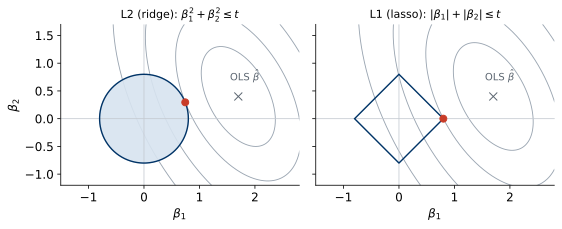
Two operational rules make penalties meaningful. Scale first: the penalty charges by coefficient size, and size depends on units - unscaled, it punishes features for their units rather than their usefulness; standardise before any penalised model, fitting the scaler on the training data only (the Block 1 golden rule again - and sklearn will not warn you). To feel why this rule is mandatory rather than tidy, run the units experiment in your head: express the credit limit in single currency units and its coefficient is numerically tiny (a huge number multiplies it); express age in years and its coefficient is numerically large. The penalty, blind to units, taxes the age coefficient heavily and the limit coefficient not at all - it has silently decided that limits matter and age does not, based on nothing but bookkeeping. Rescale the limit into thousands and the “importance” reverses. A penalised model on unscaled features is not a worse model; it is an arbitrary one. Choose on validation data: is a hyperparameter, so the data that fit the coefficients cannot also pick it. Figure 27 shows the sweep on a deliberately high-variance version of our payments-from-bills problem (80 training rows, polynomially expanded features): training error rises monotonically with while validation error traces a genuine U with an interior optimum (). Done properly - with cross-validation - next week. Read the two curves of Figure 27 as the bias-variance ledger in motion: at tiny the model is nearly unpenalised, training error is flattering and validation error pays the variance bill; at huge everything is shrunk toward zero and both curves meet in shared, biased mediocrity; the interior minimum is where the last unit of variance removed stopped being worth the bias it cost. Every hyperparameter sweep you run in this course - tree depth next week, learning rate in Block 6 - will produce this same pair of curves, and you will read them the same way.
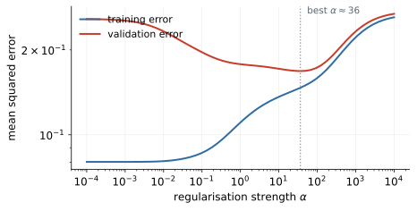
In practice
In LogisticRegression the knob is C - bigger C means weaker penalty - and regularisation is on by default (C=1). Everyone who has ever fitted sklearn’s logistic regression has been regularising, mostly without knowing. Also remember what penalties cannot do: they control coefficients, not data quality, and will happily shrink their way around leakage without curing it.
Penalties are one instance of a universal idea: put a leash on flexibility and generalisation improves. Max depth and minimum leaf size leash trees (Block 3); learning rate and the number of rounds leash GBDT (Block 3); early stopping and dropout leash neural networks (Block 6); even WoE’s coarse bins leash scorecards. Different mechanics, one U-curve - so when you meet a new model family, your first question is fixed: where is its leash? The implementation partner of all of this is the sklearn Pipeline, which welds preprocessing to the model so that whatever data the model sees, its transforms were fitted on the corresponding training part - not style advice, but the only way to stay leakage-free inside cross-validation.
2.8 Feature selection
Regularisation shrinks coefficients; feature selection removes columns outright. The two overlap (lasso is both) but selection deserves its own frame, because in credit work the pressure to shorten the feature list comes from everywhere at once: regulators want auditable inputs, engineers want cheap pipelines, and Block 4’s curse of dimensionality wants fewer voters. The standard taxonomy has three families.
Filter methods score each feature against the target before any model is fitted: correlations (point-biserial for a binary target), mutual information, and credit scoring’s own Information Value computed from WoE bins, with the folklore bands (IV 0.02 useless, 0.1-0.3 medium, 0.5 suspicious - the last band being a leakage smell, not a triumph). The IV construction is worth one sentence beyond the folklore: it sums, over a feature’s bins, the difference between the good and bad distribution shares weighted by the bin’s WoE - so a feature scores high exactly when its bins separate the two populations, and the “ is suspicious” band encodes hard-won experience that honest application-time features rarely separate good from bad that well; the ones that do usually contain a whiff of the outcome. Filters are fast and blind: they see each feature alone, so they keep redundant twins and miss features that only work in combination (Block 2’s interaction lesson in reverse).
Wrapper methods search over feature subsets using the model itself as the judge - forward selection adds the best next feature, backward elimination drops the least missed one, recursive feature elimination (RFE) automates the loop. Wrappers see combinations but cost many model fits and, run carelessly, overfit the validation data - the multiple-testing warning of Block 5 applies to feature search too.
Embedded methods let the model choose while training: lasso zeroes coefficients (Block 2), and tree ensembles supply importance rankings (Block 3) that can gate a shortlist. Embedded selection inherits the model’s biases - impurity importance’s fondness for high-cardinality features among them.
Two rules keep any of the three honest. First, selection is a fitted transform: it must happen inside the pipeline, on training data only - selecting features on the full dataset and then cross-validating is one of the classic leakage recipes (features were chosen while peeking at every fold’s test rows). Second, report stability: rerun the selection across folds or bootstrap samples and publish how often each feature survives; a feature that appears in half the reruns is a coin-flip, not a finding. On our ten-feature Taiwan matrix selection is cosmetic; on a 300-variable bureau feed it is a week of the project and the difference between a model validation passes and one it does not.
2.9 Evaluating classifiers, part 1
Our PD baseline scores 80.6% accuracy on the held-out test set of 9,000 real clients. A model that always predicts “repaid” scores 77.9%. Three points better than doing nothing - is the model useless? No: it ranks customers well, but accuracy at an arbitrary threshold cannot see that. Diagnosis requires opening the box of “right and wrong”:
| Predicted | |||
| default | repaid | ||
| Actual | default | TP (caught) | FN (missed) |
| repaid | FP (falsely declined) | TN (rightly approved) | |
Four numbers, four different business events. At threshold 0.5 our baseline is cautious: it raises few false alarms (294) and misses 1,450 of 1,991 defaulters. Whether that is good depends on prices: a false negative costs roughly the principal; a false positive costs the margin plus possibly the customer - amounts an order of magnitude apart, with the ratio belonging to the business, not the data scientist.
2.9.1 The accuracy trap, with the arithmetic laid bare
The trap’s mechanism is arithmetic, so run the arithmetic. Accuracy is correct predictions over all predictions - and under imbalance the majority class supplies almost all of both. Our 77.9% do-nothing score is just the complement of the 22.1% base rate: predict “repaid” for everyone and you are automatically right for every one of the repaying majority. Push the imbalance to a realistic loan book at a 2% default rate and the do-nothing model scores 98% - a number that would earn applause at a board meeting while describing a model that has literally never flagged a single risk. The general lesson: accuracy’s baseline is not 50%, it is the majority share, so an accuracy figure is uninterpretable until placed next to the base rate - and the gap between them, not the level, is the model’s contribution. There is a second, subtler jaw to the trap: accuracy weighs both error types equally, at one point each, while our two errors differ in cost by an order of magnitude. A metric that prices a missed defaulter equal to an unnecessarily declined customer is optimising a bank that does not exist. Both jaws close at once on threshold-0.5 classifiers under imbalance, which is why “what is the model’s accuracy?” is, for PD work, a question that mostly reveals who has not yet taken this course.
2.9.2 Confusion-matrix economics: pricing the cells
The confusion matrix stops being a table and starts being a business report the moment you attach prices, so let us do it once with illustrative round numbers - say a missed defaulter (FN) costs 10,000 in lost principal and a falsely declined good customer (FP) costs 1,000 in lost margin, a deliberately crude 10:1 ratio of the right order. Price our matrix at threshold 0.5: M of error cost. Now price two do-nothing strategies. Approve everyone: M. Decline everyone: M. Sit with that last line for a moment: under these prices, our trained, tested, 80.6%-accurate model is losing to a rule that declines every customer. The model is not broken - its ranking is genuinely informative - but its threshold is priced for a fantasy bank where both errors cost the same. The repair is a one-line result worth memorising: comparing the expected cost of approving () against declining () says decline exactly when not - with a 10:1 cost ratio the rational bank declines anyone with more than about a 9% predicted PD. The lab’s threshold game makes you feel this: as you slide the cut-off down from 0.5, recall climbs, false alarms multiply, and total cost falls, bottoms out, and rises again - a U-curve once more, this time denominated in money. Three caveats keep the exercise honest: the prices here are illustrative and the real ones (loss given default, margin, customer lifetime value) belong to the business; the formula assumes per-customer costs, while real exposures differ per customer, pushing you toward expected-loss scoring rather than flat thresholds; and the whole computation trusts the predicted probabilities, which is precisely why calibration gets its own treatment in Block 3.
The metrics that respect the asymmetry are precision ( - when we flag, how often are we right? here , real skill against a 22% base rate) and recall ( - how many defaulters do we catch? here : nearly three in four walk through). F1, their harmonic mean, buys convenience at the price of ignoring true negatives and costs - use knowingly or not at all. The pair trades off along the threshold (Figure 28): lower the cut-off and recall rises while precision falls. The threshold is a business decision expressed in code.
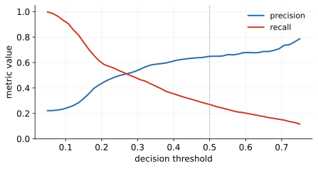
Notice the division of labour the pair encodes, because each answers a different stakeholder. Precision speaks to the cost of acting: of the customers we decline (or route to manual review), how many deserved it? - the number the customer-experience side and the false-alarm budget care about. Recall speaks to the cost of missing: of the losses coming toward us, what share did we intercept? - the number the risk appetite statement cares about. Reporting one without the other is how models get gamed: a model can reach precision near 100% by flagging only its three most obvious defaulters (recall collapses), or recall of 100% by flagging everyone (precision collapses to the base rate). Any single-number summary of the pair, F1 included, has silently chosen an exchange rate between the two - and F1’s choice (equal weight, harmonic mean, true negatives invisible) corresponds to no bank’s economics. When you must compress, compress with the cost arithmetic above, where the exchange rate is at least stated in money.
2.9.3 The bridge to Block 3: from thresholds to ranking
Every number in this section shares one confession: it depends on the threshold, and we have just seen the threshold is a business variable, not a model property. So how do you evaluate the model itself, before and apart from any threshold choice? Ask a question no cut-off can distort: take a random defaulter and a random good customer - how often does the model assign the defaulter the higher PD? That probability is threshold-free, insensitive to the base rate, and measures exactly the quality that made our 80.6%-accuracy model worth defending: ranking. It is called AUC, it is the headline metric of PD model validation, and Block 3 builds it properly from the ROC curve - where our baseline will post an AUC of 0.731, a number to remember, because every fancier model in the rest of the course will be asked one question first: did you beat it?
Which metric for PD, then? Accuracy: no. Precision and recall: honest but threshold-bound - they judge one cut-off, not the model. What we actually want, in order: does the model rank risk well (ROC/AUC)? are the probabilities honest (calibration)? what does the best threshold earn (expected cost)? All three arrive in Block 3. Until then, one rule survives every situation: never a single metric, never on training data.
2.10 Lab and hand-in
The lab notebook 02_regression_baselines walks the block’s arc on the live portfolio: a stratified, seeded split; the linear warm-up with its residual check; the logistic PD baseline inside a pipeline; coefficients and odds ratios (with the Block 1 indicator on top); the accuracy trap on the student’s own numbers; confusion matrices at two thresholds; and an optional sweep of C to watch the leash work. Exercises add one-hot purpose, a recall-targeted threshold, a refit without the indicator (watch correlated teammates absorb its role), and the clean in-pipeline imputation. “Done” means being able to defend the baseline: features used, one number you trust, and why. The project checkpoint: teams close at Block 3, the data-understanding note is due before it, and the rubric’s “ model families, justified” expects one of them to be exactly this kind of baseline.
A closing word on what “one number you trust” means, because it is the block’s whole argument in miniature. It is not the highest number your notebook produced; it is a number whose provenance you can narrate under questioning: computed on held-out data the model never touched, with every transform fitted inside the pipeline, at a threshold you chose for a stated reason, read alongside the base rate it must beat, and carried with its sampling uncertainty rather than its third decimal. A student who can tell that story about one honest number has understood Block 2; next week we make the story stronger - cross-validation to steady the estimate, AUC to free it from the threshold, and one engineered trap to test whether the discipline holds when the leak is hiding inside a plausible-looking feature.
3 Block 3 - Trees, ensembles & honest evaluation
Block 2 left a challenge on the table: a logistic baseline with test AUC 0.731 on 30,000 real clients, and a rule that complexity must earn its keep. Block 3 supplies the challengers - trees and their ensembles - and, more importantly, upgrades the judging: cross-validation, ROC/AUC, calibration, and a threshold with a price tag. It also detonates, deliberately, the leakage trap armed in Block 1.
The block has a deliberate arc, and it helps to see it whole before diving in. First come the models that bend: a single decision tree, an interlude on support vector machines (the third classical route to nonlinearity), and then the ensembles - random forests and gradient boosting - that turned trees into the workhorses of tabular machine learning. Then, precisely because the models get stronger, the judging must get stronger too: a single train/test split will no longer carry the weight of the decisions we want to make, so cross-validation, ranking metrics, calibration and expected cost arrive as a matched set. And finally, the block’s darkest lesson: a model can pass every one of those upgraded checks and still be worthless, because the checks share a blind spot called leakage. Keep that arc in mind - each section exists because the previous one created a need it could not satisfy.
3.1 Models made of rules: decision trees
Where logistic regression draws one straight boundary, a decision tree asks nested yes/no questions: if utilisation exceeds 0.62, and there is no checking account, risk is high; otherwise… Each question splits the data; each leaf holds a prediction (the leaf’s default rate). Two properties follow immediately. Trees read like a credit policy, which is why business audiences trust them instantly. And because the second question applies only inside the first question’s branch, trees model interactions natively - Block 2’s hand-built product columns, for free. Geometrically (Figure 29), logistic regression cuts the feature space once; a tree tiles it with axis-aligned rectangles.
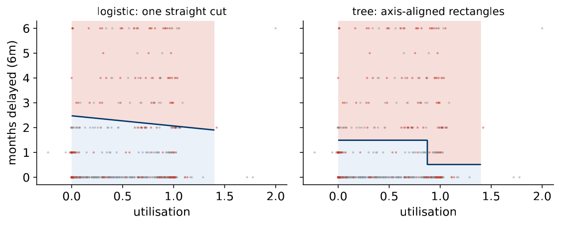
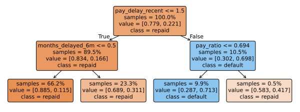
Figure 30 shows a small tree fitted to the portfolio. Prediction means walking one path from root to leaf, and reading the path aloud is an explanation for free. Note the root: the tree opens on pay_delay_recent at the two-months-behind cliff - agreeing with the logistic coefficients that payment history is where the signal lives. Two very different algorithms, the same verdict. When two model families that share no assumptions point at the same feature, you have learned something about the data, not just about a model - and that kind of agreement is worth more than a tenth of a point of AUC.
3.1.1 Recursive partitioning as greedy optimisation
It pays to be precise about what the tree-growing algorithm actually optimises, because the answer explains both its speed and its blind spots. The object we would like to find is the best tree overall: the partition of the feature space into rectangles that minimises some loss on the training data, subject to a size limit. That problem is computationally hopeless - the number of distinct trees explodes combinatorially with depth and the number of features, and finding the optimal tree is NP-hard even in stylised versions. So CART and its descendants settle for a greedy strategy: at every node, choose the single split that looks best right now, commit to it, and recurse into the children without ever reconsidering. No lookahead, no backtracking. One pass over features and cut-points per node, and the whole tree is grown in seconds even on our 21,000 training rows.
Greed is a trade, and the price is that the algorithm can miss structure that only pays off two moves ahead. The classic worked example is an XOR-style interaction. Imagine two binary flags, and , and a toy world where a customer defaults exactly when one of the flags is up but not both. Check the marginals: splitting on alone gives two children that are each still 50/50 - zero impurity gain. Splitting on alone: identical, zero gain. To the greedy criterion both features look useless, even though together they determine the outcome perfectly - because the value of asking about only materialises after you have asked about , and vice versa. If the tree does split on one of them anyway (a noisy tie-break, a slight imbalance in the sample), the other feature becomes perfectly informative inside each branch and the tree finishes the job; if not, the interaction is simply never found. Pure XOR is rare in credit data, but softened versions - features that matter only inside a segment - are everywhere, and greedy growth finds them only when the path to them happens to open. This is one honest reason why ensembles of many differently-grown trees, which explore many different first moves, see things a single greedy tree does not.
3.1.2 Impurity: Gini, entropy, and a worked split
Splits are chosen greedily; the criterion that scores them is impurity. At every node the algorithm tries every feature and every cut-point and keeps the split that makes the children purest, measured by Gini impurity , where are the class shares in the node: a pure leaf scores 0, a 50/50 node scores 0.5. A worked example fixes it. A parent node of 1,000 customers at 30% default has Gini ; splitting on utilisation into 600 customers at 10% (Gini 0.18) and 400 at 60% (Gini 0.48) gives weighted impurity , an improvement of . Now score a weaker candidate against it, because the comparison is the point: splitting the same parent on age into two children of 500, at 25% and 35% default, gives Ginis and , weighted impurity , an improvement of only . The utilisation split separates risk; the age split shuffles it. The algorithm computes that improvement for every candidate split, takes the maximum - utilisation wins by a mile - and growth recurses until a stopping rule intervenes.
Entropy, , is the same idea with logarithms, and the two rarely rank splits differently. You can verify that on the same example: the parent’s entropy is ; the utilisation children score about and , weighted , for a gain of - the same clear winner, on a different scale. The deeper reason the rankings agree is that both measures are concave functions of the class share, both peak at 50/50, both hit zero at purity, and their curvatures differ only mildly in between; a split has to be finely balanced on the boundary of two candidates before the choice of measure flips the decision. In practice you leave the criterion at its default and spend your attention where it matters: on the leash.
3.1.3 Growing, stopping, and the classical leash
That stopping rule is the tree’s leash - max_depth, min_samples_leaf, pruning - and Figure 31 shows the familiar U-curve: unleashed, training AUC approaches 1 while test AUC falls; on this portfolio the optimum sits around depth 6 - thirty thousand rows feed a deeper tree than four thousand ever could. The mechanics of memorisation are worth spelling out once: an unleashed tree keeps splitting until leaves hold a handful of customers each, and a leaf of three customers “predicts” whatever those three happened to do - noise, dressed as a rule. Depth limits and minimum leaf sizes prevent the noise-leaves from forming in the first place.
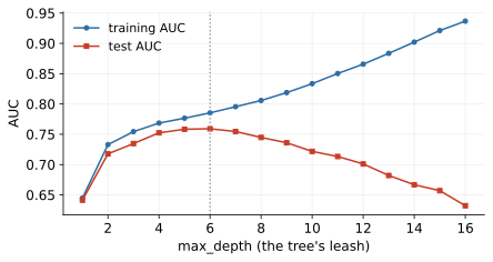
max_depth is the leash.The classical alternative to stopping early is cost-complexity pruning: grow the tree deliberately too large, then cut it back. The pruning criterion should look familiar from Block 2 - it is loss plus leash again: minimise (training error) (number of leaves), where prices every leaf the tree wants to keep. At the full tree survives; as grows, subtrees whose error reduction does not justify their leaf count are collapsed back into single leaves, and the tree shrinks along a nested sequence of candidates; itself is chosen by cross-validation. Pre-stopping (max_depth) is cheaper and is what most practitioners tune; pruning is the more principled classical answer because it lets a locally-unpromising split survive when its descendants earn the keep - a partial antidote to greed. Either way, the leash logic is identical to the of ridge and lasso: a complexity price, tuned on data the model has not seen.
3.1.4 Why one tree is not enough
A single tree has three pathologies worth naming. High variance: nudge the training data and the first split flips, and everything below it changes - one tree is a nervous model. This instability is structural, not incidental. The greedy chain means every split is conditioned on all the splits above it, so a small perturbation at the root - a few resampled rows moving a cut-point, two nearly-tied candidate features swapping ranks - does not produce a slightly different tree; it produces a different tree, with different rules, different leaves, and visibly different predictions for individual customers. If you bootstrap the training set ten times and grow ten trees, you will often get ten different root features and ten stories a risk committee would struggle to reconcile. Hold that thought: an estimator whose errors swing wildly around the truth is exactly the kind of estimator that averaging can rescue, and that single observation is the seed of everything in the ensembles section. Steps, not slopes: within a leaf the prediction is constant, so risk that plainly grows with utilisation becomes a staircase. Extrapolation, worse edition: beyond the training range a tree predicts the edge leaf’s value, flat forever. Regression trees share all of this with a numeric target - leaves predict means, splits minimise variance - and matter today chiefly because gradient boosting fits regression trees to errors even for classification.
What trees don’t need is almost as instructive. No scaling (splits compare against cut-points; units are irrelevant); no monotone transforms (the log-income lens changes nothing - splits are order-based); no one-hot gymnastics for ordinal codes (a tree can cut an ordered code anywhere, and the dummy trap is a linear-model disease). Missing values: plain sklearn trees still require imputation, but HistGradientBoosting handles NaN natively, learning which side a missing value should travel - Block 1’s structural NaN can stay a NaN. Less preprocessing does not mean less thinking: the time-travel test and the missingness taxonomy apply in full. The invariance to monotone transforms deserves one more sentence, because it is a genuinely deep property: a split at income and a split at partition the customers identically, so the entire tree - structure, predictions, everything - is unchanged by any order-preserving relabelling of a feature. All the anguish Block 2 spent on skew, outliers and feature scaling simply does not arise; what remains, undiminished, is the anguish about which features are legitimate.
3.2 Interlude: support vector machines
Before the ensembles, a brief visit to the third classical route to nonlinearity - and a beautiful piece of geometry. Among all lines that separate two classes, the support vector machine picks the one with the widest margin: whose margin width is ; the soft-margin version adds to tolerate violations, with as the leash. The striking property (Figure 32): the boundary is held up only by the support vectors, the circled border cases - every other customer could vanish without moving the line. A wide street is built-in caution about new customers near the boundary.
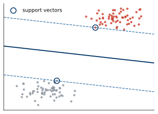
3.2.1 The margin is a leash
Look again at the objective and you will recognise an old friend wearing a new costume. Minimising is exactly the ridge penalty from Block 2; the SVM has merely moved the data-fitting part into the constraints. A small means the decision function changes slowly across the feature space - a flat, cautious function - and, since the margin width is , a small norm is a wide margin. Margin maximisation is regularisation, stated geometrically. This is why the soft-margin trade-off behaves exactly like every leash in this course: large punishes margin violations harshly, the street narrows to accommodate every borderline training customer, and the model memorises; small keeps the street wide, tolerates some misclassified training points, and generalises. The statistical-learning-theory result that made SVMs famous says the same thing formally: generalisation bounds for large-margin classifiers depend on the margin achieved, not on the dimension of the space - a license to work in absurdly high-dimensional feature spaces, which the next idea promptly exploits.
3.2.2 The kernel trick and its economics
Nonlinearity arrives via the kernel trick: map points into a higher-dimensional space where a line suffices, computed implicitly through a kernel without ever building . The economics of that sentence deserve unpacking, because they are the whole trick. Suppose you wanted the degree-2 polynomial expansion of features explicitly: all squares and pairwise products, roughly columns; at degree 5 the count runs into the tens of millions, and the RBF kernel’s implicit feature space is infinite-dimensional - you could not build it if you wanted to. Yet the kernel evaluates the dot product in that space with a formula that touches only the original coordinates: for RBF, one squared distance and one exponential. Because the SVM’s optimisation and its final decision function can both be written entirely in terms of dot products between data points, replacing every dot product with trains a linear model in the giant space at the price of the small one. The trick’s economics cut both ways, though: the cost now scales with the number of rows rather than the number of features - the kernel matrix is - which is precisely the wall the method hits on large datasets. The workhorse RBF kernel, , encodes similarity decaying with distance - and is one more leash: large makes similarity hyper-local (every training point its own island, memorisation), small blurs everyone together (back towards a linear model). Figure 33 shows the effect on the course’s crescents: the linear kernel is still a line; the RBF machine bends.
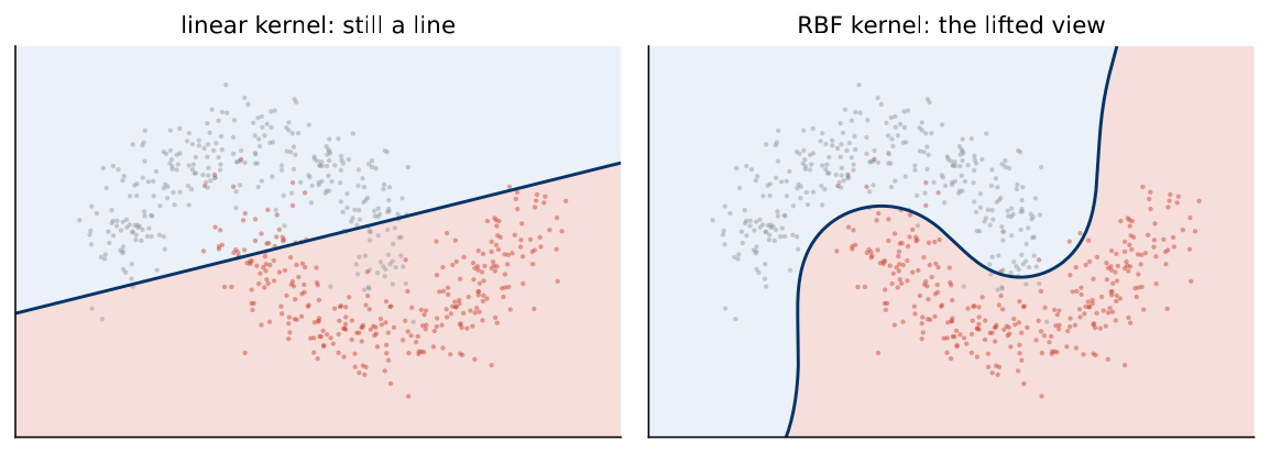
3.2.3 Hinge versus logistic loss
In loss-function terms the SVM minimises the hinge loss , which is zero once a point is right with margin - against Block 2’s logistic loss, which never fully forgives (Figure 34); both are convex stand-ins for the 0/1 loss we actually care about, and the whole model is once again loss plus leash, minimised. The difference in forgiveness has consequences. Because the hinge is exactly zero for confidently-correct points, they drop out of the optimisation entirely - that is why only the support vectors hold up the boundary, restated in loss language. The logistic loss, by contrast, keeps a small gradient alive for every customer, no matter how safely classified; every point pulls on the coefficients a little, forever. One practical corollary matters for credit: the logistic loss’s gentle slope is what makes its outputs interpretable as probabilities, while the hinge’s hard zero produces a margin score with no probability semantics at all - the geometric elegance costs you the PD.
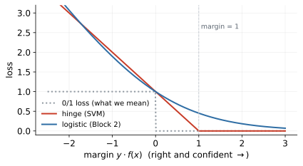
In practice: scale first (distances again); no native probabilities (calibrate before pricing - the SVM outputs margins, not PDs); and training scales poorly past rows, one reason GBDT took the tabular crown SVMs wore in the 2000s. On our PD task - trained on a 6,000-row subsample precisely because of that cost - the RBF SVM scores test AUC 0.715, behind even the logistic baseline: kernels buy bend, but not as cheaply as trees buy the delay cliff. The fuller verdict on why SVMs faded on tabular data lists four counts: the cost; no native probabilities; no native handling of missing values or categoricals, both endemic in business data; and two sensitive leashes (, ) that must be grid-searched where GBDT’s defaults already land close. But note what survived the fashion cycle, because it is most of the intellectual content: margins as a lens for understanding generalisation (the standard explanation for why boosting resists overfitting is a margin argument), kernels as the general recipe for making linear methods nonlinear (kernel ridge, kernel PCA, Gaussian processes), and the discipline of writing every model as loss plus leash. Methods fade; ideas migrate.
3.3 Ensembles: manufacturing disagreement
One tree is nervous; a crowd of differently-wrong trees is calm. Averaging many over-flexible models cancels part of their individual errors: variance drops, bias stays. The catch is that trees grown on the same data make the same mistakes - averaging clones buys nothing - so ensembling is really the art of manufacturing disagreement between good models and averaging it away. Two recipes dominate: give each tree different data (bagging), or give each tree a different job (boosting). Everything in this section is one of those two moves, plus engineering.
3.3.1 Bagging: the bootstrap variance-reduction argument
Bagging gives each tree different data: bootstrap-sample rows with replacement (each tree sees 63% of unique rows), grow deep, average the probabilities. The 63% is not folklore: the chance one particular row escapes all draws is , so about 63.2% of distinct rows make it into each bootstrap sample and about 37% sit out. Each tree’s unseen 37% (the out-of-bag rows) supplies validation-like feedback without a split: score every row using only the trees that did not train on it, and you get an honest generalisation estimate as a by-product of training - free validation, no held-out data spent.
Why does averaging help, and by how much? The statistics of averages tell the whole story, and it is worth telling in words. Average estimators that each have the same error variance. If their errors were independent, the variance of the average would shrink like - the classic “average of noisy measurements” effect, and with hundreds of trees the nervousness would essentially vanish. But bootstrap trees are not independent: they are grown on overlapping samples of the same portfolio, so their errors are correlated, and the variance of the average splits into two parts - a part proportional to the between-tree correlation, which averaging cannot touch, and a part that decays like , which averaging kills. Add trees and the second term dies; what remains is a variance floor set entirely by how correlated the trees are. Read that formula-in-words twice, because it is the design brief for the random forest: once you have enough trees, the only remaining lever is decorrelation. Averaging more clones buys nothing; making the crowd disagree buys everything.
3.3.2 Random forests: the feature lottery
A random forest adds a feature lottery: at every node only a random subset of features (max_features) may compete. Without it, one dominant feature opens every bootstrap tree identically and the trees stay correlated; the lottery forces variety, decorrelates the crowd, and makes the averaging work. On our portfolio the dominant feature is obvious - the repayment-status cliff - and without the lottery nearly every bootstrap tree would open on it, agree about the top of the tree, and disagree only in the noisy lower branches: exactly the high-correlation regime where averaging stalls at its floor. Forcing some root splits to choose among other features (utilisation, limits, history) produces trees that carve the space along genuinely different first cuts, and their pooled vote is calmer than any of them. The standard default, max_features , is a sensible compromise: aggressive enough to decorrelate, gentle enough that most nodes still see some strong candidate. Note the paradox worth savouring: the lottery makes every individual tree worse - it is sometimes forbidden from using the best feature - and the ensemble better. Deliberately handicapping the members to improve the committee is the deepest idea in this section.
As Figure 35 shows, test AUC climbs and then plateaus in the number of trees - more trees never overfit, they only cost compute, so n_estimators is not really a tuning knob; the tree-level leashes are. The plateau is the variance floor made visible: by a few hundred trees the term is gone and the correlation term is all that is left. This is also why the forest is famously hard to ruin - its members are deep, low-bias trees, its averaging handles their variance, and the only real leashes (min_samples_leaf, max_features) have forgiving defaults.
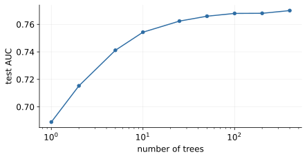
3.3.3 Boosting: stagewise additive modelling
Boosting gives each tree a different job: build sequentially, each new (small, shallow) regression tree fitting the gradient of the loss - the errors of the ensemble so far - with predictions accumulating as under a learning rate . The scheme has a classical name, stagewise additive modelling: the final model is a sum of many small terms, fitted one at a time, each term frozen the moment it is added. No term is ever revisited - like the greedy tree, boosting commits and moves on - and the model’s capacity grows term by term, which is exactly why the number of rounds is part of the leash.
One honest paragraph on why it is called gradient boosting, because the name is precise, not decorative. Think of the model’s predictions on the training set as the unknowns - one number per customer - and the training loss as a function of those numbers. Gradient descent would improve the loss by nudging each prediction against its gradient: for log-loss, the gradient for one customer is (predicted probability minus actual outcome), i.e. the residual. But we cannot ship a lookup table of per-customer nudges - we need the update to be a function that generalises to new customers. So each round fits a small regression tree to the residuals: the tree is the best function-shaped approximation of the gradient step that the tree family can express, and adding times that tree to the ensemble is one step of gradient descent in the space of functions. Rounds are iterations; the learning rate is the step size; early stopping is the convergence criterion. This is also why the regression trees of the tree section matter even for classification - residuals are numeric, whatever the target was.
Two design choices follow from the mechanics. Shallow trees: a tree of depth can express interactions of order at most , so capping depth at 2–4 makes each round a humble, low-order correction and lets the sum build complexity gradually; a deep tree per round would take huge, overfitting-prone steps. The learning rate versus rounds trade-off: shrinking makes each step smaller, so more rounds are needed to reach the same training fit - but the slow path is smoother and reliably generalises better, which is why the classic recipe is a small learning rate, many rounds, and early stopping on a validation slice to say when to get off. Where bagging attacks variance, boosting attacks bias, and can therefore overfit; its leash (learning rate rounds, tree size, early stopping) matters more. The industrial implementations - XGBoost, LightGBM, CatBoost - are refinements of exactly this idea: histogram-binned split search for speed, built-in regularisation terms, native missing-value and categorical handling, but the same stagewise gradient skeleton underneath.
3.3.4 Random forest or gradient boosting?
Practical guidance, since you will face the choice in the project and beyond. The forest is the robust first ensemble: parallel, nearly tuning-free, hard to ruin, and a strong benchmark within minutes - if your carefully tuned GBDT cannot beat a default forest, your tuning is not working. GBDT is the usual state of the art on tabular data, but it earns that title only with its leash held properly: early stopping on a validation slice, a modest learning rate, shallow trees - it is easy to ruin, and half its bad reputation in careless hands is self-inflicted overfitting. The forest’s deep trees attack variance by averaging; boosting’s shallow trees attack bias by accumulating - so the forest is the safer default when data is small or noisy, and boosting pulls ahead when there is enough signal and enough rows to support its appetite. On our portfolio the two finish in a statistical dead heat (0.774 versus 0.773 on the test set), which is itself a lesson: the gap between well-run ensembles is usually smaller than the gap between either and a model run carelessly.
In practice
Leashes are sized to the data. On this 21,000-row training set, sklearn’s default GBDT already scores 0.774 - the defaults are tuned for data of roughly this size. The same defaults on Block 1’s 2,800-row synthetic world scored 0.651 against 0.714 tuned: small data needs short leashes. Check in both directions; never assume.
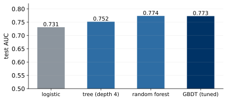
The tournament (Figure 36) delivers the block’s headline: every rung of the ladder pays. Logistic 0.731, a single depth-4 tree 0.752, random forest 0.774, tuned GBDT 0.773 - about four AUC points from baseline to ensemble, on real behavioural data full of exactly what linear models must be hand-fed: the repayment-status cliff (one missed month is news, the second is a siren), saturating utilisation, delay-by-limit interactions. The contrast with Block 1’s synthetic world - additive in log-odds by construction, where the baseline held and complexity politely declined - is the meta-lesson in stereo: which family wins is an empirical question, decided per dataset, against a baseline, on honest numbers, never by fashion. On tuning: start from defaults and move one leash at a time; random search beats grid search at equal budget; tune on cross-validation and confirm on test; and stop early - feature work usually pays more than the fourth hour of tuning.
3.4 Evaluation you can trust
The tournament just ranked four models on one held-out test set, and the honest question is: how much should you trust that ranking? To answer it you need to know what a single split actually measures.
3.4.1 What one split estimates - and its variance
When you compute test AUC on one train/test split, you are estimating a population quantity - roughly, “how well would this model rank future customers drawn from the same portfolio?” - using one finite sample of test rows and one particular assignment of rows to sides. Both choices inject randomness. A different lottery of rows into the test set would contain different hard cases and different flukes, and the number would move; a different training draw would fit a slightly different model, and the number would move again. The single split’s score is therefore a draw from a distribution - a random variable pretending to be a number - and its spread shrinks with the test set’s size. Our test set of 9,000 customers keeps the noise modest, but differences of a few tenths of a point of AUC can still be sampling luck rather than model quality, and most real projects have far fewer rows to spend. Two conclusions follow. First, never let a single-split difference smaller than the noise decide anything. Second, to see the noise, you need more than one number - you need a distribution of scores. That is what cross-validation manufactures.
3.4.2 -fold cross-validation, slowly
What cross-validation is deserves a slower paragraph than it usually gets, because it is the single most-used evaluation device in applied machine learning. The problem it solves: any single test split is one draw from the space of possible splits, so the score it produces is a random variable pretending to be a number - and differences of a point of AUC between models can be pure sampling luck. The device: split the training data into equal folds (five or ten in practice); train on of them and score the held-out fold; rotate until every fold has served as the judge exactly once. Three properties make this efficient and honest at the same time. Every row is scored by a model that never saw it, so no score is contaminated by memorisation. Every row is used for training in of the rounds, so no data is wasted - the crucial advantage over carving out a single fixed validation set. And the output is scores rather than one, i.e. a mean and a spread, which is what turns model comparison from impression into measurement. The price is model fits, and a subtlety worth knowing: the scores are not independent (their training sets overlap heavily), so the naive standard error is optimistic - treat the spread as a readable yardstick, not a formal confidence interval. Variants tune the trade-offs: stratified -fold preserves class rates per fold (our default); repeated CV re-runs the whole procedure with new shuffles when a decision is close; leave-one-out is the extreme (nearly unbiased, expensive, high-variance); and nested CV wraps one CV for hyperparameter tuning inside another for evaluation, the belt-and-braces protocol when the same data must both choose and judge a model. Figure 37 shows ours: logistic , tree , forest - at 21,000 training rows the spreads are tight, and the tree-versus-logistic gap clears its spread several times over. The ladder’s wins are certified, not lucky; a model “winning” by less than the spread has not won anything yet.
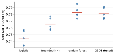
3.4.3 The pipeline goes inside: CV hygiene
Four rules of CV hygiene. Stratify the folds. Put the pipeline inside the CV so scalers, imputers and encoders are refit per fold - fitting transforms once on all data leaks across every fold boundary, which is the real reason pipelines exist. Let CV choose (hyperparameters, model family) and the untouched test set confirm. And never cross-validate on data that includes the test set.
The pipeline rule earns a worked example, because the mistake is the single most common leak in student projects and it looks completely innocent. Innocent version first: z-score all 21,000 training rows once, then run five-fold CV on the scaled matrix. Each fold’s “unseen” rows have already contributed to the mean and standard deviation the model trains under - a whisper of the held-out data inside every fit. For plain scaling the optimism is usually small. Now the dangerous version: target mean encoding, where a categorical column is replaced by the average default rate of its category. Fit that encoder once on all rows and every customer’s own outcome flows into their own feature. Take the extreme case to see it starkly: a category containing a single customer who defaulted gets the encoded value 1.0 - the label, photocopied into a feature column - and CV will duly report a spectacular score for a model that has learned to read its own answer sheet. Fit the encoder inside each fold, on that fold’s training part only, and the fold’s held-out rows are encoded with averages computed without them - honest again. The mechanical rule that prevents the whole class of errors: anything with a fit method belongs inside the pipeline, and the pipeline belongs inside the CV loop.
One more split subtlety is credit-specific: portfolios drift (products, policies - Block 1’s selection bias - and the economy), so random CV, which lets the model “see the future”, scores optimistically. The industry standard is out-of-time validation: train on the past, test on a later window, with CV inside the training period for tuning. Our synthetic portfolio has no dates; your project data or your first job will. Ask “does time matter here?” before every split - for credit the answer is essentially always yes.
3.4.4 The ROC curve, built by hand
Precision and recall judged the model at one threshold. The threshold belongs to the business and may move, so judge the ranking first: sweep the threshold and trace true-positive rate against false-positive rate - the ROC curve (Figure 38), on which choosing an operating point is choosing a threshold.
To demystify the curve completely, build one by hand. Five customers: three eventual defaulters scored , two good clients scored . Sort by score, descending: , , , , . Start with the threshold above every score: nothing is flagged, so TPR , FPR - the curve’s bottom-left corner. Now lower the threshold one score at a time. Past 0.9: one of three defaulters caught, no false alarms - . Past 0.6: . Past 0.5: the first good client is flagged - ; the curve steps right. Past 0.4: . Past 0.2: , the top-right corner. Every defaulter passed moves the curve up; every good client passed moves it right; a perfect ranking climbs the left wall before stepping right at all, and a random one staggers up the diagonal. The area under this little staircase is - hold that number for a moment.
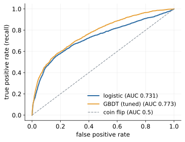
The area under the ROC curve has a meaning worth memorising: AUC is the probability that a randomly chosen defaulter is scored riskier than a randomly chosen good customer - 0.5 is dice, 1.0 a crystal ball, and it is threshold-free and imbalance-insensitive. What it cannot tell you: whether the probabilities are honest, or what a decision costs.
In practice
Credit scoring speaks its own dialect: Gini (logistic 0.46, GBDT 0.55; retail PD models normally live at 0.4-0.6), and KS, the maximum gap between the score distributions of goods and bads. When a risk manager says Gini they mean this - not the Gini impurity of the tree section. Same Corrado Gini, different formula; knowing the difference is an interview survival skill.
3.4.5 Interpreting AUC and Gini like a practitioner
Because AUC and Gini decide model approvals, promotions and vendor contracts, they deserve more than a definition. Start with the probabilistic reading, because everything else follows from it: AUC is the probability that a randomly drawn defaulter is scored riskier than a randomly drawn good client. Our GBDT’s 0.773 therefore says: draw one future defaulter and one future good client at random, and 77 times in 100 the model orders them correctly - 23 times in 100 it has them backwards. A tiny worked example makes the mechanics concrete: score three defaulters at and two good clients at ; of the defaulter-good pairs, five are ordered correctly (0.9 and 0.6 beat both good scores, 0.4 beats only 0.2) and none are tied, so AUC and Gini . Counting concordant pairs is the metric; the ROC integral is the same count drawn as an area - and indeed is exactly the staircase area computed by hand above. Same customers, two routes, one number: that agreement is the proof that the geometric and probabilistic definitions coincide.
Interpretation then needs anchors, because “is 0.77 good?” has no universal answer - discrimination is a property of the data as much as of the model. Rules of thumb from retail credit: application scorecards on bureau-thin data live around Gini 0.3-0.45; mature application models with bureau data 0.45-0.6; behavioural models - which watch the customer’s own account, like ours - commonly 0.5-0.7 (our 0.55 sits comfortably here); collections and fraud models can run higher still. Reading the number against the wrong benchmark produces both false alarm and false comfort: a Gini of 0.45 is respectable for a thin-file application model and alarming for a behavioural one, and anything approaching 0.9 on any credit portfolio is Block 3’s leakage smell, not a triumph. Three more habits keep the metric honest. Quote the uncertainty (CV spread or a bootstrap interval) - a Gini reported to three decimals without one is numerology. Compare only within the same population and time window - AUC shifts when the mix of applicants shifts, without the model changing at all. And remember what the number refuses to say: nothing about calibration (Block 3’s reliability diagrams), nothing about the chosen threshold’s costs, nothing about fairness across groups (Block 6). AUC answers exactly one question - does the model order risk well? - and the practitioner’s skill is refusing to let it answer any other.
3.4.6 Precision–recall and the tyranny of the base rate
Two companions complete the ranking view. The precision–recall curve (Figure 39) floors at the base rate (22% here) and punishes false alarms among rare positives; at real default rates of 1–5% - or fraud’s 0.1% - ROC can flatter while precision is dismal, so check both.
Work the base-rate effect in numbers, because nothing else makes it stick. Take a model operating at a fixed, respectable ROC point: it catches 80% of bad customers (TPR ) while flagging 10% of good ones (FPR ). At our portfolio’s 22% base rate, among 10,000 customers there are 2,200 bad and 7,800 good; the model flags true positives and false alarms, so precision is - seven flags in ten are right, a workable alert queue. Now move the same model - same ROC point, same AUC - to a thin-risk book with a 2% base rate: 200 bad, 9,800 good; it flags true positives and false alarms, and precision collapses to - six flags in seven are wrong. The ROC curve did not move a pixel; the PR curve fell off a cliff. That is the whole argument for checking both: ROC judges the ranking in a way that ignores the class mix, which is a feature when you compare models and a bug when you plan an operation whose workload is made of flags, not of rates.
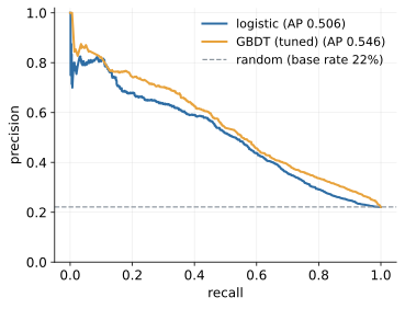
3.4.7 Calibration: are the probabilities honest?
And the calibration curve (Figure 40) asks whether a predicted 0.3 defaults 30% of the time: ranking pays for approval order, calibration pays for pricing and provisioning, where the probability itself sets the interest rate. The diagnostic is the reliability diagram: bin customers by predicted PD (say, deciles), plot each bin’s average prediction against its observed default rate, and read the deviations from the diagonal - points below it mean the model over-states risk in that range, points above it mean under-statement. Note that calibration and ranking are genuinely independent virtues: divide every predicted PD by ten and the ranking (hence AUC) is untouched while every price computed from the scores becomes nonsense - which is exactly why the evaluation stack asks the two questions separately.
Repairs exist (Platt scaling, isotonic regression, CalibratedClassifierCV) - and they differ in a way worth knowing. Platt scaling fits a small logistic regression mapping the raw score to a probability: two parameters, hard to overfit, works on modest data, but it assumes the distortion is sigmoid-shaped. Isotonic regression fits the best monotone step function from scores to observed rates: assumption-free beyond monotonicity, able to fix any consistent distortion, but data-hungry - on small samples its steps chase noise. The practical rule: Platt when calibration data is scarce, isotonic when it is plentiful; and in both cases fit the calibrator on data the model was not trained on (the CV-wrapped estimator does this for you), or the repair inherits the optimism it was meant to remove. And recall from Block 2 that class_weight breaks calibration by design - if you reweighted classes to help the ranking, recalibrate before anyone prices with the output.
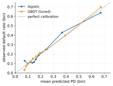
3.4.8 Expected cost: metrics meet money
Finally, metrics meet money. Price the confusion-matrix cells - here a missed defaulter at a falsely declined client, deliberately conservative for our 22% default rate (real low-default books push 10-50) - sweep the threshold , and minimise the expected cost per client, (Figure 41). The optimum lands near 0.26, not 0.5, and the move cuts expected cost by roughly 11%: same model, better decision, and Block 2’s cliffhanger resolved.
There is theory behind the empirical sweep, and it explains where the optimum lands. If the predicted probabilities are honest, declining a customer with PD is worth it exactly when the expected loss of approving, , exceeds the cost of declining a customer who would have been good, ; solving for the break-even gives the textbook threshold . With our 3:1 cost ratio that is - and the empirical sweep’s 0.26 lands almost on top of it, which quietly certifies that the GBDT’s probabilities are close to honest. The formula also exposes the threshold’s sensitivity to the cost ratio, which is the number the business is least certain about: at the threshold drops to , at to - in low-default books nearly every detectable risk is worth declining, because one miss pays for dozens of false declines. Since the ratio is always an estimate, sweep it: recompute across a plausible range of ratios and check how much the achieved cost moves. Typically the cost curve is flat near its minimum - being roughly right about the ratio matters far less than the one decision that is reliably wrong, which is leaving the threshold at 0.5 because nobody asked.
The full PD evaluation stack, in order: does it rank (AUC/Gini, CV mean sd)? are the probabilities honest (calibration)? where do we cut (expected cost, with the business)? does it stay good (out-of-time tests, monitoring, forever)? A perfectly calibrated model that ranks badly prices garbage accurately; a great ranker with dishonest probabilities misprices everything.
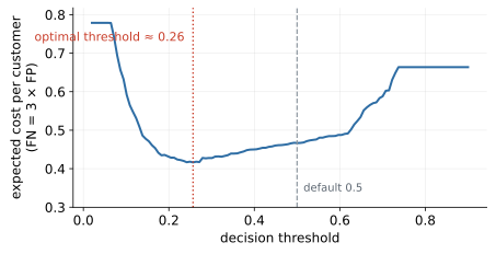
3.5 Leakage: the detonation
collections_contact has been in the portfolio since Block 1, flagged do not use: collections calls customers mostly after they default, so at application time the value does not exist. Adding this single column to the tuned GBDT lifts test AUC from 0.773 to 0.953 (Figure 42) - the best model this course will ever produce, and completely worthless, because the feature is unknowable at decision time.
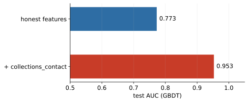
What makes leakage dangerous is its seductiveness. The leaky feature looks like your best feature - importance rankings crown it instantly. Every honest-looking check passes: cross-validation loves it and the test set loves it, because the leak sits on both sides of every split. Nothing crashes and no warning fires; the only failing dataset is the one you do not have yet, production. Leakage is therefore caught by reasoning about features, not by metrics - the metrics are its accomplices. Sit with that last sentence, because it inverts everything this chapter built. The entire evaluation apparatus - CV spreads, held-out tests, honest protocols - assumes the future will resemble the data you evaluated on. Leakage breaks that assumption at the level of a single column: the evaluation data contains information the production data will not, so every metric computed on it, however carefully, is measuring the wrong world. This is why an evaluation section and a leakage section belong in the same block - the second is the failure mode of the first.
3.5.1 A taxonomy of leaks
The bestiary organises into four families, and naming the family is half the diagnosis. Target leakage: a feature that encodes the outcome itself - post-outcome fields (collections_contact, account_closed_reason) recorded because the default already happened, and target twins (months_overdue predicting default) that are near-definitions of the label. These are the loudest leaks: one column, spectacular scores, and the time-travel question kills them instantly once it is asked. Train-test contamination: information crossing the split through the procedure rather than through any single column - transform leaks (scaler, imputer or encoder fitted on all data before splitting; the CV-hygiene example above), and duplicate leaks (the same customer, or the same row after a join gone wrong, appearing in train and test so the model is quizzed on questions it has memorised). Temporal leakage: the future informing the past - time-travel joins (feature tables joined from post-decision snapshots, so “income” is the value known a year after the decision, not at it), and random splits on drifting data that let the model train on customers from after the test window. Group leakage: rows that belong together split apart - one person’s several loans divided across sides, so the “unseen” test loan shares its owner with a training loan; households, branches and merchants leak the same way. The last three families are the sneaky ones - no single column looks guilty; the procedure leaks - and they are caught by auditing the split and the joins, not the feature list.
3.5.2 The time-travel test as an audit protocol
The smells that should trigger an audit: AUC far above the domain’s normal range, one feature dominating importance, test far above CV. Any one of the three is enough to stop; two together are close to proof. The audit itself should be boringly systematic - a protocol, not a vibe. For every feature, write down the answer to one question: at the moment the decision would be made, is this value already in the database? - not “does the column exist”, but whether the value for this customer, at this timestamp, could have been queried. Record the answer per feature, with the source system and the snapshot date of the table it came from; a feature nobody can answer for is treated as leaky until proven otherwise. Then audit the procedure: confirm every join uses a snapshot dated before the decision; check identifier keys for duplicates across the split; confirm rows sharing a customer, household or contract sit on the same side; and if time exists in the data, demand the out-of-time test, because it is the one evaluation design that catches temporal leaks mechanically - a feature computed from the future cannot help on a test window that lies beyond the training period’s future. The checklist before believing any good result compresses to four lines: every feature has a written answer to “when is this value known?”; all transforms live inside the pipeline; keys are checked and groups split together; and if time exists in the data, an out-of-time test exists too. Teams that run this protocol routinely treat a surprisingly good number the way an engineer treats a surprisingly quiet engine - as a symptom, first.
3.6 Explaining models
Two standard answers to “which features matter?” (Figure 43): impurity importance - how much Gini each feature removed - is free and train-side, but biased (it loves high-cardinality features and splits credit among correlated ones); permutation importance shuffles one column on the test set and measures the AUC drop - slower, model-agnostic, honest about what the model actually uses.
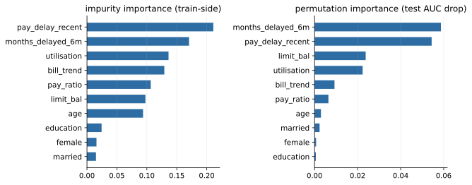
3.6.1 Permutation importance: mechanics and failure modes
The mechanics are almost embarrassingly simple, which is their virtue. Score the model on the test set. Take one column, shuffle its values across rows - destroying its relationship to the outcome while preserving its marginal distribution - and score again. The drop in AUC is that feature’s importance: how much the model’s performance depended on that column carrying real information. Repeat the shuffle several times and average, because one permutation is one random draw; features the model ignores show drops near zero, and the whole procedure needs nothing from the model but predictions - it works identically for a forest, a GBDT, or next block’s neural network.
Its honest failure mode is correlated features, and it fails in both directions at once. Direction one, understatement: if utilisation has a near-twin (say, balance-to-limit computed slightly differently), shuffling one leaves the model leaning on the other, the AUC barely drops, and both twins can report near-zero importance while being jointly indispensable - the same credit-splitting pathology as Block 2’s lasso choosing one twin. Direction two, distortion: shuffling breaks the correlation structure itself, so the model is evaluated on impossible customers - high utilisation paired with the twin’s low value, combinations that never occur - and its behaviour off the data manifold is being measured, not its behaviour in reality. Neither failure makes the tool useless; both mean a permutation ranking is read alongside a correlation matrix, and features are shuffled in correlated groups when the question is “does this cluster of information matter”, not “does this exact column”.
Impurity importance’s bias also has a mechanism worth knowing rather than memorising. A feature with many distinct values offers many candidate cut-points, hence many chances to find a split that fits noise - so high-cardinality features accumulate impurity credit they have not earned. And because the score is computed on the training data, splits that merely memorised are counted as contributions. Free is the right price for it: use impurity importance as a quick first look, and permutation on held-out data for anything anyone will act on.
3.6.2 SHAP, in one honest paragraph
SHAP generalises Block 2’s receipt: for one prediction, attribute the deviation from the average outcome across features fairly (Shapley values); locally it yields one customer’s bars (adverse-action material), globally an importance ranking with direction. The fairness has a precise meaning imported from game theory: each feature’s credit is its average marginal contribution over all orders in which features could be revealed, and the attributions provably sum to the gap between this customer’s prediction and the average one - the receipt always adds up. For tree ensembles the computation is exact and fast (TreeSHAP); for arbitrary models it is approximated by sampling. Its costs: computation, and ambiguous credit-sharing among correlated features - the same twins that confuse permutation importance confuse Shapley attribution, and no amount of game theory can decide which of two interchangeable columns “really” did the work. Students who understood the logistic decomposition already know what a SHAP plot is trying to be: the coefficients-times-values receipt, rebuilt for models that have no coefficients.
3.6.3 Monotonic constraints: domain knowledge as a leash
Domain knowledge can also enter as a constraint: modern GBDT accepts monotonic constraints (monotonic_cst), forcing the score non-decreasing in chosen features - regularisation, explainability and regulator comfort in one move; risk that locally falls as utilisation rises is an artefact nobody should have to defend. The constraint is a leash in the exact technical sense of this course: it shrinks the space of functions the ensemble may fit, trading a little flexibility for stability - and when the constraint encodes something true about the world, the trade is nearly free, because the wiggles it forbids were noise. It is the same move as Block 1’s binning and Block 2’s chosen coefficients: domain knowledge entering the model on purpose, in a form an auditor can read.
And one boundary to keep sacred: explanations explain the model, not the world. Importance is not causality; correlated features trade places between runs (remember lasso picking one twin). Utilisation “mattering” means the model leans on it, not that persuading customers to reduce utilisation would lower their risk - the feature may simply be the visible shadow of something else. Legitimate uses are debugging (a dominant weird feature is a leakage smell - importance rankings are the leak-detector this block already used once), monitoring (importance drift as an early warning that the portfolio is changing under the model), and communication - with the caveats spoken aloud. Policy conclusions need causal designs, which lie beyond this course but not beyond your career.
3.7 Lab and hand-in
The lab notebook 03_trees_ensembles_evaluation runs the whole arc: cross-validating the Block 2 baseline (fold spread first); growing, reading and leashing a tree (whose root split agrees with the logistic coefficients); the four-model tournament under one CV protocol; ROC, PR and calibration for the finalists; the leakage detonation with permutation importance crowning the leak; and the expected-cost sweep that moves the threshold from 0.5 to 0.26 for a 11% saving. Exercises add raw NaNs fed natively to HistGBDT, a forest leash sweep, isotonic calibration, a cost-ratio sensitivity analysis, and an optional monotonic constraint. “Done” means being able to say which model won, whether the gap beats the CV spread, and at which threshold you would run it - with a cost curve to back you up. Project checkpoint: teams are final, and the rubric’s evaluation criterion (20%, “correct, leakage-aware”) now has an operational definition - the minimum kit is CV mean sd, ROC and PR, a calibration look, one cost-based threshold argument, and a written time-travel audit of the features. That kit, executed cleanly, is most of the difference between a passing project and a memorable one - and it is, feature for feature, the same kit a validation team would demand of a production PD model, which is not a coincidence.
4 Block 4 - Clustering & dimensionality reduction
Blocks 2 and 3 had a luxury we now lose: a label. Without default to predict, there is no ground truth, no test set that can say “correct”, and no error with a price. The goal becomes structure - groups of similar customers, compressed representations - and the standard of judgement becomes usefulness, which is argued rather than measured. One consequence deserves to be stated before any algorithm: an unsupervised method always returns an answer, and nothing in the mathematics says whether the answer means anything. Ask k-means for four clusters and you will receive four clusters - on your portfolio, on a table of random numbers, on the digits of . The supervised world had a built-in humiliation mechanism - a model that learned nothing scored an AUC of 0.5, and the test set said so in public; that mechanism is gone. Scepticism graduates from a virtue to a method.
Why does a lender cluster at all? Customer segmentation feeds strategy, product design and communication - “who are our customers, in four sentences?” is a question every retail bank asks and clustering is the disciplined way to answer it. Anomaly detection - customers unlike everyone else - feeds fraud work and data-quality checks; it is Block 1’s outlier perspective upgraded from cleaning chore to deliverable. Clusters are EDA power tools, hypotheses about heterogeneity you did not know to look for. And compression (PCA) turns dozens of correlated features into a few components. What clustering is not for, in a regulated shop, is making individual credit decisions: segments inform strategy; the PD model prices the person. The workflow is a recipe with five steps - representation, distance, algorithm, validation, naming - and, as always in this course, the early steps decide more than the algorithm: by the time you have chosen which features describe a customer and what “similar” means numerically, most of the answer is already fixed, and the algorithm merely reads it out.
4.1 Working without ground truth
With no ground truth, evaluation rests on a triad: internal metrics (inertia, silhouette - necessary, never sufficient), stability (reseeding, resampling, next quarter - the unsupervised cousin of cross-validation), and external usefulness (profiles against outcomes held out of the clustering, plus the business sniff test). Each leg deserves honest scrutiny, because each can be fooled - and a practitioner who knows how each substitute fails is much harder to mislead.
Internal metrics measure geometry, not meaning. A silhouette score asks whether points sit closer to their own cluster than to the next one - a sensible question, but one posed entirely inside the feature space you built: if that space encodes an artefact (an unscaled income column, a duplicated concept), the metric happily certifies the artefact. Worse, every internal index carries its own aesthetic - silhouette and inertia both prefer round, compact, well-separated blobs, structurally biased towards the kind of answer k-means produces. Using inertia to validate k-means is close to letting the student grade their own exam: useful for comparing runs, never proof of truth.
Stability is a stronger substitute because it asks a falsifiable question: if the data had come out slightly differently - another random start, another 80% subsample, next quarter’s snapshot - would we have told the same story? Structure that evaporates under reseeding was never structure. But stability is necessary, not sufficient: a perfectly stable answer can be a perfectly stable artefact. Cluster on raw, unscaled incomes and you will get the same income bands every time - stable, reproducible, and meaningless as a statement about customer behaviour.
External usefulness is the strongest leg: hold an outcome out of the clustering - default, churn, profitability - then check whether the segments separate on it. If groups built purely from behaviour turn out to have default rates ranging from 15% to 58%, the structure has demonstrated cash value on information it never saw. Even this test has a limit worth naming: it validates the segmentation for that outcome - a segmentation useless for credit risk might be excellent for marketing, and vice versa. “Is this clustering good?” is not a well-posed question; “is this clustering good for this decision?” is. Keep the triad in mind through the whole chapter - every method we meet will be judged by it.
4.2 Distance, scaling, and the curse
Distance is a modelling choice. Euclidean distance is the default and, through its squares, amplifies large single-feature gaps; Manhattan distance sums absolute gaps and forgives an extreme coordinate; cosine similarity (angle, not length) waits for text in Block 5; mixed numeric and categorical data needs care (Gower’s coefficient is the classical fix). A small worked example makes the units concrete: two customers standing , and standard deviations apart on three standardised features are apart in Euclidean terms - about one and a half “typical spreads” - and in Manhattan terms.
4.2.1 A menu of distances, and what each one rewards
Stay with that worked pair, because it already exposes the character of the two metrics. The three per-feature gaps are , and . Under Manhattan, each contributes in proportion: , and the small age gap supplies about 8% of the total. Under Euclidean, the gaps are squared first: , and the age gap’s share collapses to under 2% - squaring is a megaphone for the largest disagreement. If you believe one extreme coordinate should be able to dominate “similar” - a customer four months delinquent is simply different, whatever else matches - Euclidean encodes that belief; if you want ten small disagreements to weigh the same as one large one, Manhattan does. There is no correct answer - only the answer you chose, whether or not you noticed choosing.
Cosine distance drops magnitude entirely and compares direction. Take two customers whose monthly spending across two categories is and : Euclidean sees a gap of , while cosine sees two vectors pointing the same way - proportionally identical spenders, one simply operating at twice the scale - and reports a distance of zero. Exactly right for documents (Block 5), where long and short articles on one topic should count as similar; for balances, perhaps not - which is the point.
Mixed data breaks all three: what is the “distance” between renting and owning? Gower’s coefficient handles each feature in its own currency and averages: numeric features contribute their absolute gap divided by the feature’s range (landing in ), categorical features contribute for a match and for a mismatch. A micro-example: limits of 60k and 160k on a portfolio spanning 500k give ; housing rent versus rent gives ; ages 30 and 40 on a 50-year range give ; Gower distance . Not exam material, but the design lesson is: someone must decide how a category mismatch trades against a numeric gap, and if you do not decide, the encoding decides for you.
The feature list itself is the definition of “similar”: every column is one vote. Application-time information only (segments built on post-outcome fields inherit every leakage pathology of Block 3); one concept, one vote (two utilisation variants let utilisation vote twice); business-relevant only (identifiers never - customer_id would vote that consecutively onboarded customers are alike - and near-constant columns never, since they vote “everyone is similar”); and the target stays out - default is reserved for profiling, because clustering on it manufactures fake foresight.
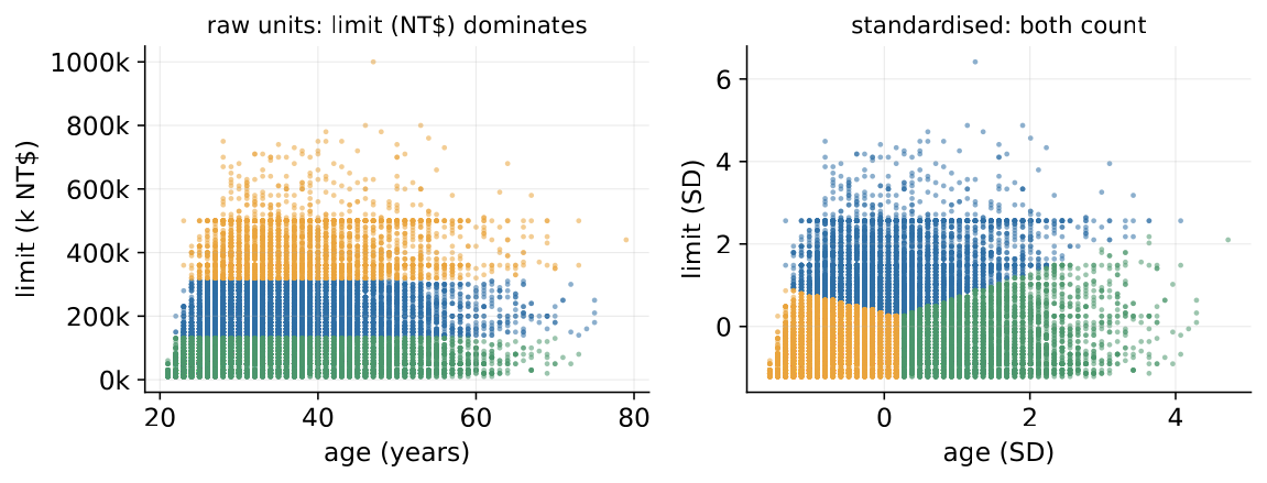
4.2.2 Why scaling changes the answer
Scaling, optional for trees, is never optional for distances: Figure 44 shows k-means on raw units producing pure income bands - age never got a vote. The arithmetic behind the figure is worth doing once by hand. Take two customers: incomes 120,000 and 80,000 PLN, ages 25 and 60. In raw units the Euclidean distance is a 35-year age gap - practically a different generation - moves the distance by two hundredths of one income unit. The metric is not weighing the features; the units are. Now standardise. If income has a standard deviation of roughly 40,000 PLN and age of roughly 12 years, the gaps become and standard deviations, and the distance is - suddenly age dominates, because in “how unusual is this gap among customers?” terms, 35 years is the bigger disagreement. Neither number is wrong; they answer different questions; standardising answers the one you almost always mean - distances in units of typical customer-to-customer spread, one vote per concept. Trees forgave you this (splits are order-based); distances never will.
4.2.3 The curse of dimensionality
Finally, the curse of dimensionality: as dimensions grow, distances concentrate until the nearest and farthest customers are nearly equally far. The intuition is additive noise. Every feature contributes one term to the sum of squared gaps; if the features are mostly unrelated, those terms average out, and the total distance between two random customers hugs its expected value ever more tightly - the sum grows like the number of dimensions , while its spread grows only like , so the relative spread shrinks like .
A numeric illustration makes it vivid. Scatter points uniformly in the unit cube and measure the distance between two random points: the typical distance is about , while its standard deviation stays near regardless of . In dimensions (our six clustering features), that is a typical distance of about with a spread of - distances vary by a quarter of their size, and “near” versus “far” still means something. In , the typical distance is about with the same spread - a 6% relative variation; in , under 2%. Every customer becomes approximately equally far from every other, and any algorithm built on “who is close?” is asking a question the geometry can no longer answer. Practical consequences: cluster on a curated feature set, not on everything you have; watch for correlated double-counting; and treat dimensionality reduction - PCA, later this chapter - as a legitimate opening move rather than an afterthought.
4.3 K-means
K-means is one loop (Figure 45): pick centres; assign every point to its nearest centre; move each centre to its points’ mean; repeat until nothing changes. It minimises the within-cluster sum of squares (“inertia”), which bakes in assumptions - clusters roughly round, similar in size and spread, in the scaled space - and carves the feature space into convex cells around the centroids.
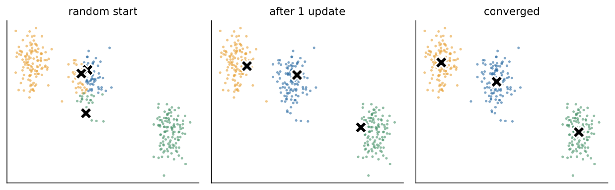
4.3.1 Lloyd’s algorithm: why it always converges, and why only locally
The loop above is Lloyd’s algorithm, and it is worth seeing as coordinate descent on the inertia: the objective has two blocks of unknowns - the assignments and the centres - and each step optimises one block exactly while holding the other fixed. The assignment step cannot increase inertia: moving a customer to a nearer centre only shrinks their squared-distance term. The update step cannot increase it either, by a one-line calculus fact: among all candidate centre positions, the arithmetic mean minimises the sum of squared distances to a fixed set of points. So inertia falls (or stays put) at every step; since there are finitely many ways to partition customers into groups, a quantity that never increases must eventually stop changing - convergence is guaranteed, typically within a handful of iterations.
What is not guaranteed is convergence to the best answer. Coordinate descent stops at the first configuration where neither block can improve alone, and such local optima can be badly wrong. A toy you can verify by hand: four customers at the corners of a long rectangle, , , , , with . The right answer pairs the nearby corners - left pair and right pair - for an inertia of . But start the centres at and and k-means pairs the bottom corners against the top: each point sits distance from its own centre and from the other, so no point wants to switch, no centre wants to move, and the algorithm halts - contentedly - at inertia , sixteen times worse than the optimum, with nothing in the output to warn you. This is why the start matters, and why two cheap insurance policies are standard practice.
The first is smarter seeding: k-means++ picks the first centre at random, then picks each subsequent centre with probability proportional to the squared distance from the nearest centre already chosen. Far-flung regions - exactly the ones a uniform random start tends to miss - get proportionally more chance to host a centre, so the initial centres arrive spread out rather than huddled in one dense area. The second is repetition: n_init=10 runs the whole algorithm from ten starts and keeps the partition with the lowest inertia - internal metrics used exactly as intended, to compare runs of the same method, not to certify truth. Together they make the rectangle pathology rare, though never impossible; and since the final partition still depends on the seed, random_state is part of the segmentation’s recipe - Block 1’s reproducibility rule, unsupervised edition. Two smaller practical notes: squared distances chase outliers, so inspect (or winsorise) extreme customers first, or use k-medoids, the robust cousin that centres on actual customers; and k-means is fast enough for millions of rows, with MiniBatchKMeans buying another order of magnitude of scale for a small quality discount.
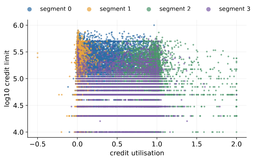
On the portfolio we cluster on six scaled behavioural features - log limit, age, utilisation, months delayed, payment ratio, bill trend - with the target excluded, and sex and marriage excluded too: protected traits must not define “similar”, even in strategy work (Figure 46). Even the raw scatter teaches: the dense wall of points at utilisation near zero is the transactor population - clients who pay in full every month - visible before any algorithm runs.
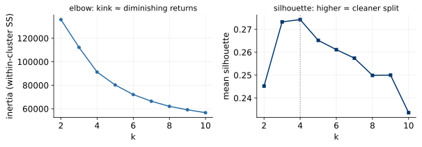
4.3.2 Choosing : the elbow’s logic
Choosing (Figure 47) starts from a fact about inertia: it always falls as grows. Adding a centre can only help - at worst it sits unused - and at every customer is their own centre and inertia is zero. So the raw value of inertia at any single proves nothing; what carries information is the shape of the curve. If the data genuinely contains four groups, moving from to lets the centres finally cover all of them and inertia drops sharply; moving from to merely splits a real group in two and buys little. The elbow is that kink of diminishing returns - the point where extra centres stop paying for themselves. On our portfolio the curve is smooth, with no clear kink: the honest reading of an elbow plot is often “the data declines to commit”, and that non-answer is itself information about how firm the structure is.
4.3.3 The silhouette, worked by hand
The silhouette gives each individual customer a verdict. For customer , let be the mean distance from to the other members of its own cluster (cohesion: how far is home?), and the mean distance from to the members of the nearest other cluster (separation: how far is the best alternative?). Then which lands in : positive when home is closer than the alternative, zero on the fence, negative when the customer actually sits nearer to a neighbouring cluster than to their own. Three worked cases pin down the scale. A customer with and scores - home is four times closer than the alternative; this customer is deep inside their cluster. A customer with and scores - the two clusters are nearly equally plausible; this customer sits on a border, and the hard assignment k-means reports is close to a coin flip. And a customer with and scores - the “nearest other” cluster is actually closer than home; this customer is probably mis-assigned, a casualty of convex cells or a bad local optimum. Averaging over all customers gives the mean silhouette - the single number on the right panel of Figure 47.
Ours peaks exactly at our , at - moderate, genuine grouping: the transactor wall and the delinquent tail are real behavioural islands, though the groups touch and many clients live near a border. After the worked cases, has a face - most customers clearly closer to home, mixed with a genuine borderland of near-zero scores. The contrast with Block 1’s synthetic portfolio is the teaching point: there the same diagnostic read 0.12 - one connected cloud - and k-means returned four sharp segments anyway. The number, not the picture, tells you how much to believe; the report sentence - state , the silhouette, and how firm the borders are - belongs in every segmentation deliverable either way. (Remember, though, that the silhouette shares k-means’ taste for round, separated blobs - a second witness, not an independent judge.) Where k-means breaks structurally - stretched clusters, unequal spreads (Figure 48) - the centroids land wrong confidently; when the shapes are wrong for the tool, change the tool.
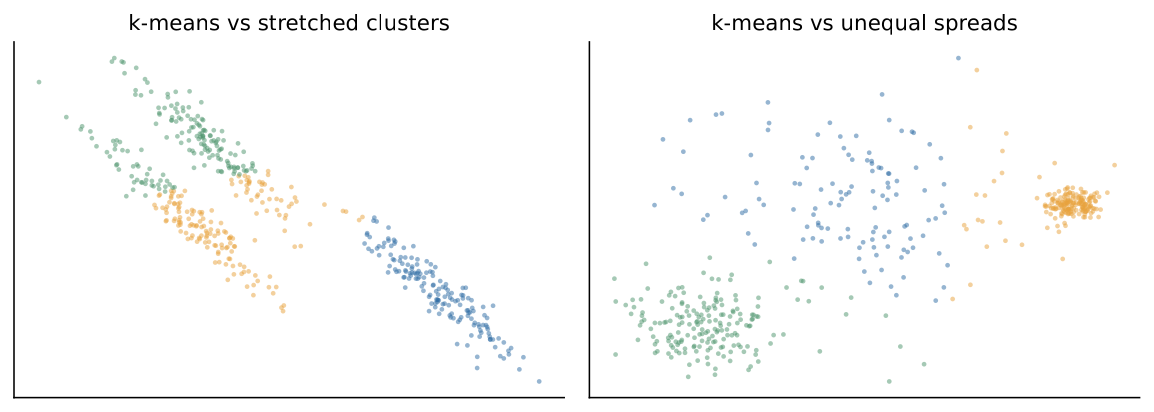
4.4 Hierarchies and density
Agglomerative clustering starts with every customer alone and repeatedly merges the two closest clusters, recording the whole history. “Closest between clusters” is the linkage: single (nearest members - chains), complete (farthest - compact, brittle), average, or Ward (least variance increase - k-means’ cousin and the usual default). The cost is pairwise distances: fine for thousands, painful for millions - sample first.
4.4.1 Linkage: four definitions of “close”, four personalities
The linkage choice deserves more than a list, because it changes what the method can find. Single linkage calls two clusters close if their nearest members are close. That lets clusters grow by touching - a chain of customers, each near the next, merges into one long snake even if its ends are far apart: a gift when the true structure is elongated, a disease otherwise, since one noisy customer sitting between two genuine groups becomes a bridge and the groups merge through it. Complete linkage is the opposite temperament: two clusters are only as close as their farthest members, so a cluster cannot absorb anything that would stretch its diameter - compact, round groups, but brittle, because a single outlier on a cluster’s rim inflates its apparent distance to everything. Average linkage splits the difference. Ward’s method merges whichever pair increases total within-cluster variance the least - greedily optimising a hierarchical version of k-means’ inertia, which is why it shares k-means’ preference for similarly sized round groups and why it is the usual default for customer work. The trade-off in one sentence: single linkage risks chaining, complete and Ward risk shattering elongated shapes; you are choosing which mistake you would rather make.
4.4.2 Reading a dendrogram
Agglomerative clustering’s gift is the dendrogram (Figure 49): the whole merge history in one picture, with each merge drawn at a height equal to the distance at which it happened. Read it vertically: long vertical runs mean a group survived a wide range of distances without being forced to merge - genuine separation - while short runs mean the merge order was nearly arbitrary. To extract a flat clustering, cut horizontally where the vertical runs are long, and the number of branches you sever is your : one picture holds every at once. Ours merges early and often - the weak-structure verdict from a second witness. Sometimes, though, the hierarchy itself is the deliverable: strategy wants five coarse super-segments, CRM wants twenty fine ones, and a dendrogram serves both from one fitted object, with the guarantee that the fine segmentation nests cleanly inside the coarse one - something two separate k-means runs cannot promise.
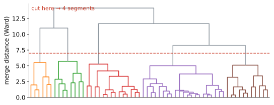
4.4.3 DBSCAN: clusters as dense places
DBSCAN abandons centres for density: a cluster is a packed region - core points with at least min_samples neighbours within , plus their reachable friends - and everything else is noise. The vocabulary is worth pinning down, because the three-way point classification is the algorithm. A core point has at least min_samples neighbours within radius - it sits in the thick of things, and clusters grow outward from core points by connecting any two that fall within of each other. A border point is not dense enough to be core itself but lies within of one - the shoreline of a cluster; it joins, but cannot extend the cluster further. A noise point is neither - too far from any dense region - and is labelled as such rather than forced into the nearest group.
Three superpowers follow: any shape (clusters grow by local connectivity, not proximity to a centre, so crescents and rings are no obstacle), no to choose (the density structure decides how many clusters exist), and an explicit outlier label (in fraud work the noise bucket is sometimes the entire deliverable). The price: touchy knobs and one global density - a single must serve the whole space, so a portfolio holding one tight group and one legitimate-but-diffuse group defeats every setting: an small enough to keep the tight group tight declares the diffuse group noise, and one large enough to hold the diffuse group together merges everything else. Choosing has its own elbow - sort every point’s distance to its -th nearest neighbour (with ) and cut at the knee, where the curve stops falling through empty space and flattens into the typical within-cluster spacing; the elbow-and-scree philosophy again, and the same admission of judgement. If no knee exists, densities vary too much for one global , and HDBSCAN is the keyword. Figure 50 shows the classic contrast: two crescents that k-means must slice with a line (convex cells oblige) and DBSCAN traces naturally, quarantining stragglers as noise. Crescents are rare in credit; the lesson is general - the algorithm’s assumptions decide what it can find.
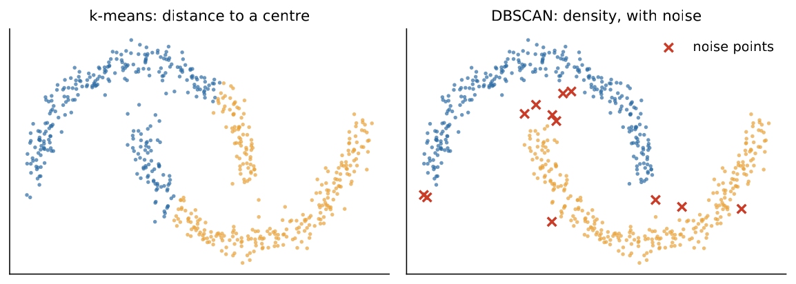
4.4.4 Soft memberships: Gaussian mixtures in one honest paragraph
Between the hard memberships of k-means and reality sit Gaussian mixtures: the data is modelled as a blend of Gaussian clouds, and instead of answering “which segment?”, the model answers “with what probabilities?” - every customer gets a membership vector such as 70/25/5/0. The fitting algorithm, expectation-maximisation (EM), will feel familiar after Lloyd: the E-step computes each customer’s membership probabilities given the current clouds (the soft analogue of the assignment step), and the M-step re-estimates each cloud’s centre, spread and weight as probability-weighted averages (the soft analogue of the centroid update). Like Lloyd, every iteration provably improves the objective - here, the likelihood - and like Lloyd, EM converges only to a local optimum, so multiple starts remain the insurance. K-means is exactly the hard-edged limiting case (round, equal clouds, memberships forced to 0/1), and because a mixture is a proper probability model, the number of components can be chosen by BIC, the information-criterion cousin of the elbow. The honest caveat: the clouds are still ellipses, so the model inherits a shape assumption, and its probabilities are only as trustworthy as that assumption. Credit likes mixtures anyway, for a credit-shaped reason: borderline customers are the interesting ones, and a 55/45 membership says “borderline” out loud where k-means would silently pick a side.
4.5 PCA
Why compress? To see (portfolios live in 20 dimensions; a faithful 2-D shadow beats twenty histograms), to fight the curse (fewer, decorrelated dimensions make distances meaningful), to de-duplicate (correlated features carry one concept several times), and to feed models (components can replace dozens of raw features - at an interpretability price). Principal component analysis finds the directions of maximal variance: PC1 is the axis along which customers differ most, PC2 the most-varying direction orthogonal to it, and so on (Figure 51 shows income and savings collapsing onto a shared “affluence” axis). Formally, PC1 solves the components are the eigenvectors of the correlation matrix, ordered by their eigenvalues - which are the explained variances. Components are orthogonal - multicollinearity dies here, delivering Block 2’s third remedy - and each is a recipe: a weighted mix of original features whose weights, the loadings, are the key to interpretation.
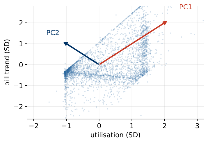
A two-feature toy shows the whole mechanism in miniature. Take two standardised features with correlation ; their correlation matrix has eigenvalues and , so PC1 explains of the variance. At - income and savings, say - PC1 carries 90%: the cloud is a cigar, and one axis (the shared “affluence” direction) tells most of the story. At the eigenvalues are equal, the cloud is round, and there is nothing to compress. The rule falls out immediately: PCA’s discount always equals the redundancy it finds - no more, no less. One paragraph on computation, for honesty: in practice nobody forms and calls an eigensolver; software factorises the centred data matrix directly via the singular value decomposition, , where the columns of are exactly the loading vectors and the squared singular values, divided by , are exactly the eigenvalues - same answer, better numerical behaviour, and the reason sklearn’s PCA mentions SVD in its documentation.
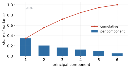
How many components? The scree plot (Figure 52) answers: PC1 explains 35%, and 90% takes five of six components - moderate compression, tracking the correlation structure exactly. The bill-driven features (utilisation, bill trend, payment ratio) share an axis; age stands alone; PCA compresses redundancy, and here there is some - so there is some discount. Reading a scree plot is the elbow skill again: eigenvalues sorted in decreasing order, and you look for the drop after which the remaining components are “scree” - the rubble at the foot of a cliff, in the metaphor that named the plot. A steep-then-flat profile says a few axes carry the story; our gentle slope says the six features are genuinely six-ish concepts - itself a finding about the feature set.
The loadings (Figure 53) deliver the interpretation: PC1 loads positively on utilisation and bill trend and negatively on payment ratio and limit - a revolving-stress axis, nameable, and a component nobody can name is a feature nobody can defend. Read a loading vector exactly like a recipe: a customer’s PC1 score is (roughly) utilisation plus bill trend minus payment ratio minus log limit, each in standardised units, so scoring high means heavily utilised, bills growing, repaying small fractions, on a small limit. Two honest footnotes belong next to any loadings chart. First, signs are arbitrary: if is an eigenvector then so is , so a library update or a rerun on next quarter’s data can flip every sign on a component while changing nothing real. The axis is real; the direction is a labelling choice - fix a convention (“high PC1 = high stress”) and state it, or two analysts will argue about a minus sign that means nothing. Second, orthogonality has an interpretive price. Real behavioural constructs are correlated - affluence and revolving stress genuinely co-move - but PCA forces every component to be perpendicular to all previous ones, so PC2 is not “the second most natural concept” but “the most-varying direction after PC1’s shadow is removed”. Later components are increasingly defined by what they must exclude, which is why PC1 and PC2 usually earn clean names and PC5 rarely does.
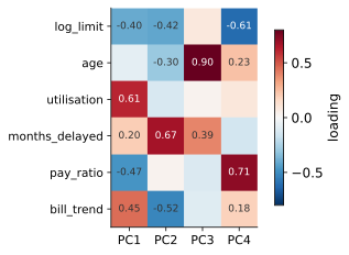
An equivalent lens: keep components and reconstruct - rebuild each customer from their scores. The rebuild is imperfect, and the reconstruction error equals exactly the variance thrown away, so “explained 90% with five components” and “reconstruction loses 10%” are the same sentence - use whichever the audience hears better. This lens generalises: autoencoders (Block 6’s cousins) are this idea with nonlinear compress and decompress.
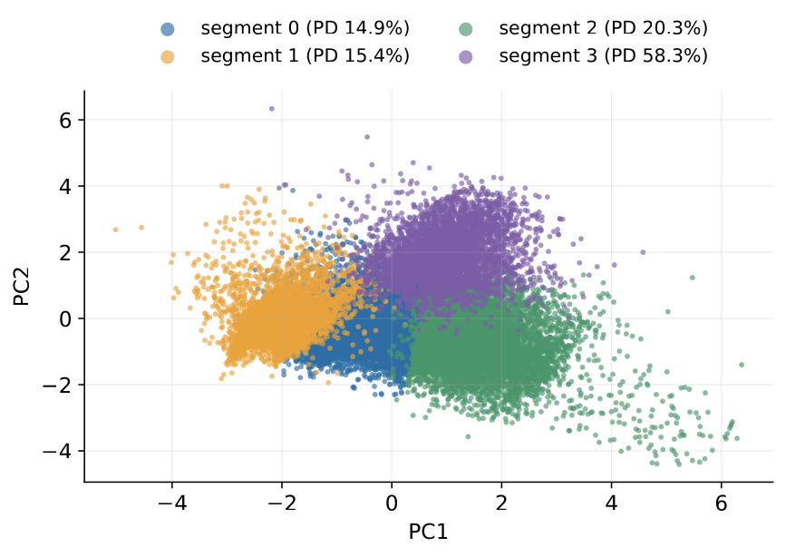
Projecting the segmentation onto the first two components (Figure 54) shows the transactors and the distressed pulling visibly apart along PC1 - the revolving-stress axis - with default rates running from 15% to 58% across the legend: structure a strategy team can act on.
4.5.1 The fine print
Four caveats, each a documented way to get PCA wrong. Scale first: unscaled, PC1 is simply the biggest-unit feature - the variance-maximising direction in raw units is whatever is measured in the largest numbers, income yet again. Variance is not importance: PCA never saw the target, and a direction can carry little variance yet all the signal - the one narrow combination that predicts default (a slight tendency to pay late while utilisation creeps up, say) may land in PC6, and “keep the top components” quietly discards the risk signal while faithfully preserving most of the variance. Check compressed features against the supervised task before discarding anything. Linear only: PCA finds flat directions, and curved structure compresses badly - a horseshoe-shaped cloud has no small set of straight axes that represent it well. And when components feed a supervised model, the loadings are fitted parameters: fit on training data only, inside the pipeline - make_pipeline(StandardScaler(), PCA(5), LogisticRegression()) - where cross-validation will refit them per fold automatically; outside a pipeline they silently leak, Block 3’s lesson in a new costume.
For visualising curved structure, t-SNE and UMAP deserve one honest paragraph, because their pictures are seductive. Both build a 2-D embedding that tries to keep each point’s neighbours close, and both sacrifice everything else to do it: the distances between islands mean little, the sizes and densities of the islands mean little, and different hyperparameter settings (t-SNE’s perplexity above all) can turn one cloud into three tidy clusters or one smear - from the same data. They are microscopes for local neighbourhood structure, not maps of the space: use them to generate hypotheses and pictures, never as input to downstream distances or models, and never read cluster separation off a t-SNE plot as evidence - the algorithm manufactures separation by design.
4.6 Segmentation in practice
The deliverable is the profile table: per-segment means of the clustering features plus outcomes held out of the clustering - and that is where the business value appears.
| Segment | size | limit | util. | delays | default rate |
|---|---|---|---|---|---|
| 0 “mainstream revolvers” | 12,562 | 174k | 0.20 | 0.3 | 14.9% |
| 1 “transactors” | 4,980 | 174k | 0.03 | 0.3 | 15.4% |
| 2 “maxed-out borrowers” | 8,576 | 72k | 0.90 | 0.4 | 20.3% |
| 3 “distressed delinquents” | 3,882 | 54k | 0.60 | 4.2 | 58.3% |
Segment 3 - four months behind on average and defaulting at 58%, over two and a half times the portfolio’s 22% - writes its own story, and the quartet as a whole is the classic industry segmentation (transactors, revolvers, maxed-out, distressed) rediscovered from scratch by an unsupervised algorithm. Read the table’s logic carefully, because it is the external leg of the validation triad in action: the clustering never saw default, so the spread of default rates across segments - 14.9% to 58.3% - is honest evidence that the behavioural structure carries risk information, not an echo of the target smuggled in. (Had we clustered on the target, the same table would prove nothing: groups built from the answer always separate on the answer.) The table teaches beyond risk, too: transactors default at 15.4%, much like mainstream revolvers - but they generate no interest income, a profitability story rather than a risk story, and exactly the kind of strategic fact segmentation exists to surface.
4.6.1 Naming as a discipline
Naming is a craft with a test: a product manager should predict the profile from the name alone. “Transactors” passes - you can guess low utilisation and full monthly repayment from the word; “segment 1” fails by construction; “high-PC1-low-limit cluster” fails the opposite way - technically accurate, organisationally dead. Short, concrete, slightly memorable is the target. The failure mode to fear is dishonest naming: names imply crisp tribes where the data shows a continuum, and our silhouette of says the borders are soft - so every name travels with the soft-boundaries disclaimer earned by that number. And write down the recipe - features, scaling, , seed - because next quarter’s refresh must rebuild these segments, not invent new ones; a segmentation whose names change quarterly teaches the organisation to ignore segmentations.
4.6.2 Stability checks
Stability is the closest thing to correctness: reseed (different random starts - same partition? ours holds under n_init=10), resample (cluster 80% subsamples and cross-tabulate memberships - do customers travel together?), re-time (do next quarter’s segments reappear, or did we photograph noise?), and perturb (drop one feature and refit - does the story survive, or did one column dictate everything, the unscaled-income disease in disguise?). Each check targets a different fragility: reseeding catches local optima, resampling catches structure that lives in a handful of customers, re-timing catches seasonal artefacts, perturbation catches single-feature dominance. Then the strongest validator available: does the business recognise these customers? Line managers carry an informal segmentation in their heads; when the algorithm’s segments meet theirs, both gain credibility - and when they clash, one of the two is wrong in an interesting way.
In practice
The sobering demonstration belongs in every practitioner’s pocket: run k-means with on pure uniform noise and receive four tidy, colourful, publishable clusters (Figure 55). Every clustering deliverable should survive the question “what would this slide look like on noise?” - the unsupervised twin of Block 1’s “torturing the data until it confesses”. A bonus recipe in the same pocket: distance-to-nearest-centroid is a one-line anomaly score, and the top 1% is a serviceable first fraud shortlist with zero labels required.
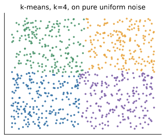
The noise demonstration’s lesson is precise, not merely cautionary: every internal statistic you might report - centroids, segment sizes, a colourful 2-D scatter - exists for the noise run too. What distinguishes the real portfolio from noise is exactly the validation triad: silhouette (noise scores near zero at every ), stability (noise clusters reshuffle under every reseed), and held-out outcomes (noise segments show identical default rates). The demonstration is not an argument against clustering; it is the argument for validating it. The anomaly recipe, meanwhile, upgrades Block 1’s lesson about outliers: a customer far from every centroid matches no known behavioural pattern - a data error, a fraud case, or a customer type you have not met yet, and worth a human look in all three cases; DBSCAN’s noise bucket delivers the same shortlist for free.
Where segments are allowed to work: strategy and product design; drift monitoring (segment sizes over quarters as a leading indicator, tying into Block 3’s monitoring - a growing “maxed-out” segment tells you something no single account shows); communication (tone and channel per segment); and as features in supervised models - with the clustering fitted on training data only, the golden rule following us everywhere. Where they are not: as the individual credit decision - pricing a person by their segment invites regulatory trouble and unfairness (Block 6 returns to fairness properly). The common sins, for the record: clustering on the target or its twins (manufactured foresight - Block 3’s leakage in a new costume); unscaled features (one column secretly dictates the whole segmentation); more segments than anyone can name (fourteen segments is a lookup table, not insight); hard-boundary storytelling on a continuum; quarterly refits that re-derive “new” customer types from seed noise; and never asking the noise question.
4.7 Lab and hand-in
The lab notebook 04_clustering_pca walks the arc: break clustering with unscaled features, then scale; choose with elbow and silhouette and read the weak signals honestly; profile and name the segments (with the honesty clause); a Ward dendrogram on a sample; DBSCAN versus k-means on crescents; PCA’s scree, loadings and 2-D projection; and the noise demonstration. Exercises cover reseeding and resampling stability, feature-drop perturbation, the anomaly shortlist, Gaussian-mixture soft memberships, and PCA-as-features inside the Block 3 tournament pipeline - expect no miracle on our compact feature set; the point is the pattern, which pays off on wide, correlated data. “Done” means the segment names pass the product-manager test and the honesty paragraph would survive a sceptical reviewer. Project checkpoint: both model families should exist this week, however rough, so the final fortnight belongs to evaluation and the slides; and any project segmentation must arrive with the honesty kit - silhouette or stability evidence, the soft-boundaries sentence, and named profiles; a pretty scatter plot is not a deliverable.
5 Block 5 - Pattern discovery & text mining
Two new datasets join the course, both about the same 4,000 customers: which of ten products each holds (finance_data.load_baskets()) and 1,200 labelled customer complaints (load_complaints()). They carry the block’s two crafts - mining co-occurrence patterns, and turning text into features - plus a supervised comeback: the multiclass classification promised on Block 1’s map. The two crafts look unrelated but share a skeleton: both force a messy object (a basket, a sentence) into one wide, sparse matrix, both then let the rest of the course loose on it, and both need the same honesty checks at the end - wide sparse matrices are exactly where spurious structure loves to hide.
5.1 Baskets and association rules
The abstraction is one binary table, transactions items - the literal shopping basket in retail, co-prescriptions in medicine, pages per session on the web, and in fraud work the shared devices and phone numbers that expose application rings. Ours is product cross-holding (Figure 56): sparse, binary, one row per customer. The business question: which products travel together - and which pairing is genuine affinity rather than a coincidence of popularity? Building the matrix is a TransactionEncoder or one pd.crosstab away - after answering Block 1’s question (what is a row? one visit or one customer-lifetime?) whose answer the mined rules inherit. Add timestamps and the question upgrades to sequences - what comes next - the customer-lifecycle version we only mention.
The reach of the abstraction is worth dwelling on, because it decides whether you will recognise a basket problem when it does not arrive in a shopping trolley. Whenever you can name a transaction (a customer, a hospital admission, a browsing session, a loan application) and an item vocabulary (products, drugs, pages, phone numbers), you can build the table and everything in this chapter applies. In medicine the rules are co-morbidities and drug-interaction candidates; on the web they are “customers who viewed this also viewed”; in fraud the direction reverses - there the surprising co-occurrence (five applications sharing one device) is the alarm, not the campaign. And note what the row-definition question does to the output: if a retail row is one visit, the rules describe what lands in one trolley together (beer and crisps); if a row is one customer-year, the rules describe lifestyles (nappies and baby food). Neither is wrong - but a campaign built on the wrong grain answers a question nobody asked.
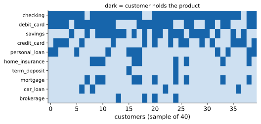
5.1.1 Support, confidence, lift - the three numbers
An itemset is any set of products; its support is the share of customers holding all of it (single-item supports are just penetration rates, Figure 57). A rule reads “holders of tend to hold ” - the arrow is our reading direction, not causality. Three numbers rank rules: Support is materiality, confidence is the reliability of the promise, lift is surprise - how much more often than chance, with 1 meaning independence. The probability identities deserve one slow reading. Support is the joint probability estimated by a count; confidence is the conditional probability , which by definition equals - support of the pair over support of the antecedent; and lift is the observed joint probability divided by what independence would predict. The second form makes two facts obvious: lift is symmetric (lift of equals lift of , which is why mirror rules always share it), and lift is exactly the definition of statistical independence.
A toy contingency table makes the three numbers concrete. Take 100 customers; 40 hold product , 30 hold product , 20 hold both:
| holds | no | total | |
|---|---|---|---|
| holds | 20 | 20 | 40 |
| no | 10 | 50 | 60 |
| total | 30 | 70 | 100 |
Then , , and : -holders take at 1.67 times the population rate - a real attraction, though a modest promise (only half convert). All three numbers come from the same four cells; when a rule confuses you, reconstruct its table.
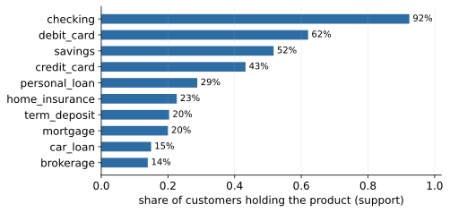
Worked on our data: 800 mortgage holders, 906 insurance holders, 678 with both, so support , confidence , lift - and the actionable list is the rule’s complement, the 15% of mortgage holders without the bundle. Read the rule aloud, all three numbers in one sentence: 17% of customers hold both; 85% of mortgage holders have the insurance - 3.7 times more often than a random customer. The deck’s sixty-second exercise runs the same arithmetic on brokerage deposit (558 brokerage holders, 815 deposit holders, 359 with both: support , confidence , lift ) - a weaker promise, the same verdict: genuine affinity, an affluent-saver pattern of the kind a segmentation of this product portfolio would surface (Block 4’s craft, applied here).
5.1.2 The confidence trap, in full
Here is the arithmetic that makes the trap inescapable rather than merely plausible. Confidence is - and if is held by nearly everyone, then is high for any whatsoever, informative or not. Condition on holding a savings account, condition on owning a red umbrella: either way the share with a checking account hovers near the base rate, because the base rate is where conditional probabilities live when the conditioning event carries no information. Formally, independent of gives exactly - so a 92%-penetration consequent guarantees roughly 92% confidence for free. Confidence answers “how reliable is the promise?”; only lift answers “is there a relationship at all, beyond chance?” - it is the ratio that divides the promise by what no-information would already deliver.
In practice
The confidence trap, from our own output: savings checking boasts 92.7% confidence - against a 92.4% base rate. Lift 1.003: pure base-rate flattery, Block 2’s accuracy trap wearing a basket. The two traps are literally the same fraction: a majority-class classifier is “93% accurate” and an everybody-has-it consequent is “93% confident”, and in both cases the impressive number was inherited, not earned. Rule hygiene in one line: filter by support, rank by lift, read confidence for the campaign promise. And deduplicate: one mortgage–insurance affinity surfaces as a dozen rules - both directions, re-decorated with irrelevant extras (Figure 59) - one insight in ten costumes.
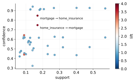
The rule landscape (Figure 58) is worth memorising: a dense crowd at lift - popular items co-occurring by arithmetic, not affinity - and a handful of outliers worth a meeting. The discipline (filter, rank, deduplicate) exists precisely to fish the outliers out of that crowd.
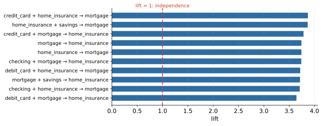
5.1.3 Redundancy, and the numbers beyond the big three
Acting on rules deserves its own honesty. The 15%-without-insurance call list may differ exactly in whatever made them decline the bundle; the honest upgrade is an experiment - hold out a control group, measure uplift, not response. And expect feedback: acting on a pattern changes it, so rules are re-mined on fresh data and rule lists carry dates. Association rules nominate actions; experiments validate them. Beyond the big three, leverage () resists tiny-support flattery; conviction, , rephrases confidence against independence (1 means independent, means never wrong); and closed/maximal itemsets compress the inventory.
Conviction rewards one more sentence, because its formula looks opaque until you read it as a ratio of error rates. The numerator is how often the rule would be wrong if told us nothing (a random customer lacks that often); the denominator is how often the rule is wrong. Conviction therefore says “the rule fails this many times less often than independence would”. On the toy table above: - the rule is wrong 1.4 times less often than chance. Unlike lift it is direction-sensitive, which occasionally breaks the tie between a rule and its mirror.
Redundancy is not a cosmetic nuisance; it is a reporting hazard. Because lift is symmetric, every affinity ships as two rules; because adding a near-universal item to either side barely moves the numbers, each of the two spawns decorated variants (+ checking, + debit_card). A ten-slide “insights deck” can easily contain one insight. The professional discipline: collapse mirrors, drop rules whose antecedent is a superset of a simpler rule with the same consequent and no better lift, and report each surviving affinity once - with all three numbers and one honest sentence.
5.2 Mining at scale
Brute force dies immediately: itemsets to count. At our that is a harmless 1,023; at a supermarket’s it is astronomy, and yet stores mine baskets every night. The rescue is the Apriori principle (downward closure): every subset of a frequent itemset is frequent - equivalently, an infrequent itemset’s supersets are infrequent and need never be counted.
5.2.1 Downward closure, proved in three sentences
Every customer who holds all items of a set also holds all items of any subset - holding more can only shrink the set of qualifying customers, never grow it. Hence whenever : support is monotonically non-increasing as itemsets grow. So if already fails the support threshold, every superset fails it too - and an algorithm may skip all of them without counting a single one. That is the entire mathematical content of Apriori; everything else is bookkeeping.
5.2.2 The level-wise search and its economics
Apriori (1994) applies the principle level-wise: count the support of all 1-itemsets and prune the infrequent ones; build candidate 2-itemsets only from surviving 1-itemsets and count those; build candidate 3-itemsets only from pairs of surviving 2-itemsets, checking that every 2-subset survived; repeat until a level produces no candidates. The deck’s five-customer toy shows the mechanism end to end: with min-support at 2-of-5, {leasing} dies at level one, so {leasing, anything} is never even generated; {loan, deposit} dies at level two, so the only conceivable 3-itemset {card, loan, deposit} is pruned before counting because one of its subsets already failed. The economics: the exponential candidate space is tamed because each pruned itemset takes its entire superset cone with it, and in sparse data almost everything is pruned early. The cost that remains is I/O - every level re-scans the data - which Apriori accepts in exchange for simplicity and easy parallelisation.
The throttle on the whole machine is min_support, and it is a business number, not a tuning knob: “rules touching 3% of customers cannot fund a campaign” is the right sort of justification. Its consequences run in both directions. Set it too low and the candidate levels stop pruning: the frequent-itemset inventory explodes, the rule list balloons into thousands of fragile patterns each supported by a handful of customers, and multiple testing - which is built into the method, since every itemset is a hypothesis - guarantees that many are noise. Set it too high and only the obvious survives: checking co-occurs with everything, and the list becomes a penetration report. And since retail’s interesting items are individually rare, long-tail catalogues get mined at category level (“any insurance product”) where supports are honest.
5.2.3 FP-Growth, honestly
FP-Growth (2000) reaches the identical output by a different route: it compresses the baskets into a prefix tree (the FP-tree) in which customers sharing frequent prefixes share branches, then mines the tree recursively, extracting each item’s “conditional” subtree and recursing on it - no candidate generation at all, and only two scans of the data. That is the whole honest story: same definitions, same frequent itemsets, same rules; the win is engineering (memory locality, no repeated I/O), which is why it is the usual industrial choice, and why at our you cannot measure the difference. mlxtend ships both. Whatever the miner, output discipline is fixed: filter support, rank lift, deduplicate, then read.
5.3 Text becomes numbers
Banks are full of unmined text - complaints, chats, advisor notes. Our corpus: 1,200 complaints, five categories (card fraud, mortgage, fees, app & service, collections), and the target task of routing each to the right team. Models eat numbers, so the craft is the bridge: strings to a feature matrix, in four deliberate steps. Normalise (lowercase, punctuation - decisions, not defaults); tokenise; count - the bag of words, one column per token, word order discarded on purpose (“the bank closed my account” equals “my account closed the bank”); weigh - TF-IDF. Each step throws information away on purpose; the art is knowing what you can afford to lose.
5.3.1 Tokenisation decisions are modelling decisions
The normalisation submenu is feature engineering by another name, and every default hides a claim about your problem. Lowercasing asserts that Bank and bank mean the same thing - usually true, false for tickers and product names. Stripping punctuation asserts that “24/7” and “PLN” and exclamation marks carry nothing - yet in complaint text, punctuation density is a decent anger proxy. Stopword lists shrink the matrix but a default list happily deletes not (“not refunded”!) - a single deleted token that reverses the meaning of a sentence; audit any list before trusting it. Stemming chops endings fast and crudely (charged, charges, charging collapse to one column - efficient, occasionally comic); lemmatisation reduces to dictionary base forms and earns its keep in morphology-rich languages - Polish’s opłata, opłaty, opłatom, opłatach are one lemma and four bag-of-words strangers, with character n-grams as the robust fallback and multilingual embeddings largely dissolving the problem. Every one of these choices merges or splits columns of the future matrix; the discipline is the same as for any engineered feature - document the recipe, and keep it identical between training and production, because a router trained on lemmatised text and fed raw inflections is comparing strangers.
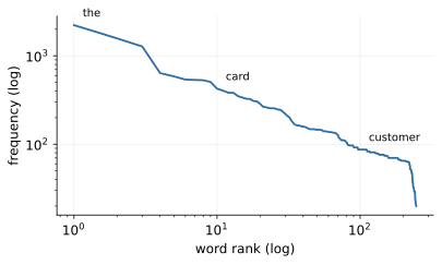
5.3.2 Zipf’s law and what it implies
Every corpus obeys Zipf’s law (Figure 60): a few words everywhere, most words rare, a near-line on log-log axes - frequency falling roughly as one over rank. Both ends are trouble - the head carries no distinction, the tail no statistics - and max_df/min_df are the vectoriser’s leash. The law has a consequence worth stating explicitly, because it drives half the engineering in this section: as the corpus grows, the vocabulary keeps growing (new rare words keep arriving, essentially forever) while the information does not grow with it - each new column is rarer, appears in fewer documents, and supports weaker statistics than the last. Feature matrices built from text therefore widen without bound unless pruned, and pruning the tail with min_df is nearly free: a token seen in one document cannot generalise to a second one anyway.
5.3.3 TF-IDF, with the arithmetic on the table
TF-IDF then weighs each count by rarity, so account costs almost nothing while skimmed and casino scream card fraud (Figure 61); length normalisation keeps rambling complaints from outweighing terse ones. A tiny worked example fixes the mechanics. Take a four-document corpus and a document in which some term appears 3 times. If the term occurs in all four documents, its idf is : weight , the raw count, no boost - ubiquity buys nothing. If instead it occurs in only two documents, idf is : weight . Same count, half the corpus coverage, fifty percent more weight - and the rarer the term, the steeper the boost. Note that idf is a corpus statistic: it is estimated from the training documents and then applied, frozen, to every future document - which is why it is a fitted parameter and why it leaks if computed on the full dataset before the split.
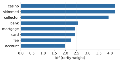
5.3.4 N-grams, sparsity, and cosine
N-grams buy back fragments of word order - collection calls, unauthorized transactions - worth three accuracy points on our corpus at the price of a vocabulary explosion ( features; real corpora shed thousands of one-off tokens to min_df with no loss). The trade is always the same shape: longer n-grams capture more context and appear less often, so each added order buys specificity and pays in Zipf-tail sparsity - word bigrams are usually worth it, trigrams rarely, beyond that almost never for classification. Character n-grams run the same trade at the sub-word level: a 3–5 character window slides over the string, so opłata and opłatach share most of their features automatically, typos cost one n-gram instead of a whole word, and morphology-rich languages get robustness that word tokens cannot offer - the standard fallback when no good lemmatiser exists.
The resulting matrix is 90–97% zeros - a complaint uses a few dozen distinct words of a vocabulary of hundreds - and sparsity is not a defect but the resource that makes text mining affordable. Sparse storage keeps only the non-zero entries, megabytes instead of gigabytes; sparse-aware linear algebra multiplies only what is stored, so training cost scales with the number of words in the corpus, not with the matrix’s nominal area. That is why wide text models stay fast - and one more reason wide-and-sparse is linear-model country. The practical corollary from the lab: never densify a sparse matrix “just to look”; that single .toarray() is how notebooks die.
For distances, cosine similarity compares direction rather than length, - Block 4’s “distance is a modelling choice”, text edition. The reason length-normalisation matters is mechanical: a long and a short complaint about the same fraud contain the same word mix but very different word amounts, so Euclidean distance places them far apart on length alone. Dividing by the norms erases document length and compares only proportions - two documents about skimmed cards are close whether one is a paragraph and the other a page. And once text is columns, the whole course applies: EDA on top words, clustering complaints, truncated SVD as latent semantic analysis, and classification - next.
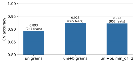
5.4 Classifying complaints
The router is two familiar pieces - a TfidfVectorizer welded to LogisticRegression in a pipeline - with the golden rule in its text edition: vocabulary and idf are fitted parameters, so the vectoriser fits on training data only. Test accuracy: 90.3% on five balanced classes against a 20% chance floor (Figure 63), with errors concentrated exactly where complaints ramble across topics - the cases a human router also flags. Balanced classes make accuracy honest here; real complaint streams are imbalanced, and then per-class recall and macro-F1 (each class weighted equally) take over, with the worst class - not the average - being the number that pages you.
5.4.1 Why linear models rule sparse text
It is worth pausing on why so unfashionable a model wins here, because the reason generalises. A TF-IDF matrix has thousands of columns, each individually weak (casino appears in a handful of documents) but collectively decisive, and each acting near-additively: more fraud words, more fraud evidence. That is precisely the regime a regularised linear model is built for - it can carry a coefficient for every column, regularisation keeps the thousands of weak coefficients from overfitting, and sparse arithmetic makes the whole thing fast. Trees, by contrast, must pick one feature per split; with signal smeared thinly across thousands of near-binary columns, axis-by-axis splitting wastes most of the evidence, which is why GBDT rarely beats logistic regression on raw sparse text. Add interpretability - a coefficient per word per class is an audit trail - and linear-on-TF-IDF remains the default that alternatives must beat.
5.4.2 Naive Bayes in one derivation sketch
Naive Bayes remains the classical fast baseline (MultinomialNB; the baseline discipline says try it), and its logic fits in four lines. Bayes’ rule gives ; the “naive” step assumes words are independent given the class, so , with each estimated by a smoothed count: how often word appears in class- training documents. Take logarithms and the classifier scores each class by - a linear function of the counts, which is why NB and logistic regression are siblings: same functional form, differently estimated weights. The independence assumption is plainly false (collection and calls travel together), so the estimated probabilities are badly calibrated - but classification needs only the ranking of class scores, and correlated words mostly inflate all class scores together without flipping the winner. Wrong model, right argmax - which is why NB classifies far better than it estimates, and why it filtered the world’s spam for decades.
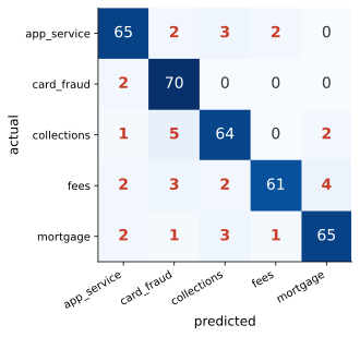
5.4.3 Reading the router, then operating it
Interpretability carries over intact: top coefficients per class (Figure 64) are a sanity check you can read - fraud listens for card, payments, online; collections for collector, calls; mortgage for agreement, contradicts - and an off-topic top word is the leakage smell, text edition (imagine refunded predicting fraud, written after resolution). Read the confusion matrix (Figure 63) the same way you read Block 3’s: the diagonal is comfort, the off-diagonal cells are the product. Each off-diagonal cell is a specific routing failure with a specific cost - fees complaints landing in the mortgage queue waste a specialist’s morning; fraud complaints landing anywhere else delay a card block - and “done” in the lab explicitly requires an explanation per cell, because a cell you cannot explain is a cell you cannot fix.
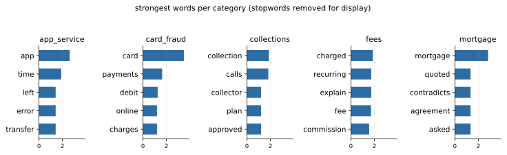
Operations adds Block 3’s threshold logic in multiclass form: route automatically only above a confidence bar. On our test set, a 0.6 bar auto-routes 81% of complaints at 98.3% accuracy and queues the hard 19% for humans - the bar chosen with the operations team, not by the data scientist alone. The sweep around that point shows the trade explicitly: no bar means 100% automation at 90.3% accuracy; a 0.5 bar auto-routes 91% at 93.6%; 0.6 gives 81% at 98.3%; 0.7 gives 79% at 100% on this test set. The economics behind the choice are Block 3’s expected-cost logic verbatim: every point of the bar trades automation volume (human minutes saved) against auto-routing errors (misfiled complaints, each with a cleanup and reputation cost), and the right bar depends on numbers only the operations team has. The human queue is not an admission of failure - it is the design: human attention concentrates exactly where the model itself signals difficulty.
Embeddings and LLMs are the modern bridge - dense vectors where “the app crashes” and “application keeps freezing” finally meet - feeding the same classical models: Block 2’s feature-factory promise delivered, with TF-IDF still winning when data is small, latency and cost matter, and the auditor asks why. The shop rule is Block 3’s discipline verbatim: start with TF-IDF plus logistic, and let embeddings earn their complexity against that baseline.
5.5 Pitfalls of both crafts
5.5.1 The shuffled-basket null test
The sobering demonstration, basket edition: shuffle every product column independently (killing all co-occurrence, keeping all penetrations) and re-mine with identical settings - 312 “rules” still pass the filters, against 545 on the real data. The rule count is nearly meaningless; what noise cannot fake is lift: 1.14 versus 4.28. Recognise the move: this is Block 4’s noise question - what would this deliverable look like on data with no structure? - answered with a number instead of a shrug, the unsupervised cousin of a permutation test. Shuffling each column independently preserves every marginal (penetration rates are untouched) while destroying every joint pattern, so anything the miner still “finds” is pure arithmetic of popular items co-occurring by chance under the filters. The 312 phantom rules calibrate your scepticism: a rule from real data impresses only to the extent that its lift clears what the shuffled world produces. The test costs five lines of code and should accompany any mined-rules deliverable, for the same reason a shuffled-label baseline accompanies a classifier.
5.5.2 Text hygiene and the joint sin list
Text hygiene mirrors it: the vectoriser inside the pipeline (vocabulary leaks too - a vocabulary or idf computed on the full corpus has seen the test documents, and rare-word idf is the sharpest leak); vocabulary drift over time (out-of-time testing applies to text, and deserves monitoring in production: new products, new slang and new fraud patterns arrive as words the fitted vocabulary has never seen, the router’s failure is silent - out-of-vocabulary tokens are simply dropped, and the complaint is confidently misfiled into the nearest old category - so the minimal monitoring watches the prediction-confidence distribution for a growing low-confidence mass, per-class routing rates against baseline, and a small ongoing human-labelled sample, with retraining triggered by drift, not by the calendar); PII living inside free text (anonymise before mining - GDPR is not a footnote); and language reality beyond our conveniently English corpus. The joint sin list: confidence without lift; one insight in ten costumes; reading rules causally; stopword cargo-culting; evaluating text models on near-duplicate documents across the split - templated complaints landing on both sides of it are the duplicate leak, text edition; and shipping a router with no human queue - 90% right means one complaint in ten lands on the wrong desk, silently.
5.6 Lab and hand-in
The lab notebook 05_pattern_mining_text mines the baskets (penetration, Apriori, rules, the confidence trap on live output), runs the shuffled-basket sobering check, builds the text bridge (Zipf, TF-IDF, idf spot-checks), trains and audits the router (classification report, confusion matrix, misrouted examples - which visibly ramble), operates it with a confidence bar, and reads the per-class top words. Exercises add n-grams, the Naive Bayes bake-off, a min_support sweep ending in a reporting decision, complaint clustering (Block 4 meets Block 5), character n-grams for robustness, and a drift stress-test. “Done” means three rules that survive the lift-versus-confidence interrogation and a confusion matrix whose every off-diagonal cell has an explanation. Project checkpoint: two weeks to the presentation - interpretation, a written recommendation, and the presentation skeleton belong to this week, and the code-plus-slides upload lands before Block 7. If your project touches baskets or text, the honesty kit extends to it directly: lift over confidence, deduplicated rules, the vectoriser inside the pipeline, and one out-of-vocabulary sentence in the limitations.
6 Block 6 - Neural networks & responsible ML
The last teaching block does two jobs. It completes the model-family tour with the one family everyone has heard of - honestly, foundations first, entered into the same tournament as everyone else. And it assembles the course’s scattered responsibility threads - selection bias, truthful reasons, segments that must not decide, PII - into one section with our own model’s numbers in it.
6.1 From the neuron to the MLP
6.1.1 One neuron is Block 2, wearing a new hat
A neuron is a weighted sum squashed through a nonlinearity, - which the attentive reader of Block 2 recognises immediately: one neuron with a sigmoid is logistic regression. Write both out and compare symbol by symbol. Logistic regression computes with ; a single sigmoid neuron computes exactly the same expression. Same weights, same bias (the intercept under a new name), same squashing function, and - as we will see shortly - the same loss. The correspondence is not an analogy; it is an identity, and it means everything you fear about neural networks already has a Block 2 anchor: weights as slopes, sigmoid as probability, log-loss as the objective. (The perceptron dates to 1958 - older than CRISP-DM and credit scoring; two AI winters later, data and GPUs made the mathematics bloom largely unchanged.)
What changes everything is not the neuron but the stacking. The multilayer perceptron (MLP) arranges neurons in layers: each hidden unit computes its own logistic-like score of the layer below, and the next layer combines those scores rather than the raw features. Where logistic regression sees ‘utilisation’ and ‘delays’ as given columns, a hidden unit can learn to fire on ‘high utilisation and recent delays together’ - a derived feature nobody typed in. The network thereby engineers its own features - Block 1’s craft, automated - which is the entire selling point. Depth composes: layer two builds combinations of layer one’s combinations, so the representational vocabulary grows multiplicatively with each layer while the parameter count grows only additively.
6.1.2 The XOR lesson: why linear models need hand-fed interactions
The classical XOR lesson says why depth matters. Consider the “either-or” pattern: risky iff high utilisation or a savings buffer, but not both (each alone is a warning; together they cancel). Put the two binary flags on axes: the risky cases sit at and , the safe ones at and . No single straight line separates the diagonal corners - try it - and a single neuron is a single straight cut, so it cannot learn this pattern no matter how long you train. (That 1969 observation helped freeze the field for a decade.) One hidden layer fixes it, and it is worth seeing exactly how. Let fire when (an OR detector) and fire when (an AND detector); then an output unit that fires when computes “OR but not AND” - which is XOR, assembled from two linear cuts and one linear combination of their outputs. The network learns weights like these from data; nobody hand-specifies the detectors. Contrast the course’s other families: trees find such interactions natively by splitting twice (Block 3); linear models must be hand-fed a product term (Block 2’s interactions); the MLP builds the pieces itself, at any angle, smoothly.
6.1.3 What universal approximation does and does not promise
You will meet the folklore claim that “one wide-enough hidden layer can fit anything.” The underlying theorem (universal approximation) is real: a single hidden layer with enough units can approximate any reasonable continuous function to any desired accuracy. But read the fine print the way you learned to read a model’s AUC. It is an existence statement: such weights exist; nothing says gradient descent will find them from your finite, noisy sample. “Wide enough” can mean absurdly wide - more units than you have training rows. And decisively for this course: the theorem says can, not will - a family rich enough to fit anything is exactly a family rich enough to fit your noise. Universal approximation explains why the MLP is a serious contender; the validation set still decides whether it earned its keep.
6.1.4 Counting parameters: sizing the ambition
Counting parameters keeps the ambition honest, and the counting rule is simple: each layer with inputs and units carries weights plus biases. Our lab network maps 10 features through hidden layers of 32 and 16 units to one output (): , then , then , totalling weights and biases - against logistic regression’s for the same task. Whether 897 knobs is a lot depends entirely on the data budget: comfortable on 21,000 training rows (roughly 23 rows per parameter), and in need of a much tighter leash on Block 1’s little 2,800-row world (barely 3 rows per parameter). Size the leash to the data. The same counting exercise scales unchanged to modern large language models - and so does the data appetite.
6.1.5 Activations: the bend is where the power lives
Between layers sits the activation - sigmoid, tanh, or the modern default ReLU (, cheap, gradient-friendly) (Figure 65); without the bend, stacked layers collapse into one linear model. The collapse is worth verifying once by hand: if layer one computes and layer two computes , the composition is - a single matrix, a single linear model, no matter how many layers you stack. The nonlinearity is therefore load-bearing: the only thing standing between a thousand-parameter network and an overdressed linear regression. Why did ReLU displace the sigmoid inside the network? Look at the derivatives. The sigmoid’s slope never exceeds and decays to zero for large ; backpropagation multiplies the gradient by such a factor at every sigmoid layer, so ten stacked layers can shrink it by - the vanishing gradient, and the practical reason deep sigmoid networks refused to train for decades. ReLU’s slope is exactly 1 wherever the unit is active, so gradients pass through undiminished; its price is that a unit pushed permanently negative goes silent (“dies”) - one entry on the debugging checklist below. The sigmoid survives honourably at the output, where we need a probability - Block 2 says hello.
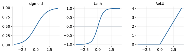
At the output, the head and the loss match the task: sigmoid with log-loss for binary PD (Blocks 2–3’s loss, verbatim), softmax with cross-entropy for the five-class complaint router (Block 5), a linear unit with squared error for regression. The softmax, for the record, is - the multi-way sigmoid: five scores in, five probabilities out, summing to one. The body of the network is task-agnostic feature machinery; only the head and the loss change - one body, exchangeable heads, which is the design idea that carries all of deep learning (and, in passing, is all multi-task learning is).
6.1.6 Backpropagation: the chain rule doing bookkeeping
Training is bookkeeping, not magic: forward pass, log-loss, then backpropagation - the chain rule attributing a share of the error to every weight - and a small gradient-descent step (with learning rate ), repeated over epochs. To see that it really is just the chain rule, work the smallest network that has any depth at all: one input , one hidden unit, one output, so with log-loss . For the output weight, the chain rule gives the same beautiful cancellation you met in Block 2: the residual times the input to that weight. For the hidden weight, simply keep chaining: Read it right to left: the error signal is passed backward through , scaled by the local slope , and finally multiplied by the input - exactly the pattern “error times downstream weight times local slope times local input” that repeats at every layer of every network ever trained. Backpropagation is nothing more than organising this computation so that each intermediate quantity is computed once and reused instead of re-derived per weight - the accountant’s trick of running subtotals, which is why the honest name for it is bookkeeping. You can also now see the vanishing gradient in the formula: every factor is at most , and deep chains multiply many of them.
6.1.7 Stochastic gradient descent, learning rates, and Adam
In practice the gradient is estimated on mini-batches (stochastic gradient descent; one pass over all batches is an epoch). Computing the exact gradient would mean touching every one of 21,000 customers before taking a single step - accurate, slow, and pointless at scale; a random batch of, say, 200 customers gives a noisy but unbiased estimate at a hundredth of the cost. The noise is even a feature, not just a tolerated flaw: the jitter helps escape poor valleys of the non-convex landscape - controlled chaos, cousin to the bootstrap’s controlled resampling in Block 3. The learning rate has simple physics: the loss surface near a minimum is a valley, and the step you take is times the slope. Too large and you leap across the valley to the opposite wall - and back, and across again - settling, if at all, visibly higher than the floor. Too small and each step is a shuffle: the loss creeps down so slowly the run looks dead. Adam, the default optimiser, deserves one honest paragraph: it keeps a running average of each weight’s recent gradients (momentum) and of their recent magnitudes, and scales each weight’s step by the ratio - so weights with consistently small gradients get proportionally larger steps and vice versa, which makes it far less temperamental about the initial rate. But it is still gradient descent with a learning rate you own: Adam removes tantrums, not judgement, and a bad rate still produces a bad run.
6.1.8 Initialisation and seeds: why the MLP wobbles when trees do not
Unlike OLS there is no closed form, and unlike logistic regression the landscape is not convex - many valleys, so initialisation and seeds matter: the reproducibility rule, weights edition. The contrast with the rest of the course is instructive: a single tree is deterministic given the data, and a forest averages away its own randomness, but the MLP starts from random initial weights (it must - if all weights started equal, every unit in a layer would compute the same thing and receive the same gradient forever; symmetry has to be broken), and gradient descent then rolls downhill into whichever valley is nearest. Different seed, different valley, different network, slightly different AUC. So fix the seed for reproducibility, but never mistake a fixed seed for stability - run twice with different seeds before claiming an improvement, and if the seed wobble is bigger than your claimed gain, you have claimed noise (Block 3’s CV-spread discipline, verbatim).
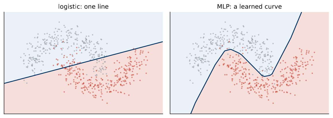
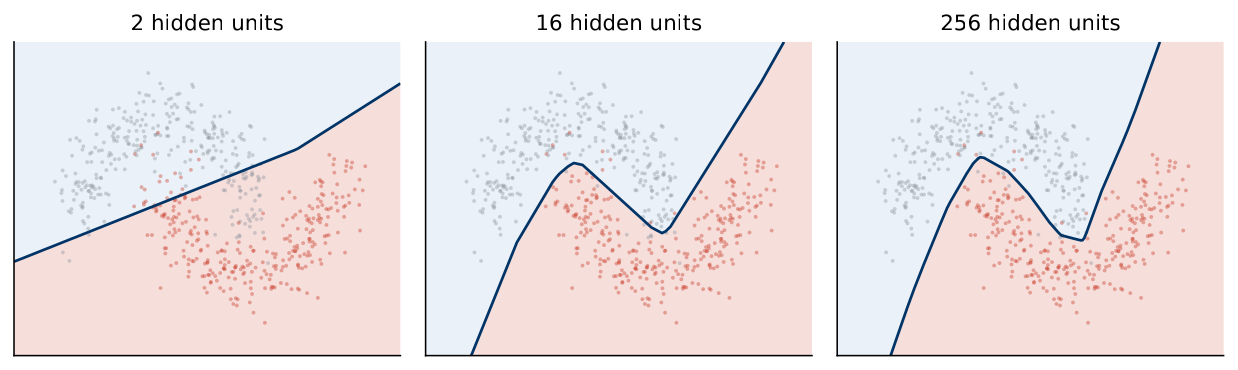
What the bend buys is visible on the course’s favourite crescents (Figure 66): logistic must draw a line, the MLP learns a smooth curve with no hand-engineered features - compare the tree’s staircase from Block 3. And what capacity costs is equally visible (Figure 67): two hidden units underfit, 256 memorise the noise along the edge - the U-curve of Blocks 2 and 3, neural edition, with width and depth as the capacity dials where degree, depth and used to be. Universal-approximation folklore (“one wide-enough layer can fit anything”) is a statement about can, not will; nothing about neural networks repeals the U-curve.
6.2 Training realities
6.2.1 Reading the canonical plot
Reading a training run is a skill worth more than any architecture trivia. The canonical plot (Figure 68): training loss falls forever; validation accuracy rises, peaks, and decays as memorisation sets in - early stopping halts at the peak and is the network’s everyday leash. The shape is inevitable, not accidental: early in training the network learns genuinely general structure, which also lives in the validation set, so both curves improve together; past some point the cheapest way to keep lowering the training loss is to encode the training set’s idiosyncrasies - noise, one-off customers, label quirks - which by definition do not live in the validation set, so the validation curve turns. The divergence of the two curves is overfitting watched in real time: the U-curve traced along the training-time axis instead of the capacity axis.
6.2.2 Early stopping as regularisation
That reframing explains why early stopping is a genuine regulariser and not a mere convenience. Stopping at epoch 40 instead of 400 means the weights never travelled far from their small random initial values - and a network whose weights are constrained to stay small is, in effect, a lower-capacity network - training time functions as a capacity dial. Halting early is therefore first cousin to weight decay (which pulls weights toward zero explicitly, ridge-style) and to simply building a smaller network - three roads to the same place on the U-curve. The complete leash inventory maps one-to-one onto the course: early stopping (GBDT’s number of rounds), weight decay (ridge), dropout (randomly silencing units during training, a bagging-flavoured randomiser), smaller networks (tree depth) - and more data, the only leash that adds signal rather than restricting the fit. Every mechanism is new; no idea is new. Ask the fixed question - where is the leash? - and any future architecture becomes familiar in an afternoon.
6.2.3 The learning rate, and the practicalities that bite
The learning rate is the one knob that can consume an evening (Figure 69): too high and the steps overshoot the narrow valley and settle at a visibly worse loss; too low and the network sleeps; the usable band spans orders of magnitude, so it is searched on a log scale - try before refining (Block 3’s tuning advice applies verbatim). GBDT’s learning rate is the same concept - humble steps, more of them. Practicalities that bite: scale the features - gradient descent on unscaled inputs limps, because a feature measured in thousands drags gradients around while a 0–1 flag whispers, so the pipeline with a scaler is mandatory again (gradient country, not tree country); impute-plus-indicator returns, because the MLP has no native missing-value handling (GBDT stays the more convenient family here); and everything costs more - minutes-not-milliseconds training, a larger tuning surface, a hungrier data appetite - all of which must be paid for by measured accuracy.
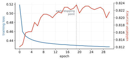
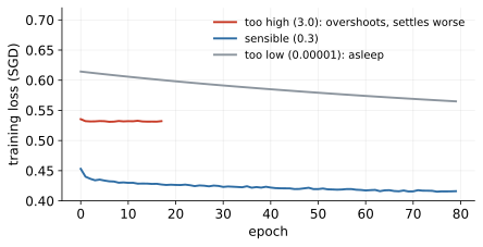
6.2.4 Debugging a training run: the field checklist, in prose
A field checklist for broken runs, expanded into the reasoning behind each line. Loss is NaN or exploding: the learning rate is too high - each overshoot lands on a steeper slope, the next step is larger still, and within a few iterations the weights overflow; drop the rate tenfold and restart. Loss flat from epoch one: three suspects, checked in order - the rate is too low, the features are unscaled (one loud feature dominating every gradient), or a layer of ReLUs has died (all units stuck negative, passing zero gradient - often the scar of an earlier too-high rate). Train great, validation ugly: the U-curve says hello - tighten a leash. And the classic smoke test: a healthy network memorises 100 rows perfectly - 897 parameters should crush 100 points - so if yours cannot, the bug is in the pipeline (a label misaligned with its features, a broken scaler, a wrong loss), not in your patience. Note the shape of this list: it is Block 1’s read-the-traceback discipline, upgraded to a stochastic system where the failure is a curve, not an exception.
In practice
sklearn’s MLPClassifier inside a pipeline is enough for foundations and for this course’s tournament; industry reaches for PyTorch when architectures get custom. The habits transfer unchanged.
6.3 The verdict
The final tournament (Figure 70) closes the course’s longest-running experiment: MLP 0.759 - clearing the baseline (0.731) by almost three points, so complexity earned its keep - yet still behind the tuned GBDT (0.773). (The random forest’s 0.774 is a statistical dead heat with the GBDT - we carry the tuned GBDT forward as the ensemble representative.) The real portfolio’s final order reads GBDT MLP SVM logistic (the Block 3 interlude’s SVM entered the same tournament at 0.715, trained on a 6,000-row subsample): the most fashionable family takes second place, and the tabular crown stays with boosted trees, exactly as the benchmark literature predicts.
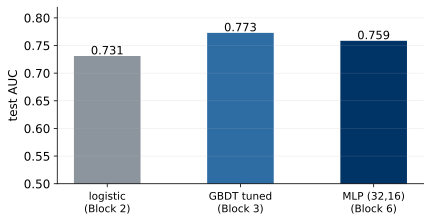
6.3.1 Where neural networks actually win
That benchmark literature deserves an honest summary, because our result is one instance of it. Across repeated public comparisons on mid-size tabular problems - tens of columns, thousands to hundreds of thousands of rows, the shape of most credit, churn and pricing datasets - tuned gradient-boosted trees win most of the time, deep models win sometimes, and the margin either way is usually modest. The structural reason: tabular columns are heterogeneous and individually meaningful, with no spatial or sequential arrangement for layers to exploit, so the MLP spends capacity rediscovering what column structure gives trees for free. Our 0.759 versus 0.773 is that paragraph in one line. Neural networks win elsewhere, and win by knockout: perception and sequence data - images, speech, text, time series - where layers exploit structure that tabular rows lack (pixels near pixels, words after words), and where the network’s real product is representation learning: the hidden layers learn the features that decades of hand-crafted pipelines failed to. Genuine tabular wins exist too: entity embeddings for thousand-category features such as merchant IDs, learned into dense vectors - the same idea as Block 5’s word embeddings; and representation reuse - autoencoders (Block 4’s reconstruction lens gone nonlinear, useful for anomaly scores) and pretrained models. The shop rule, final form: logistic GBDT deep, each step only after the previous one is beaten on honest numbers. What the course skipped on purpose - CNNs, transformers and attention, pretraining - each reduces to one focused week of reading once the neuron, the loss, SGD and the leash inventory are owned.
6.3.2 The interpretability bill
The interpretability bill prices the trade: Block 2’s receipt was exact and free - every coefficient a signed, quantified statement you could read to a customer - and the tree’s path was at least readable; the MLP’s hundreds of weights carry no individual meaning, so explanation becomes approximate reconstruction (SHAP and friends): fitting an explanatory account around the model rather than reading one off it. Two practical shapes of that reconstruction: reason codes - the top features pushing this customer’s score toward decline, extracted per decision and required, in some form, wherever adverse decisions must be explained - and global surrogates, a small tree or linear model trained to mimic the network, faithful in bulk but never guaranteed faithful for the one customer on the phone. In regulated lending the bill is concrete: adverse-action reasons that must be true, model-validation teams that must reproduce and attack the model, and regulator Q&A - each harder, slower, more contestable than with the receipt. The trade is therefore not accuracy versus beauty but accuracy versus auditability, monitoring cost and legal risk - priced per use case: a half-point of AUC that costs your explanation is a bad trade at a bank and a fine one in ad ranking. Context prices it.
6.4 Responsible ML
A wrong sales forecast wastes money; a wrong credit model declines the wrong people, systematically, at scale, silently - the social consequences the course outcomes name as K3. Every earlier block planted a piece - selection bias (Block 1), probabilities that price people (Blocks 2–3), segments that must not decide (Block 4), PII in text (Block 5) - and this section assembles them on our own model’s numbers, not hypotheticals. The operating question is never “is the model accurate?”; it is “what does the model do to people, and who checked?”
6.4.1 The legal floor
The legal floor (EU, sketched; the real thing is done with lawyers in the room) has four planks. First, GDPR Article 22: a person has the right not to be subject to a decision based solely on automated processing when it produces legal effects or similarly significantly affects them - and credit refusal is the textbook case. Automated decisions are permitted under exceptions (contractual necessity among them), but only with safeguards: the right to obtain human intervention, to express one’s point of view, and to contest; alongside it, the GDPR’s transparency articles require meaningful information about the logic involved - not the weights file, but a truthful, comprehensible account of what drives the decision. Second, the duty to state reasons: declined customers are informed of the grounds, and the grounds must be true ones - Block 1’s punchline about truthful reasons was never merely imputation hygiene; the US calls this “adverse action.” Third, protected attributes: sex, ethnicity and friends are off-limits for credit decisions - which is precisely why the audit below runs by sex - with age in a grey, jurisdiction-dependent zone (hence a lab exercise, not a lecture assertion). Fourth, the EU AI Act lists creditworthiness assessment as high-risk, which converts a familiar list from best practice into statute: risk management, data governance, technical documentation and logging, transparency, human oversight, demonstrated accuracy and robustness. Your job as a builder is not to practise law; it is to know when to invite the lawyers - earlier than feels natural.
6.4.2 Where bias enters: the doors
Bias needs no malice to enter - it has doors, and each door is a mechanism you can name. Labels: “default” is not a fact of nature but a record of past collection practices - if one group was historically pursued harder, its recorded default rate is inflated, and the model faithfully learns the inflation (historical bias, living in the target). Selection: the training data contains approved customers only; the rejected are absent by construction (Block 1), so the model learns the approved world and is deployed on the whole one. Features: proxies encode group membership without naming it - more below. Measurement: the same quantity is captured with different fidelity across segments - income verified for some and self-declared for others is two different features wearing one column name. Objective: optimising average cost ignores who pays it; a threshold that is cost-optimal in aggregate can concentrate its errors in one group. And feedback loops - selection bias motorised. Walk the credit example through one full turn: the model declines a group at a higher rate; fewer loans to that group are observed; there is consequently no evidence the declines were wrong (a declined customer generates no repayment record); next year’s model, trained on the new data, declines them again - now with better “justification.” The model does not merely inherit the bias; it manufactures more of it, and every system that acts on its own predictions contains such a loop somewhere. Loop breakers: reject inference (Block 1’s vocabulary), deliberate exploration - approve a small random slice near the boundary, expensive but informative - and monitoring group gaps over vintages, not snapshots. None of these doors is opened by malice. All of them are opened by default, unless someone checks.
6.4.3 Fairness, formally - and why you must choose
Fairness itself has competing formalisations. For a protected group , decision (1 = decline) and outcome (1 = default): demographic parity demands equal decline rates, equal across groups; equalised odds demands equal error rates - the same FPR (creditworthy people wrongly declined) and FNR (defaulters missed) in every group; calibration within groups demands that a predicted 0.3 means 0.3 for everyone - independent of . All three sound obviously right, and the impossibility results of Kleinberg et al. and Chouldechova say they cannot all hold at once when base rates differ. A toy portfolio makes the conflict tangible. Two groups of 100 applicants; group A contains 30 true future defaulters, group B contains 10 - differing base rates, as in every real portfolio. Give yourself the best possible model: a perfect one, declining exactly the future defaulters. It satisfies equalised odds trivially (FPR and FNR are zero in both groups) and is perfectly calibrated - yet it declines 30% of group A and 10% of group B, violating demographic parity by 20 points. Now force parity instead, say by declining 20% of each group: in group A you must approve 10 future defaulters (misses), and in group B you must decline 10 creditworthy people (false positives) - you have manufactured unequal error rates to equalise decline rates. The general lesson is exactly this arithmetic: when base rates differ, decline rates, error rates and calibration are linked by accounting identities, and equalising one forces gaps in another. “Make it fair” is therefore not a specification; choosing which fairness is the decision, and it is not the data scientist’s alone.
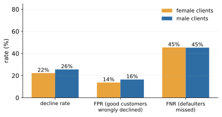
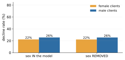
6.4.4 The audit, on real people
Then the audit itself, on real people: our GBDT at Block 3’s cost-optimal threshold (0.26), split by sex - an unambiguously protected attribute (Figure 71). Men are declined at 25.6% versus 22.3% for women, wrongly declined (FPR) at 16.5% versus 13.8% - with base default rates of 23.9% versus 21.0%. Read honestly: the gaps are modest and track the base-rate difference - the 3.3-point decline gap sits close to the 2.9-point base-rate gap - so this model does not amplify what the portfolio brought in. The verdict could have gone the other way: on the synthetic portfolio an age audit once turned a 3.6-point base gap into an 18-point decline gap - a model that manufactures disparity far beyond what the data contains - and nothing about the two models’ code or AUC would have told you which one you had. The only way to know which model you have is to measure.
6.4.5 Proxy discrimination: why removal fails
The “just remove sex” experiment (Figure 72) then lands the proxy lesson in its purest form: retrain the identical pipeline without the column, and removal changes essentially nothing - every bar identical - because six months of payment behaviour already carries whatever group structure exists. The model never needed the label: any feature correlated with group membership lets it reconstruct the group statistically, without anyone intending it. Deleting the label does not delete the information; “fairness through unawareness” here is free and toothless at once. The corollary cuts deep: if the measured gaps had needed fixing, no edit to the column list would have fixed them - any real repair would have to act on decisions (thresholds, constraints, data), not on feature names. This is why blindness-based compliance arguments (“the model cannot discriminate, it never sees sex”) fail on contact with data, and why the audit measures outcomes rather than inputs.
6.4.6 Mitigation and governance
The mitigation menu spans three stages of the pipeline. Pre-processing - fix the data: rebalance, collect better labels, attack selection bias at its source (recall that the rejected are missing by construction). In-processing - fairness constraints inside training, such as equalised-odds penalties added to the loss; Block 3’s monotonic constraints were a mild cousin of the same move. Post-processing - per-group thresholds: effective and transparent in exactly the way the toy arithmetic above suggests, and legally delicate, because it explicitly uses the protected attribute to repair its own harm - a decision that belongs with lawyers, not in a notebook. One option is always available and never delicate: measure the gaps and publish them internally, so that the people entitled to decide the trade-off can decide it with numbers in front of them. Toolkits exist (fairlearn, AIF360); the hard part was never the code.
Responsibility extends past fairness: drift monitoring that watches gaps and not just Gini - portfolios move, and yesterday’s fair model can be today’s unfair one; documentation - time-travel audits, imputation recipes, threshold rationales, fairness measurements - because at audit time the written trail is the model; human oversight as architecture, not UX - Block 5’s confidence bars and queues, statutory under the AI Act; and data minimisation - collect what the decision needs, not what the crawler found. Governance assigns the seats: the builder is the first line - measurements, documentation, honesty clauses, everything this course drilled; independent model validation is the second - a professional adversarial verifier that rebuilds your results and attacks your assumptions (a common first job for graduates of courses like this one); the model-risk committee owns the trade-offs no analyst should carry alone (which fairness, whose cost); audit and regulator arrive later and read everything. The take-home checklist has six lines - when is each feature known and may we use it (two written answers per column); gaps measured (decline, FPR, FNR, calibration by group) before go-live and on schedule after; a true explanation path per declined customer; a reachable human who can overrule; alarms on drift and on gap widening; an owner who is a name, not a department - and most real-world model-risk findings are a missing line from it.
6.5 Defence briefing, exam, and the course in five sentences
The lab notebook 06_neural_networks trains the MLP in a pipeline, reads its loss curve, sweeps the learning rate, reruns the final tournament, and then performs the fairness audit - the group report by sex at the cost-optimal threshold, the age audit as an exercise, and the sex-removal experiment - ending with the exercise that matters beyond the course: run the same audit on your own project’s model and put the table in your limitations section. “Done” means your MLP verdict matches your tournament table and your fairness audit has numbers in it.
The defence briefing: presentations run 6–8 minutes plus questions - business framing, data work, two model families against a baseline, honest evaluation, recommendation - with all code and the exact final slides uploaded before Block 7 starts; notebooks must survive Restart & Run All (the habit since Block 1 - this is why); the honesty kit (CV spread, leakage audit, threshold argument, limitations paragraph) is the differentiator; and AI assistants were allowed all semester, but you answer for every submitted line - expect to explain and modify your code live. The canonical failure modes, from the graveyard: a proud suspicious AUC (find the leak before we do), unexamined accuracy on an imbalanced target, complexity without a baseline, structure without honesty clauses, an order-dependent notebook, and analysis that ends in metrics instead of a decision. The exam (term 0, 120 minutes) weighs conceptual multiple choice at 40% and short open questions at 60%, testing selection and interpretation - “here is a confusion matrix, a rule, a coefficient, a dendrogram: what do you tell the business?” - not derivations; the worked-example slides calibrate the by-hand questions, and the six “Block in five sentences” slides are the compressed syllabus.
The course itself compresses to five: start from the decision; judge on unseen data with money attached; every family has a leash and complexity must earn its keep; unlabelled structure is found, argued and named honestly; and models act on people - explanations, fairness gaps and human oversight are deliverables, not decoration. The subtitle kept its promise: how not to fool yourself.
7 Block 7 - Defences & exam
Project presentations (6–8 minutes per team) in part one; written exam (term 0) in part two. Details in the course organisation appendix.
8 Course organisation and assessment
8.1 Course at a glance
| Programme | full-time Master’s: SMMD-ADA (Analiza danych – Big Data) |
| and SMMD-AAB (Advanced Analytics – Big Data) | |
| Also elective for | SMMD-EKO (Ekonomia), SMMD-QEM (Economics), SMMD-MIS |
| (Metody ilościowe w ekonomii i systemy informacyjne) | |
| Language | English (deliverables in English) |
| Meetings | 7 blocks, Tuesdays 17:10–20:30, Group 120 |
| Dates | 06.10, 13.10, 20.10, 27.10, 03.11, 10.11, 17.11 |
| Assessment | Project 50% + Exam (term 0) 50%; pass 60% overall |
| Prerequisite | Basic Python fluency (see primer notebook 00) |
| Running example | Retail-credit / PD (probability-of-default) portfolio |
| Tooling | Python, scikit-learn, pandas; Jupyter / Colab; uv |
8.2 Learning outcomes
On the university description, students should:
Knowledge (W).
Know and understand the steps of data mining from structured and unstructured data.
Understand data-mining methods and models, and the basics of text-mining theory.
Be able to select the proper methods/models for a specific decision problem.
Understand the idea of the presented algorithms and the interpretation of results.
Skills (U).
Solve a decision problem using the proper software.
Prepare data for a data-mining method.
Estimate data-mining models.
Assess the quality of estimated models.
Understand advantages and disadvantages of applied methods.
Social competences (K).
Appreciate the meaning of data analysis in enterprises.
Be able to assess the acquired knowledge in practical use.
Understand the social consequences of a wrong analysis.
8.3 Outcome block coverage matrix
| B1 | B2 | B3 | B4 | B5 | B6 | B7 | Proj. | Exam | |
|---|---|---|---|---|---|---|---|---|---|
| W1 | |||||||||
| W2 | |||||||||
| W3 | |||||||||
| W4 | |||||||||
| U1 | |||||||||
| U2 | |||||||||
| U3 | |||||||||
| U4 | |||||||||
| U5 | |||||||||
| K1 | |||||||||
| K2 | |||||||||
| K3 |
8.4 Project (50%)
Format. Teams of 3. A full mini CRISP-DM cycle on a dataset of the team’s choice: business framing data preparation at least two model families correct evaluation interpretation a recommendation. The project ends with a presentation of results in Block 7 (the last class).
Deliverables. (i) all code, as a reproducible notebook, and (ii) the exact presentation to be shown - both uploaded before Block 7 starts. The presentation itself runs 6–8 minutes plus questions.
Data. The team’s own choice: any real dataset that can carry the full cycle - a meaningful business decision, a predictable target, and enough rows for an honest split. Typical sources: Kaggle, the UCI repository, open government data. The choice is declared in the topic description due before Block 3, which is also where it is approved; teams unsure whether a dataset qualifies should ask before the deadline.
Deadlines. Teams of 3: before Block 2 (13.10). Topic plus a short written description (the decision, the dataset, the target, the planned two model families): before Block 3 (20.10) - students without an idea should consult before the deadline. Code and presentation: uploaded before Block 7 (17.11).
A sensible week-by-week split. Week 1: form the team; first contact with a candidate dataset (head/info/describe, target balance, a missingness map). Week 2: topic and description; EDA of the chosen data - distributions, bivariate plots against the target, data-quality risks. Week 3: data preparation (imputation with indicators, one-hot encoding) and the baseline - logistic regression in a scaled pipeline (or linear regression for a numeric target) on a stratified, seeded split, plus a written leakage audit. Week 4: the second family (random forest or gradient boosting) and the evaluation kit - CV mean sd, ROC/PR, calibration, a cost-based threshold. Week 5: an optional add-on (segmentation, rules, or text features) only if it serves the business question; interpretation and a written recommendation; the presentation skeleton. Week 6: freeze the notebook (Restart & Run All), finish the slides, rehearse, and upload.
Use of AI. Assistants are allowed, but each student answers for every submitted line. Every submission is read for the fingerprints of unchecked generation: conventions nobody in the team can explain, claims that do not match what the notebook actually computes, boilerplate that ignores the course’s methods. The stronger the impression that the project was produced solely by AI, the harder the questions at the defence - students should expect to explain, justify, and modify any part of their code live. Work a team cannot explain is treated as work the team did not do.
8.4.1 Rubric (mapped to outcomes)
| Criterion | Weight | Outcomes |
|---|---|---|
| Business framing & problem definition | 10% | W3, K1 |
| Data preparation & missingness handling | 15% | U2, W1 |
| Modelling: 2 families, justified | 15% | W2–W3, U3 |
| Evaluation: correct, leakage-aware | 20% | U4, W4 |
| Interpretation & recommendation | 15% | U5, K2 |
| Reproducibility | 5% | U1 |
| Presentation & defence | 20% | K2, K3 |
8.5 Exam - term 0 (50%)
Held in the second part of Block 7.
40% conceptual multiple choice (definitions, when-to-use, reading a metric).
60% short open questions: pick a method for a described problem and interpret a given result.
Passing. Project and exam are weighted 50/50; a student passes with of the combined score.
8.6 Datasets & tooling
Loaded via the shared finance_data.load_credit() helper, which generates a synthetic Polish credit portfolio (the pinned lab source, for reproducibility); the classic German Credit (Statlog) set remains available from OpenML through the same interface. Carries built-in missingness of every type and one deliberate leakage column.
Product cross-holding baskets (Market Basket) and a consumer-complaint text corpus for text mining.
Python 3, scikit-learn, pandas, matplotlib, mlxtend; uv sync in the course repository creates the environment; runs locally or on Google Colab. Non-programmers start with notebook 00_python_primer.
James, Witten, Hastie & Tibshirani, An Introduction to Statistical Learning (free PDF); Géron, Hands-On Machine Learning; the scikit-learn User Guide; Kaggle write-ups, read critically.