Why SHAP values are not points
Abstract
A SHAP waterfall looks like a scorecard. Read it like one and it hands out advice that is confidently wrong. Below, every claim is run against a real XGBoost model on synthetic credit data — code and figures included.
Credit risk grew up on scorecards. Points for tenure, points against for delinquency; add them up and read the decision off a table. Everyone in the room — analyst, regulator, customer — could follow the arithmetic.
Then we swapped the scorecard for gradient boosting, because it wins on performance, and got a black box we are obliged to explain. SHAP seemed to hand the scorecard back: a base value, one bar per feature, and the bars sum exactly to this customer’s prediction. One waterfall per applicant. Points restored.
The additivity is real. It is the property that makes SHAP the best post‑hoc explainer we have for tabular models, and I use it daily. The illusion is in what the bars are. A scorecard point is a coordinate: move the input and the table tells you how the total moves. A SHAP value is a share in a settlement. It comes from cooperative game theory, and it answers one narrow question — how to split the gap between this prediction and a background average fairly across the features. It divides a number that already exists. It says nothing about what happens when that number changes.
Read the bars as coordinates anyway, and four things go wrong. This time I won’t just assert it — each failure below is reproduced on a model you can rebuild from the code on this page.
A model to argue with
Everything below runs on synthetic consumer‑credit data with the correlation structure that makes SHAP interesting: a delinquency family of nested windows (max delay over 3, 6 and 12 months, plus current overdue), a utilization × tenure interaction, a count of short delinquency episodes whose meaning depends on repayment history, and a rare fraud‑style signal (phone_reuse) that is zero for 99.5% of applicants. An XGBoost model predicts default; SHAP explains it:
import numpy as np, xgboost as xgb, shap

X, y = make_credit_data(n=60_000, seed=42)     # 10 features, one row per applicant
model = xgb.XGBClassifier(n_estimators=300, max_depth=4, learning_rate=0.08)
model.fit(X, y)

rng = np.random.default_rng(42)
background = X[rng.choice(len(X), 200, replace=False)]
explainer = shap.TreeExplainer(model, data=background,
                               feature_perturbation="interventional")
shap_values = explainer.shap_values(X)         # one row of attributions per applicant
Take one applicant — the kind every risk analyst recognises: limit utilization 0.86, but 96 months of tenure and seven products closed on time. The model puts their PD at 4.0%, and the waterfall decomposes that score against the background:
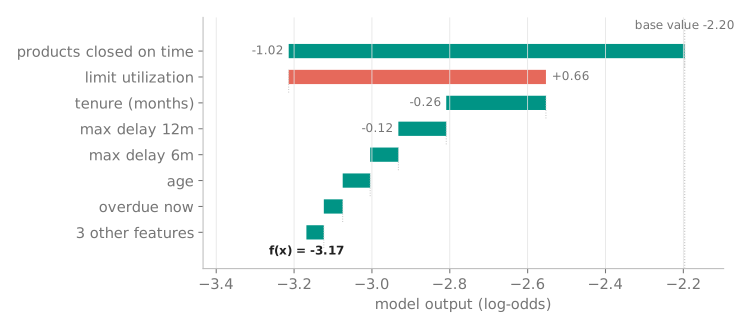
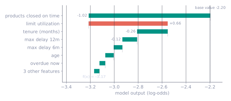
It looks exactly like a scorecard. Utilization “costs” +0.66 log‑odds; tenure “earns” −0.26. The four failures start the moment you treat those numbers as things you can push on.
Pitfall 1 — It is not a what‑if
The first failure is recourse. Utilization is the biggest positive bar, so the decline letter says: lower your utilization and your risk drops. SHAP never simulated that move — and the model disagrees:
x = trusted_applicant.copy()      # utilization 0.86, tenure 96 m, 7 products closed on time
model.predict_proba(x)[:, 1]      # 0.040 -> PD 4.0%
shap_row(x)["utilization"]        # +0.66 log-odds: the biggest positive bar

x[UTILIZATION] = 0.02             # "lower your utilization", says the letter
x[N_CLOSED_OK] = 2                # ...and they closed products while they were at it
model.predict_proba(x)[:, 1]      # 0.089 -> PD 8.9%. It went up.
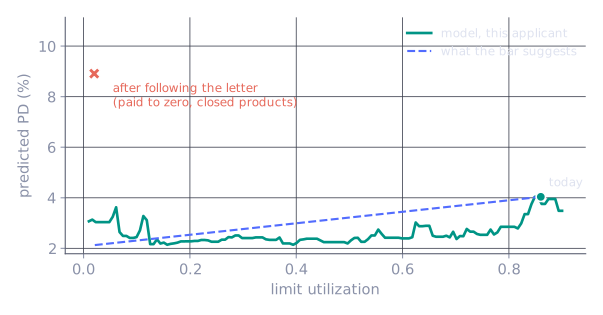
Nothing here is exotic. Inside the model, high utilization on a nine‑time, seven‑product profile reads as the normal mode of a trusted customer. The customer who follows the letter literally — pays the limit to zero, closes half the products — steps out of the very interaction that made them safe. Their PD does not drop toward the 2.1% the bar arithmetic implies. It more than doubles, to 8.9%:
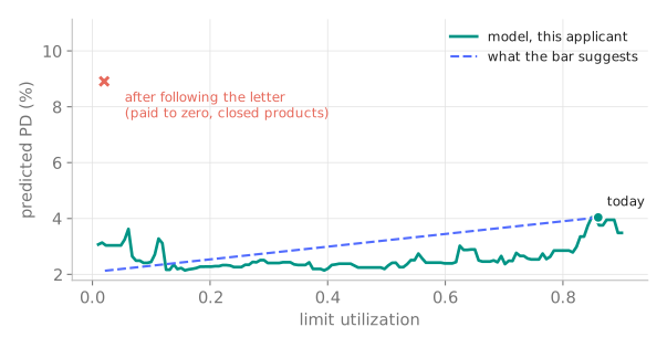
This is not an edge case; by now it is a theorem. Complete, linear attribution methods — SHAP included — provably cannot beat a coin flip at predicting how the model behaves under intervention (Bilodeau et al., PNAS 2024). “What should this customer change” is a counterfactual question, and you answer it by simulating the model until the decision flips, under constraints the real world imposes. That question is the reason treecf exists.
Pitfall 2 — Don’t subtract it day over day
The second failure is subtraction. Monday the PD is 14.8%; Tuesday it is 31.0%. The monitoring reflex is to compute SHAP on both days, subtract, and call the biggest mover the cause:
sv_mon = explainer.shap_values(x_monday)     # PD 14.8%
sv_tue = explainer.shap_values(x_tuesday)    # PD 31.0% after one new delinquency event

(x_tuesday != x_monday).sum()                # 3 of 10 inputs changed (the delay windows)
np.abs(sv_tue - sv_mon) > 0.01               # ...but the attributions of age, tenure,
                                             # utilization moved too
One thing happened to this customer — a single new delinquency event, which flows into the three nested delay windows. But the attribution deltas move almost everywhere, including on features whose values are identical on both days:
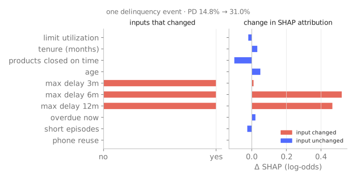
Two mechanisms drive this. Interactions: the new delinquency changes which tree paths fire, so the credit assigned to unchanged features is renegotiated. The background: every SHAP value is measured against a reference set of customers — the base value on the waterfall is that reference — and if the background drifts between two runs, every attribution moves under identical inputs. There is an engineering trap underneath, too: TreeExplainer without an explicit data= argument silently switches to path‑dependent attribution instead of interventional, and the two produce different numbers for the same applicant. If a prediction moved, diagnose it from the inputs and the attributions together. The bar that moved is often not the feature that did.
Pitfall 3 — Importance has two faces
The third failure is the importance ranking. Mean |SHAP| looks objective, and it is an artifact twice over.
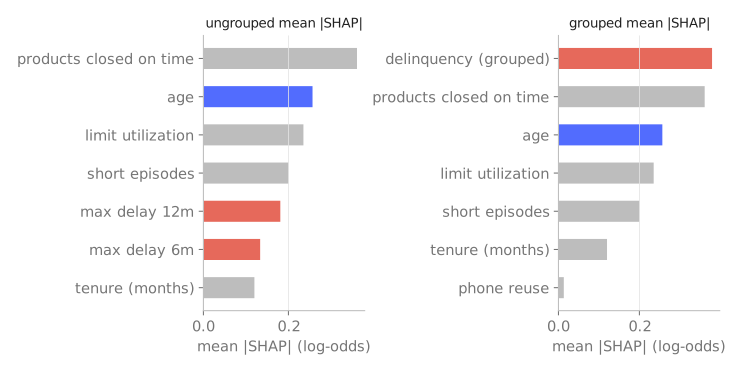
Face one: correlation splits the credit. The delinquency family describes one phenomenon in four columns, so the trees spread their splits across the windows and the attribution splits with them. Each member of the family ranks below age. Sum the family per applicant before taking the mean, and delinquency moves to the top of the ranking — where, in this data‑generating process, it belongs:
family = ["max_dpd_3m", "max_dpd_6m", "max_dpd_12m", "overdue_now"]
fam_idx = [FEATURES.index(f) for f in family]

mean_abs = np.abs(shap_values).mean(axis=0)             # per-column ranking
grouped = np.abs(shap_values[:, fam_idx].sum(axis=1))   # one phenomenon, one number
grouped.mean()                                          # tops the ranking once summed
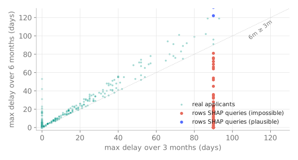
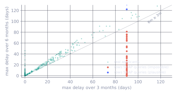
Under the same correlation there is a second, quieter problem: interventional SHAP builds its counterfactual rows by mixing the applicant’s values with background draws, feature by feature. With nested windows that manufactures rows that cannot exist — a max delay of 90 days over three months next to a smaller delay over six. For an applicant with max_dpd_3m = 90, 98.5% of the rows SHAP queries against my background violate the nesting constraint. The model is evaluated far outside the data manifold, and whatever it predicts out there leaks into the explanation (Aas, Jullum & Løland, 2021):
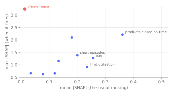
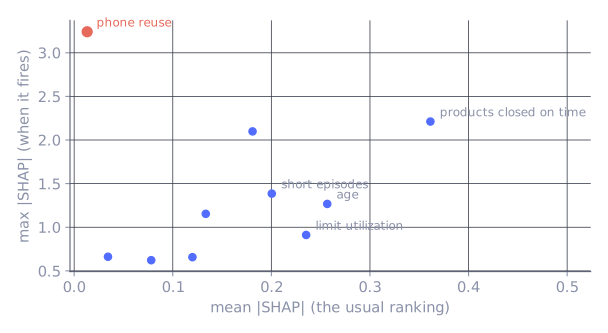
Face two: importance is measured on today’s distribution. The phone_reuse counter — applications sharing one phone number across different identities — is 99.5% zeros in training, so by mean |SHAP| it is the least important feature in the model, rank 10 of 10. Rank by the maximum instead and it is the single most powerful feature the model has — when it fires, no other feature moves a score as far:
mean_abs = np.abs(shap_values).mean(axis=0)   # phone_reuse: rank 10 of 10
max_abs  = np.abs(shap_values).max(axis=0)    # phone_reuse: rank 1 of 10
In production this is exactly the feature that bites: operators start recycling phone numbers, the share of zeros drifts from 99.5% to 90%, and a “bottom of the ranking” feature quietly becomes a top driver while nobody is watching it. The remedies are unglamorous. Group correlated features and compare phenomena, not columns. Rank and monitor by the tail of |SHAP|, not only the mean, because rare‑but‑decisive features live there.
Pitfall 4 — A feature in the model is not a model of the feature
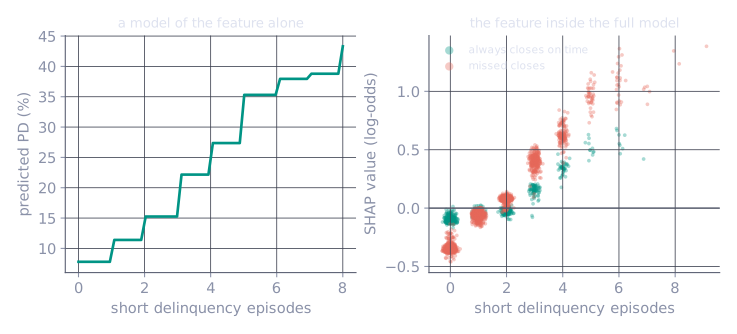
The fourth failure is intuition. Train a model on short delinquency episodes alone and it behaves the way intuition says: a clean staircase, more episodes, more risk. That curve is what most people silently picture when they read a SHAP dependence plot. The full model does something else — the same episode count carries a systematically different attribution depending on the rest of the profile, and for applicants who always close on time the contribution is dragged toward zero and below:
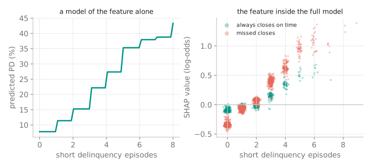
Read the SHAP of a single feature as if the feature stood alone and your business conclusion can come out backwards — especially under correlation, where part of a feature’s “effect” is credit borrowed from its neighbours.
The one rule
One sentence covers all four: SHAP explains the model, not the world. It answers — precisely, additively, fast — how the model decomposed this prediction against this background. It does not answer causal questions, counterfactual questions, or questions about the world, and it will not warn you when you ask one. It can even be deliberately steered: a discriminatory model can be dressed up to produce innocent‑looking attributions (Slack et al., AIES 2020).
None of this is a reason to bin it. It is a reason to ask it only the question it answers — and, when the stakes are high enough, to prefer a model that is transparent by construction over a black box with a good lawyer. In our benchmarks an EBM gave up roughly one point of AUROC against XGBoost and returned an exact, drawn shape per feature in exchange.
Reproduce the figures
Every figure on this page comes from one seeded script — synthetic data, the XGBoost model, interventional TreeSHAP, matplotlib: gen_figs.py. Numbers in the text are its output, not illustrations.
This note distils my Data Science Summit AI Edition 2026 talk, The Scorecard Illusion. Slides: The Scorecard Illusion (PDF) · full references: github.com/wlazlod/conference-talks.
Cite this note (BibTeX)
@misc{wlazlo2026shapnotpoints,
  author       = {Wlaz{\l}o, Daniel},
  title        = {Why {SHAP} Values Are Not Points},
  year         = {2026},
  month        = jul,
  howpublished = {datadeer.pl},
  url          = {https://datadeer.pl/notes/shap-values-are-not-points.html}
}